- Home
- /
- SAS Communities Library
- /
- SAS VA: Key Value Object now with Lattice Category!
- RSS Feed
- Mark as New
- Mark as Read
- Bookmark
- Subscribe
- Printer Friendly Page
- Report Inappropriate Content
SAS VA: Key Value Object now with Lattice Category!
- Article History
- RSS Feed
- Mark as New
- Mark as Read
- Bookmark
- Subscribe
- Printer Friendly Page
- Report Inappropriate Content
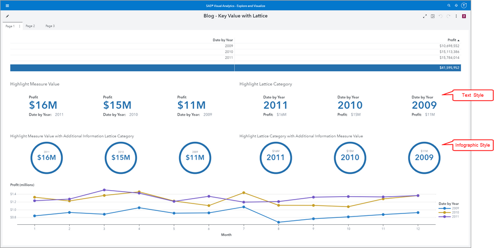
The SAS Visual Analytics Key Value object was first introduced the 8.2 release and has gotten an enhanced Role: Lattice Category with the stable 2021.1 (May 2021) release. This is an optional Role and it allows the Key Value object to display the desired measure value for a by group which can be Datetime, Date, or Category data item.
There are lots of combinations of Options to customize the look and feel for the Key Value object. For example, there are two main styles: Text or Infographic but there are several options for including labels, values, highlight the max or min values, etc. Check out my first blog for those details where I cover the different combination of options.
Select any image to see a larger version.
Mobile users: To view the images, select the "Full" version at the bottom of the page.
What’s the enhancement?
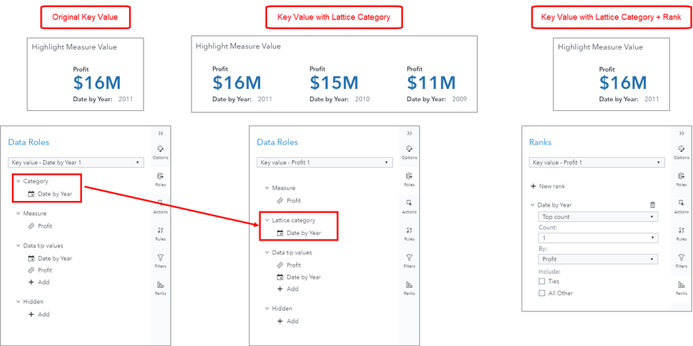
The main difference is the original Category Role has now been enhanced to be a Lattice Category Role. As you can see from the screenshot below, the original Key Value object would return just a single value, either the max or min based on the selected Options.
But the new Key Value with Lattice Category returns all of the category values for the assigned Role. In the below example, I have three Years in my data source: 2009, 2010, and 2011. We can see that the max Profit is for the Year 2011 and that is what the original Key Value object returns. In the new Key Value object, the Profit is returned for all of the values for Year and in this case the max is listed first.
How do you get back to the original Key Value behavior?
All you need to do is add a Rank to the new Key Value object. See the screenshot below, where I’ve added a Rank to the Year category, for the Top count of 1 By Profit. This returns the original Key Value state.
Why did we change it?
First, this will allow the Key Value object to return similar results to other objects when a category is specified. Think List Table, Crosstab, Bar Chart, etc and all the measures are summarized per the aggregation type and returned for all of the category values.
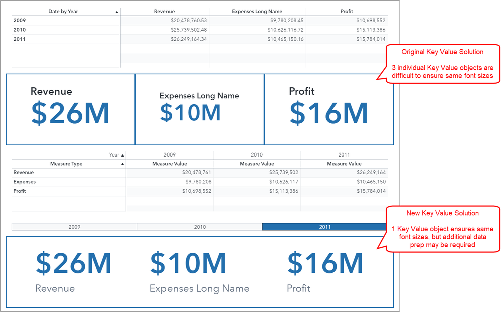
Second, this allows for multiple values to be returned in a single Key Value object for a specified category that will all be dynamically sized the same!! No more trying to get that dynamic formatting for different Key Value objects to look the same – they will now be the same size! This does not mean you can set an absolute font size, this means that all of the measure and category values will be apart of a single Key Value object and the sizing will be handled automatically.
In the example below, I did some additional data prep to essentially transpose my data. Now all of my Measure Types are in a single column and the Measure Values are in a single column as you can see in the bottom Crosstab. This allows me to use only one Key Value object and we can see how even with a long category value, Expense Long Name, all of the measure values are the same size.
Third, enhancements and improvement is the name of the game. This is just one of the latest enhancements to keep SAS Visual Analytics looking sharp and ease report development.
What happens to my old reports that use the original Key Value object?
When you import or migrate your old reports that use the original Key Value object, don’t worry, those reports will look exactly as they did when you designed them. Those reports will reference the legacy Key Value object.
Going forward, however, for any new reports, the Objects pane will only have the enhanced Key Value object available for use. Like I mentioned above, you can easily apply a ”Rank of 1” to the new Key Value object to get the original look and feel of the object.
Examples
Here are some examples to give you an idea of some of the possibilities.
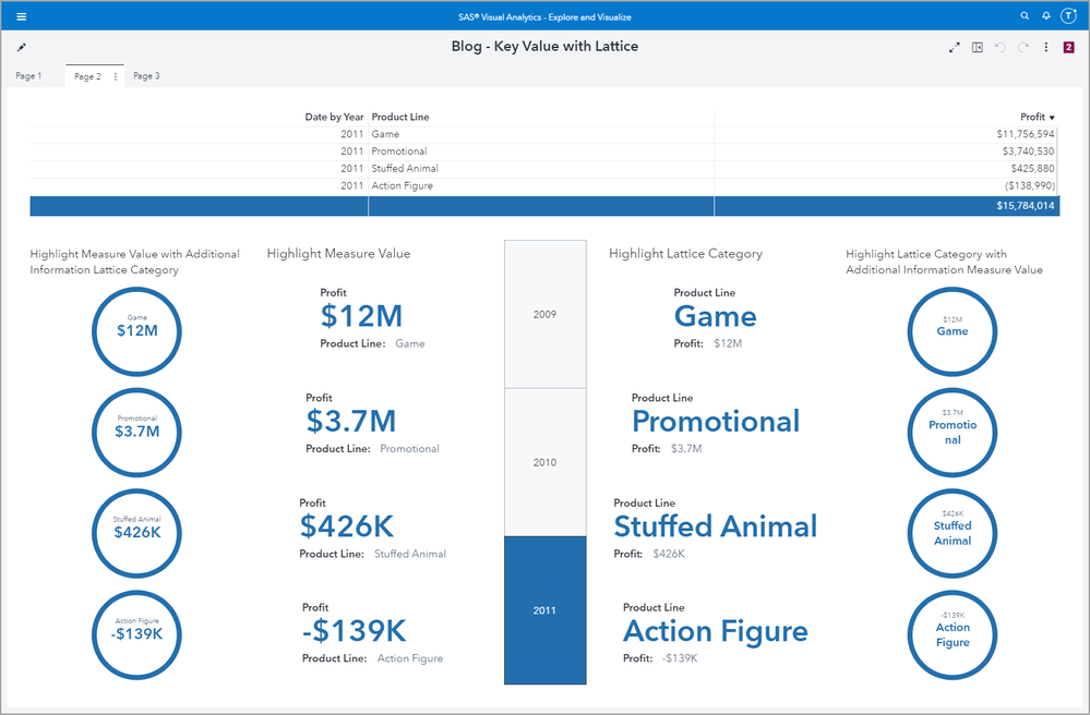
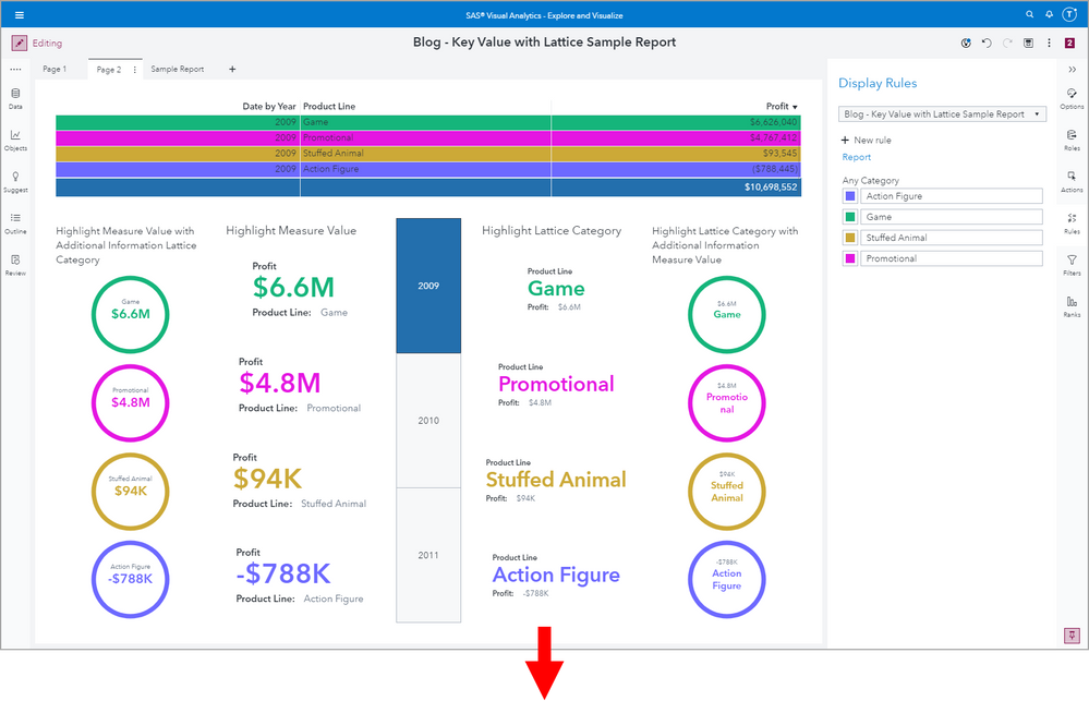
In this first screenshot, I’ve used the new Lattice layout Option with Column limit set to 1. This makes the Key Value elements vertical in a single column.
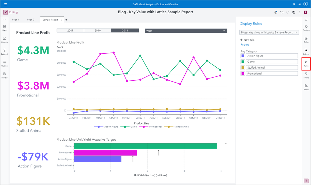
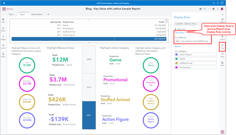
Here is a second example where I wanted to coordinate the color across the Lattice Category value. To do that I assigned a Report level Display Rule.
When using a Report level Display Rule, remember this can sometimes create unintended formatting. Just know that you can layer another Display Rule on top of the Report level at the Object level to get back your desired report look and feel.
More of my Visual Analytics related materials:
- VA Report Example: Use Text Input for custom search (sas.com)
- SAS VA Report Example: Add a scope to an aggregated measure: Article | YouTube
- Build a date in SAS Visual Analytics reports: Article | YouTube
- Use the Report Review pane to ensure good VA Report performance Article | YouTube
- SAS Viya Jobs in a SAS Visual Analytics report
- Tips for working with multiple data sources in SAS Visual Analytics: Article | YouTube
- SAS Demo | The Power Behind a Hidden Data Role in SAS Visual Analytics
- SAS Visual Analytics Report Example: Percent of Total – For All, For Rows, and For Columns
- SAS Visual Analytics example: moving average
Additional materials for using parameters in SAS Visual Analytics:
- Use parameters to highlight data points in VA reports: Article | YouTube
- New control prompt placement option in SAS Visual Analytics
- Using common filters in SAS Visual Analytics: Article | YouTube
- Using parameters in SAS Visual Analytics: Article | YouTube
- Use parameters to pick two metrics in Visual Analytics Reports
- Use parameters to pick your metric in Visual Analytics Reports: Article | YouTube
- Using Date Parameters in your SAS Visual Analytics Reports
How to prompt for a date range in a SAS Visual Analytics report Blog Series:
- Slider with Style Input of Range: Article | YouTube
- Slider with Style Input of Single Value: Article | YouTube
- Drop-down List: Article | YouTube
- Text Input: Article | YouTube
Find more articles from SAS Global Enablement and Learning here.
Catch up on SAS Innovate 2026
Dive into keynotes, announcements and breakthroughs on demand.
Explore Now →SAS AI and Machine Learning Courses
The rapid growth of AI technologies is driving an AI skills gap and demand for AI talent. Ready to grow your AI literacy? SAS offers free ways to get started for beginners, business leaders, and analytics professionals of all skill levels. Your future self will thank you.
- Find more articles tagged with:
- GEL
