- Home
- /
- SAS Viya
- /
- Visual Analytics
- /
- Re: how to show bar chart or pie chart as a tooltip
- RSS Feed
- Mark Topic as New
- Mark Topic as Read
- Float this Topic for Current User
- Bookmark
- Subscribe
- Mute
- Printer Friendly Page
- Mark as New
- Bookmark
- Subscribe
- Mute
- RSS Feed
- Permalink
- Report Inappropriate Content
Dear Friends,
Actually I would like to show pie chart or bar chart or any other useful visual as a tooltip (like Tableau & PowerBI)
Kindly suggest.
Regards,
SRi
Accepted Solutions
- Mark as New
- Bookmark
- Subscribe
- Mute
- RSS Feed
- Permalink
- Report Inappropriate Content
Hey @sridhar_m,
You can achieve what you're looking for in SAS Visual Analytics using the Pop-up Window capability. Here is the documentation page for Visual Analytics 8.4.
Starting with a Pie chart showing Adverse Capital Ration by LoB.
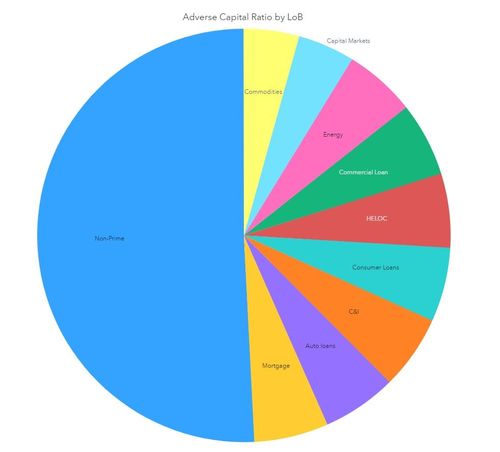
Double click on a LoB, "Energy" for example...
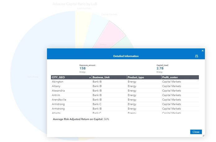
and a custom pop-up window is displayed based on the selected LoB (pie wedge).
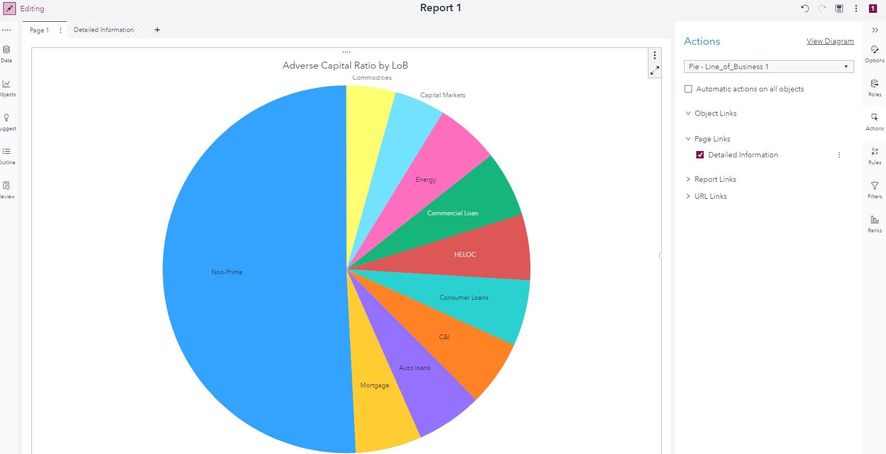
Here is the report in design mode:
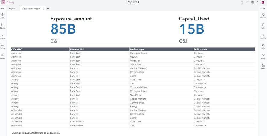
From the pie chart page, I link to the hidden "Detailed Info" page.
and build the custom pop-up window I want to see for the pie chart.
Hope this helps!
Robby
- Mark as New
- Bookmark
- Subscribe
- Mute
- RSS Feed
- Permalink
- Report Inappropriate Content
Hello Sri,
Could you explain what you want in more detail? When should the tooltip be displayed?
Thanks,
Sam
- Mark as New
- Bookmark
- Subscribe
- Mute
- RSS Feed
- Permalink
- Report Inappropriate Content
Dear Sam,
Please find the attached PowerBI doc for your reference and let me know your valuable suggestions on this.
Regards,
Sri
- Mark as New
- Bookmark
- Subscribe
- Mute
- RSS Feed
- Permalink
- Report Inappropriate Content
Thanks for providing an example!
If I understand correctly, the feature you want is a "data tip" for each bar or pie segment when you move the cursor over that element. Is that correct?
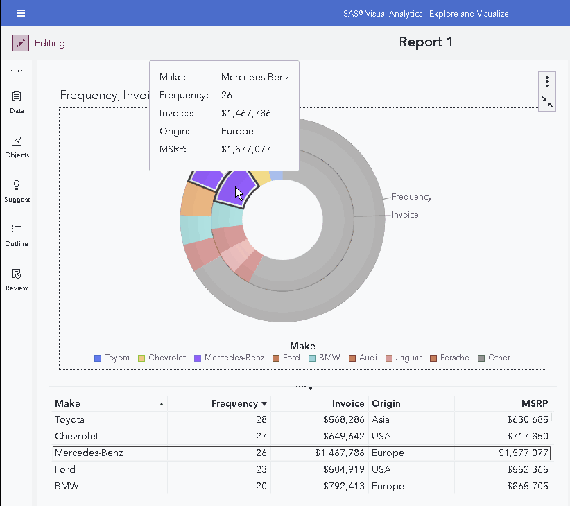
VA does provide data tips, and in recent versions of VA you can add variables to the Data Tip Values role to display those values. Here is an example:
If the chart is maximized, we also display a summary data table below the chart.
Is this the sort of thing you are looking for?
Another option to explore the data for a selected slice of a pie chart would be to create a List Table object that is filtered by the pie chart. This would enable you to see individual rows of detail data.
Thanks,
Sam
- Mark as New
- Bookmark
- Subscribe
- Mute
- RSS Feed
- Permalink
- Report Inappropriate Content
Thank you for your detailed explanation. But the thing is Data tip is different than the Tool Tip.
It is like when even you mouse hover on any data points on any existing report it should show tool tip as a "Report" (it may be any kind like pie, bar, list, crosstab or any detailed report related to that data item).
Regards,
Sri
- Mark as New
- Bookmark
- Subscribe
- Mute
- RSS Feed
- Permalink
- Report Inappropriate Content
I will see if someone more familiar with Tableau / PowerBI can help.
Sam
- Mark as New
- Bookmark
- Subscribe
- Mute
- RSS Feed
- Permalink
- Report Inappropriate Content
Dear Sam,
Yes, you are right. I am not sure may be this kind of similary is there in SAS Visual Analytics or not.
I am experienced even PowerBI/Tableau too.
Regards,
Sri
- Mark as New
- Bookmark
- Subscribe
- Mute
- RSS Feed
- Permalink
- Report Inappropriate Content
Hey @sridhar_m,
You can achieve what you're looking for in SAS Visual Analytics using the Pop-up Window capability. Here is the documentation page for Visual Analytics 8.4.
Starting with a Pie chart showing Adverse Capital Ration by LoB.

Double click on a LoB, "Energy" for example...

and a custom pop-up window is displayed based on the selected LoB (pie wedge).
Here is the report in design mode:
From the pie chart page, I link to the hidden "Detailed Info" page.
and build the custom pop-up window I want to see for the pie chart.
Hope this helps!
Robby
- Mark as New
- Bookmark
- Subscribe
- Mute
- RSS Feed
- Permalink
- Report Inappropriate Content
Thank you very much for your detailed explanation. Yes, here you have provided as a pagelink. Agree. But it's not similar as PowerBI & Tableau.
You have mentioned that when ever you double click on that particular item new page link you have provided. I think it's not yet implemented in SAS Visual Analytics.
Cheers,
Regards,
Sri
- Mark as New
- Bookmark
- Subscribe
- Mute
- RSS Feed
- Permalink
- Report Inappropriate Content
Correct, the report is designed with the pop-up window as a page link; however, it is indeed a pop-up window. I'm interested to understand the difference you see. Is your concern that it requires a dbl-click rather than hover?

- Mark as New
- Bookmark
- Subscribe
- Mute
- RSS Feed
- Permalink
- Report Inappropriate Content
No, It is different than mouse hover on Energy automatically it should show rather than double click on Energy.
Thanks & Regards,
Sri
- Mark as New
- Bookmark
- Subscribe
- Mute
- RSS Feed
- Permalink
- Report Inappropriate Content
Hi Sridhar,
You can use a prompt container to show bar charts in the similar format to a tool tip
Regards,
Surya
April 27 – 30 | Gaylord Texan | Grapevine, Texas
Registration is open
Walk in ready to learn. Walk out ready to deliver. This is the data and AI conference you can't afford to miss.
Register now and lock in 2025 pricing—just $495!
See how to use one filter for multiple data sources by mapping your data from SAS’ Alexandria McCall.
Find more tutorials on the SAS Users YouTube channel.


