- Home
- /
- Programming
- /
- Graphics
- /
- Creating a stacked bar chart with continuous data?
- RSS Feed
- Mark Topic as New
- Mark Topic as Read
- Float this Topic for Current User
- Bookmark
- Subscribe
- Mute
- Printer Friendly Page

- Mark as New
- Bookmark
- Subscribe
- Mute
- RSS Feed
- Permalink
- Report Inappropriate Content
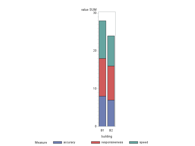
The horizontal axis is populated by categorical variable of the different buildings (i.e.b1, b2). I want the height of the bars to be the total performance measure (a continuous variable) of the buildings and then within each of these bars is the different measures that make up the total performance measure. For instance, if the height of the bar is 28 (the total), I want different demarcations for the 3 performance measures that make up that 28: speed: 10 (blue), accuracy 8 (green), responsiveness 10 (yellow). So each building would have stacked bars with various heights and 3 different variables that make up that bar and color coded. The legend would show that blue = speed, accuracy= green and responsiveness=yellow.
My dataset looks like this:
Building Speed Accuracy Responsiveness Total
B1 10 8 10 28
B2 8 7 9 24
Accepted Solutions

- Mark as New
- Bookmark
- Subscribe
- Mute
- RSS Feed
- Permalink
- Report Inappropriate Content
I think you'd have to hard-code an axis statement in Gchart. There's a 'missing' option for the bar midpoints, but I don't think there's one for the response variable.
data building;
input Building Value;
datalines;
1 22
2 0
3 44
4 .
5 .
6 0
;
run;
axis1 order=(1 to 6 by 1);
proc gchart data=building;
vbar Building / discrete type=sum sumvar=value
maxis=axis1;
run;

- Mark as New
- Bookmark
- Subscribe
- Mute
- RSS Feed
- Permalink
- Report Inappropriate Content
Look at vbarparm and hbarparm.
Or see Rob Allisons graph:
- Mark as New
- Bookmark
- Subscribe
- Mute
- RSS Feed
- Permalink
- Report Inappropriate Content
Here are the basics...
data foo;
input building $ 1-2 speed accuracy responsiveness;
datalines;
B1 10 8 10
B2 8 7 9
;
run;
proc transpose data=foo out=foo (rename=(_name_=measure col1=value));
by building;
run;
proc gchart data=foo;
label measure='Measure';
vbar building / type=sum sumvar=value subgroup=measure;
run;
- Mark as New
- Bookmark
- Subscribe
- Mute
- RSS Feed
- Permalink
- Report Inappropriate Content
Thank you. However, when I run this code, I get a chart with funky Building ID midpoints. I should have mentioned that the building variable is numeric, but I want to use it like a character. There is a weird summing that occurs. How do I make sure Building ID shows up as 1 and not 30 for instance?
- Mark as New
- Bookmark
- Subscribe
- Mute
- RSS Feed
- Permalink
- Report Inappropriate Content
By default, gchart takes numeric bar values and splits them into ranges to make a histogram.
If you want each numeric bar value to be treated as a discrete value (like a character), you can specify the 'discrete' option.
vbar building / discrete type=sum sumvar=value subgroup=measure;
- Mark as New
- Bookmark
- Subscribe
- Mute
- RSS Feed
- Permalink
- Report Inappropriate Content
If I use the discrete option then the buildings that are missing data will not show up on the x axis. Can I convert the building ID to numeric in the transpose procedure?
- Mark as New
- Bookmark
- Subscribe
- Mute
- RSS Feed
- Permalink
- Report Inappropriate Content
It depends... By 'missing' do you mean they're not in the data at all, or the building number is a sas-missing, or that the building number is there but with sas-missing response values, or other? I'd have to see some data to steer you in the right direction. You can convert a numeric to a character either before or after the transpose (again - it depends...)
There's a "missing" option in gchart, you can specify all the desired bar values in an axis statement, etc.
- Mark as New
- Bookmark
- Subscribe
- Mute
- RSS Feed
- Permalink
- Report Inappropriate Content
Ah thank you. The missing option works. Many thanks!
If it is not uncouth, I have an additional question. If I want to use proc sgplot using this data and I have an additional subgroup, what is the subgroup equivalent in sgplot?

- Mark as New
- Bookmark
- Subscribe
- Mute
- RSS Feed
- Permalink
- Report Inappropriate Content
For the multi-class situation, use SGPANEL. For example,
proc sgpanel data=sashelp.prdsale;
panelby year / onepanel novarname noborder layout=columnlattice;
vbar product / response=actual group=division;
run;
- Mark as New
- Bookmark
- Subscribe
- Mute
- RSS Feed
- Permalink
- Report Inappropriate Content
Thanks DanH!
- Mark as New
- Bookmark
- Subscribe
- Mute
- RSS Feed
- Permalink
- Report Inappropriate Content
I want to plot the following data on a bar chart, where building ID is on the x-axis and value is the height of the bar. If the value is 0 or . I want the building id to show up on the x axis. I am using the missing option, but the building ids where value = . do not show up. There is a difference between having a value of 0 and a value that is missing.
building value
1 22
2 0
3 44
4 .
5 .
6 0

- Mark as New
- Bookmark
- Subscribe
- Mute
- RSS Feed
- Permalink
- Report Inappropriate Content
This graph created using SAS 9.3, but it works fine on SAS 9.2 (remove the DATASKIN option).
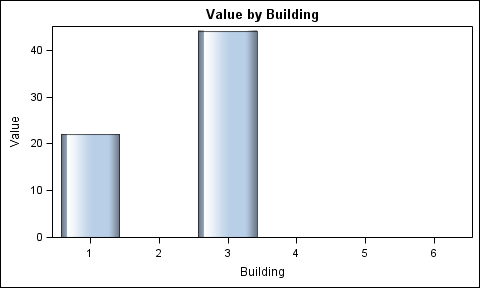
data building;
input Building Value;
datalines;
1 22
2 0
3 44
4 .
5 .
6 0
;
run;
ods html close;
ods graphics / reset width=5in height=3in imagename='Building';
title 'Value by Building';
proc sgplot data=building;
vbar building / response=value missing nostatlabel dataskin=gloss;
run;
- Mark as New
- Bookmark
- Subscribe
- Mute
- RSS Feed
- Permalink
- Report Inappropriate Content
Sanjay, is there a gchart equivalent?
- Mark as New
- Bookmark
- Subscribe
- Mute
- RSS Feed
- Permalink
- Report Inappropriate Content
I think you'd have to hard-code an axis statement in Gchart. There's a 'missing' option for the bar midpoints, but I don't think there's one for the response variable.
data building;
input Building Value;
datalines;
1 22
2 0
3 44
4 .
5 .
6 0
;
run;
axis1 order=(1 to 6 by 1);
proc gchart data=building;
vbar Building / discrete type=sum sumvar=value
maxis=axis1;
run;
- Mark as New
- Bookmark
- Subscribe
- Mute
- RSS Feed
- Permalink
- Report Inappropriate Content
Yes, this is what I ultimately ended up doing. Thanks!
.jpg")
Catch up on SAS Innovate 2026
Nearly 200 sessions are now available on demand with the SAS Innovate Digital Pass.
Explore Now →Learn how use the CAT functions in SAS to join values from multiple variables into a single value.

Find more tutorials on the SAS Users YouTube channel.
SAS Training: Just a Click Away
Ready to level-up your skills? Choose your own adventure.
-
15 replies
-
02-22-2013 01:48 PM
-
10496 views
-
4 likes
-
6 in conversation
-
