- Home
- /
- Programming
- /
- Graphics
- /
- SG procedures represent TABLE into an image form
- RSS Feed
- Mark Topic as New
- Mark Topic as Read
- Float this Topic for Current User
- Bookmark
- Subscribe
- Mute
- Printer Friendly Page

- Mark as New
- Bookmark
- Subscribe
- Mute
- RSS Feed
- Permalink
- Report Inappropriate Content
Hello,
I saw in one of the post from Cynthia talking about the new SG procedures can represent TABLE by equivalent image form. I googled this online, but I didn't find any information about this. I am wondering if there is anyone can help me?
Thanks!
Accepted Solutions

- Mark as New
- Bookmark
- Subscribe
- Mute
- RSS Feed
- Permalink
- Report Inappropriate Content
This may be what you are referring to:
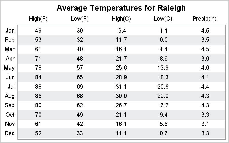
The purpose is to create a graph with axis aligned table columns like this:
Here is the code using SGPLOT procedure:
%let gpath='C:\';
data weatherTable;
input Month $ high low precip;
highC = (high-32) / 1.8;
lowC = (low-32) / 1.8;
label high= 'Fahrenheit';
label low = 'Fahrenheit';
label highc='Celsius';
label lowc= 'Celsius';
label precip= 'Precipitation (in)';
format high low 2.0;
format highc lowc precip 4.1;
x1='High(F)'; x2='Low(F)'; x3='High(C)'; x4='Low(C)'; x5='Precip(in)';
id=_n_;
if mod(id, 2)=0 then ref=month;
datalines;
Jan 49 30 4.46
Feb 53 32 3.53
Mar 61 40 4.46
Apr 71 48 2.98
May 78 57 4.03
Jun 84 65 4.06
Jul 88 69 4.35
Aug 86 68 4.30
Sep 80 62 4.27
Oct 70 49 3.28
Nov 61 42 3.06
Dec 52 33 3.25
;
run;
proc sort data=weatherTable out=weatherTable2;
by descending id;
run;
ods html style=listing;
proc print data=weatherTable(obs=10) noobs;run;
ods html close;
ods listing gpath=&gpath style=htmlblue image_dpi=200;
proc template;
define style Styles.HtmlblueSF;
parent = styles.Htmlblue;
style GraphFonts from GraphFonts /
'GraphDataFont' = ("<sans-serif>, <MTsans-serif>",8pt)
'GraphValueFont' = ("<sans-serif>, <MTsans-serif>",8pt);
end;
run;
/*--Table--*/
ods listing style=Styles.HtmlblueSF;
ods graphics / reset width=4in height=2.5in imagename='Weather_Table';
title "Average Temperatures for Raleigh";
proc sgplot data=weatherTable2 noautolegend;
scatter y=month x=x1 / markerchar=high x2axis;
scatter y=month x=x2 / markerchar=low x2axis;
scatter y=month x=x3 / markerchar=highc x2axis;
scatter y=month x=x4 / markerchar=lowc x2axis;
scatter y=month x=x5 / markerchar=precip x2axis;
x2axis display=(noticks nolabel) offsetmin=0.1 offsetmax=0.1;
yaxis display=(nolabel noticks) offsetmin=0.05 offsetmax=0.05;
run;
/*--Table with bands--*/
ods listing style=Styles.HtmlblueSF;
ods graphics / reset width=4in height=2.5in imagename='Weather_Table_Bands';
title "Average Temperatures for Raleigh";
proc sgplot data=weatherTable2 noautolegend;
refline ref / lineattrs=(thickness=20) transparency=0.8;
scatter y=month x=x1 / markerchar=high x2axis;
scatter y=month x=x2 / markerchar=low x2axis;
scatter y=month x=x3 / markerchar=highc x2axis;
scatter y=month x=x4 / markerchar=lowc x2axis;
scatter y=month x=x5 / markerchar=precip x2axis;
x2axis display=(noticks nolabel) offsetmin=0.1 offsetmax=0.1;
yaxis display=(nolabel noticks) offsetmin=0.05 offsetmax=0.05;
run;
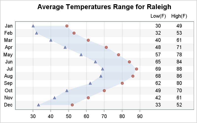
/*--Graph with Table--*/
ods listing style=Styles.HtmlblueSF;
ods graphics / reset width=4in height=2.5in imagename='Weather_Table_Graph';
title "Average Temperatures Range for Raleigh";
proc sgplot data=weatherTable2 noautolegend;
refline ref / lineattrs=(thickness=18) transparency=0.9;
band y=month lower=low upper=high / transparency=0.6;
scatter y=month x=high / markerattrs=graphdata2(symbol=circlefilled) transparency=0.4;
scatter y=month x=low / markerattrs=graphdata1(symbol=trianglefilled) transparency=0.4;
scatter y=month x=x2 / markerchar=low x2axis;
scatter y=month x=x1 / markerchar=high x2axis;
xaxis display=(nolabel) grid offsetmin=0.1 offsetmax=0.3;
x2axis display=(noticks nolabel) offsetmin=0.8 offsetmax=0.08;
yaxis display=(nolabel noticks) offsetmin=0.05 offsetmax=0.05;
run;
- Mark as New
- Bookmark
- Subscribe
- Mute
- RSS Feed
- Permalink
- Report Inappropriate Content
This may be what you are referring to:
The purpose is to create a graph with axis aligned table columns like this:
Here is the code using SGPLOT procedure:
%let gpath='C:\';
data weatherTable;
input Month $ high low precip;
highC = (high-32) / 1.8;
lowC = (low-32) / 1.8;
label high= 'Fahrenheit';
label low = 'Fahrenheit';
label highc='Celsius';
label lowc= 'Celsius';
label precip= 'Precipitation (in)';
format high low 2.0;
format highc lowc precip 4.1;
x1='High(F)'; x2='Low(F)'; x3='High(C)'; x4='Low(C)'; x5='Precip(in)';
id=_n_;
if mod(id, 2)=0 then ref=month;
datalines;
Jan 49 30 4.46
Feb 53 32 3.53
Mar 61 40 4.46
Apr 71 48 2.98
May 78 57 4.03
Jun 84 65 4.06
Jul 88 69 4.35
Aug 86 68 4.30
Sep 80 62 4.27
Oct 70 49 3.28
Nov 61 42 3.06
Dec 52 33 3.25
;
run;
proc sort data=weatherTable out=weatherTable2;
by descending id;
run;
ods html style=listing;
proc print data=weatherTable(obs=10) noobs;run;
ods html close;
ods listing gpath=&gpath style=htmlblue image_dpi=200;
proc template;
define style Styles.HtmlblueSF;
parent = styles.Htmlblue;
style GraphFonts from GraphFonts /
'GraphDataFont' = ("<sans-serif>, <MTsans-serif>",8pt)
'GraphValueFont' = ("<sans-serif>, <MTsans-serif>",8pt);
end;
run;
/*--Table--*/
ods listing style=Styles.HtmlblueSF;
ods graphics / reset width=4in height=2.5in imagename='Weather_Table';
title "Average Temperatures for Raleigh";
proc sgplot data=weatherTable2 noautolegend;
scatter y=month x=x1 / markerchar=high x2axis;
scatter y=month x=x2 / markerchar=low x2axis;
scatter y=month x=x3 / markerchar=highc x2axis;
scatter y=month x=x4 / markerchar=lowc x2axis;
scatter y=month x=x5 / markerchar=precip x2axis;
x2axis display=(noticks nolabel) offsetmin=0.1 offsetmax=0.1;
yaxis display=(nolabel noticks) offsetmin=0.05 offsetmax=0.05;
run;
/*--Table with bands--*/
ods listing style=Styles.HtmlblueSF;
ods graphics / reset width=4in height=2.5in imagename='Weather_Table_Bands';
title "Average Temperatures for Raleigh";
proc sgplot data=weatherTable2 noautolegend;
refline ref / lineattrs=(thickness=20) transparency=0.8;
scatter y=month x=x1 / markerchar=high x2axis;
scatter y=month x=x2 / markerchar=low x2axis;
scatter y=month x=x3 / markerchar=highc x2axis;
scatter y=month x=x4 / markerchar=lowc x2axis;
scatter y=month x=x5 / markerchar=precip x2axis;
x2axis display=(noticks nolabel) offsetmin=0.1 offsetmax=0.1;
yaxis display=(nolabel noticks) offsetmin=0.05 offsetmax=0.05;
run;
/*--Graph with Table--*/
ods listing style=Styles.HtmlblueSF;
ods graphics / reset width=4in height=2.5in imagename='Weather_Table_Graph';
title "Average Temperatures Range for Raleigh";
proc sgplot data=weatherTable2 noautolegend;
refline ref / lineattrs=(thickness=18) transparency=0.9;
band y=month lower=low upper=high / transparency=0.6;
scatter y=month x=high / markerattrs=graphdata2(symbol=circlefilled) transparency=0.4;
scatter y=month x=low / markerattrs=graphdata1(symbol=trianglefilled) transparency=0.4;
scatter y=month x=x2 / markerchar=low x2axis;
scatter y=month x=x1 / markerchar=high x2axis;
xaxis display=(nolabel) grid offsetmin=0.1 offsetmax=0.3;
x2axis display=(noticks nolabel) offsetmin=0.8 offsetmax=0.08;
yaxis display=(nolabel noticks) offsetmin=0.05 offsetmax=0.05;
run;
- Mark as New
- Bookmark
- Subscribe
- Mute
- RSS Feed
- Permalink
- Report Inappropriate Content
Hi Sanjay,
I am sorry for this very late reply. This is exactly what I am looking for, thank you for your efforts!
.jpg")
Catch up on SAS Innovate 2026
Nearly 200 sessions are now available on demand with the SAS Innovate Digital Pass.
Explore Now →Learn how use the CAT functions in SAS to join values from multiple variables into a single value.

Find more tutorials on the SAS Users YouTube channel.
SAS Training: Just a Click Away
Ready to level-up your skills? Choose your own adventure.
-
2 replies
-
11-16-2012 10:50 AM
-
2176 views
-
1 like
-
2 in conversation
-
