- Home
- /
- Programming
- /
- Graphics
- /
- 3 way Venn diagram
- RSS Feed
- Mark Topic as New
- Mark Topic as Read
- Float this Topic for Current User
- Bookmark
- Subscribe
- Mute
- Printer Friendly Page
- Mark as New
- Bookmark
- Subscribe
- Mute
- RSS Feed
- Permalink
- Report Inappropriate Content
Hi,
I am trying to build a 3 way Venn diagram visualising the data below.
Id min max avg
Good 12 49 25
Bad 12 41 30
Intermediate 23 46 49
I have sourced a macro via Google and does not seem provide a solution to my issue.
Macro Call
%macro venn(
data =summary_exp6
,venn_diagram = 3
,cutoff = < 0.3
,Good = Treatment A
,Bad = Treatment B
,Intermediate = Treatment C
,out_location = H:\SAS Projects
,outputfilename = Venn diagram
);
The macro above (according to my limited SAS knowledge) will not alone create the output which I require. I would be gratetful of any help resolving this issue.
Thanks !
Accepted Solutions
- Mark as New
- Bookmark
- Subscribe
- Mute
- RSS Feed
- Permalink
- Report Inappropriate Content
I published an article on the 2-way proportional Euler diagram last year. http://blogs.sas.com/content/graphicallyspeaking/?s=euler+diagram Clearly the 3-way case is harder, but maybe you can get some ideas.
- Mark as New
- Bookmark
- Subscribe
- Mute
- RSS Feed
- Permalink
- Report Inappropriate Content
- Mark as New
- Bookmark
- Subscribe
- Mute
- RSS Feed
- Permalink
- Report Inappropriate Content
That's all that I have at the moment. I do understand it forms part of a larger macro but thats what I need help with building.
Thanks
- Mark as New
- Bookmark
- Subscribe
- Mute
- RSS Feed
- Permalink
- Report Inappropriate Content
I have a paper on creating Venn Diagrams. As long as you have SAS 9.3 or more you can use the code. If you have the dataset created already than you only really need to use the GTL template.
http://support.sas.com/resources/papers/proceedings13/243-2013.pdf
- Mark as New
- Bookmark
- Subscribe
- Mute
- RSS Feed
- Permalink
- Report Inappropriate Content
What are you actually trying to plot on your venn diagram please?
- Mark as New
- Bookmark
- Subscribe
- Mute
- RSS Feed
- Permalink
- Report Inappropriate Content
Here are some references with code samples.
- Mark as New
- Bookmark
- Subscribe
- Mute
- RSS Feed
- Permalink
- Report Inappropriate Content
From a search on this topic I did a few years ago
- Mark as New
- Bookmark
- Subscribe
- Mute
- RSS Feed
- Permalink
- Report Inappropriate Content
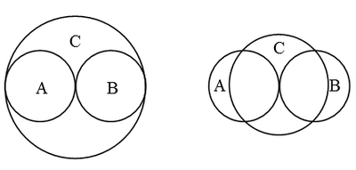
You probably don't want to hear this, but Venn diagrams that consist of planar circles are poor models for showing relationships between sets. They can be used to show QUALITATIVE relationships, but are not good for quantitative relationships.
It is easy to construct examples in which the Venn diagram misrepresents the quantities that are shared between sets. The simplest example with three sets is A={1} and B={2} and C={1 2}. There is no way to use circles to construct a Venn diagram that represents this state correctly. Two attempts are shown below. The attempt on the left indicates that there are elements of C that are not contained in A or B, which is wrong. The attempt on the right also misrepresents the union and intersection.
When you get to four or more sets, the problems become even worse.
There are other shapes that you can use to construct Venn diagrams, such as rectangles, but in general a good cross-tabulation of counts or a mosaic plot is more informative. You can use PROC FREQ to create a mosaic plot automatically.
- Mark as New
- Bookmark
- Subscribe
- Mute
- RSS Feed
- Permalink
- Report Inappropriate Content
I published an article on the 2-way proportional Euler diagram last year. http://blogs.sas.com/content/graphicallyspeaking/?s=euler+diagram Clearly the 3-way case is harder, but maybe you can get some ideas.
- Mark as New
- Bookmark
- Subscribe
- Mute
- RSS Feed
- Permalink
- Report Inappropriate Content
Thanks guys for your help. Much appreciated !!
Learn how use the CAT functions in SAS to join values from multiple variables into a single value.
Find more tutorials on the SAS Users YouTube channel.
SAS Training: Just a Click Away
Ready to level-up your skills? Choose your own adventure.


