- Home
- /
- SAS Viya
- /
- Visual Analytics
- /
- Re: Sankey Diagram SAS VA
- RSS Feed
- Mark Topic as New
- Mark Topic as Read
- Float this Topic for Current User
- Bookmark
- Subscribe
- Mute
- Printer Friendly Page
- Mark as New
- Bookmark
- Subscribe
- Mute
- RSS Feed
- Permalink
- Report Inappropriate Content
Team,
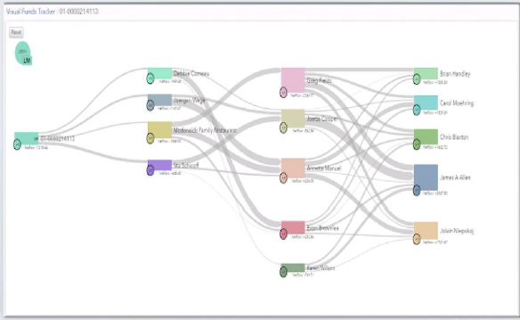
I want to visualize a funds tracker (example given in screenshot).
Planning to use path analysis for the same. But not getting correct visualization. Can someone suggest if we can achieve it and how?
- Mark as New
- Bookmark
- Subscribe
- Mute
- RSS Feed
- Permalink
- Report Inappropriate Content
Hi, Yes, I believe this should be possible - the screenshot you provided shows a generic sankey diagram. What exactly are you struggling with? Maybe you can provide some details e.g. snapshot of the data.
You may also find some related discussions useful as those cover details such as expected data structure and role assignments:
- https://communities.sas.com/t5/SAS-Visual-Analytics/Patient-Flow-Sankey-Diagram/m-p/475320#M10599
- https://communities.sas.com/t5/SAS-Visual-Analytics/Sankey-Diagrams-in-SAS-VA/m-p/212314#M2224
Hope this helps. Falko
- Mark as New
- Bookmark
- Subscribe
- Mute
- RSS Feed
- Permalink
- Report Inappropriate Content
hello Falko,
Thanks for your response. All the examples i saw shows the progress of events. What i want to show is a transnational database:
Tx id Date Sender Address Reciever Address Amount
| 312314 | 30-Sep-19 | Kingfisher Airlines (KFA) | Arielle Sixsmith | 89.1243 |
| 312315 | 1-Oct-19 | Kingfisher Airlines (KFA) | Michael Vincent Hazel | 46.876 |
| 312316 | 2-Oct-19 | Kingfisher Airlines (KFA) | Catherine Kelsey Prescott | 72.72727 |
| 312317 | 3-Oct-19 | Kingfisher Airlines (KFA) | Ashley Simon Kaniewski | 61.70213 |
| 312318 | 4-Oct-19 | Kingfisher Airlines | Haydn Simpson | 25.1324 |
| 312319 | 5-Oct-19 | Kingfisher Enterprises | Paul Telford | 20.136 |
| 312320 | 6-Oct-19 | Kingfisher Enterprises | Masroor Ahmed Siddiqui | 87.12374 |
| 312321 | 7-Oct-19 | Kingfisher Enterprises | Hameeda Asif | 70.5693 |
| 312322 | 8-Oct-19 | Kingfisher Enterprises | Anila Gulzar | 6.25 |
| 312323 | 9-Oct-19 | Kingfisher Enterprises | Abdul Aziz | 77.77778 |
| 312324 | 10-Oct-19 | Kingfisher Enterprises | Asma Noor Ahmed Bharuchi | 83.92857 |
| 312325 | 11-Oct-19 | Kingfisher Services Limited | Pinhas Schapira | 81.81818 |
| 312326 | 12-Oct-19 | Kingfisher Services Limited | Igal Mark Scheinberg | 6.52174 |
| 312327 | 13-Oct-19 | Kingfisher Services Limited | Rafael Ashkenai | 11.76471 |
I want the flow going from Sender address to receiver address with amount defining thickness. Unable to define such a flow.
Please help.
- Mark as New
- Bookmark
- Subscribe
- Mute
- RSS Feed
- Permalink
- Report Inappropriate Content
Well, I don't think your data structure is suitable for path analysis. A sankey diagram is a bit like a network diagram as it shows lines (paths) between nodes (events) appearing over time. So for instance an event (e.g. a product purchase, a registration, a cancellation, etc.) which occurs over and over again during a specific time period. A sankey diagram would show you the number of people going thru such an event - so you can measure effectiveness or general volume.
In your case - you have a transaction data base with a distinct event per transaction. I'm not sure what output you would expect given your sample data - but given your 4x senders (transaction identifiers) and receivers (events) - it would render like this:
Given a receiver doesn't appear more than once in your data across different senders - the sankey never connects paths here. Hence you have such horizontal lines here - one for each sender.
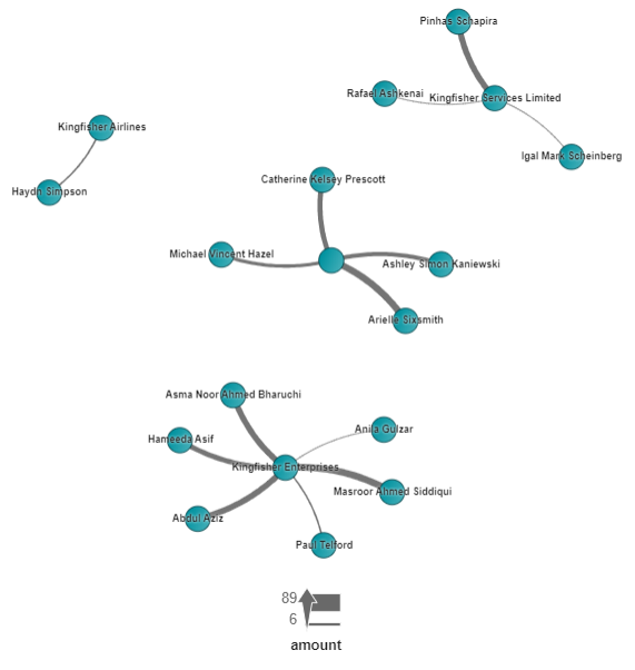
You may also consider using a network visualization instead. Given your 4x senders and amount sent to an address - it may render like this:
It doesn't do too well with dates/times but may still be useful to see overall relationship between senders/receivers.
Sankey diagrams are mostly used to visualize paths (hence you find this under path analysis in VA) - so it may not be as useful for visualizing a distinct list of unique transaction details.
Hope this helps. Regards, Falko
See how to use one filter for multiple data sources by mapping your data from SAS’ Alexandria McCall.
Find more tutorials on the SAS Users YouTube channel.


