- Home
- /
- SAS Viya
- /
- Visual Analytics
- /
- Period parameter bar chart displays wrong averages
- RSS Feed
- Mark Topic as New
- Mark Topic as Read
- Float this Topic for Current User
- Bookmark
- Subscribe
- Mute
- Printer Friendly Page
- Mark as New
- Bookmark
- Subscribe
- Mute
- RSS Feed
- Permalink
- Report Inappropriate Content
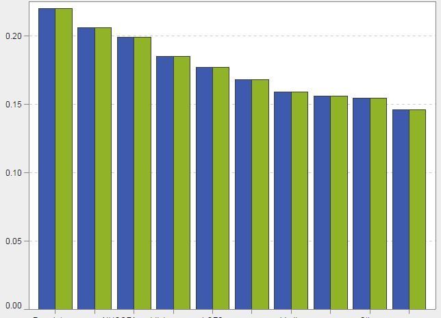
I have created a bar chart with period parameter drop down lists so the user can compare periods on the same graph (method followed: https://blogs.sas.com/content/sgf/2017/11/13/using-date-parameters-in-your-sas-visual-analytics-repo... )
I have used an average aggregate to tell me the average percentage for the selected period.
However, when I select a period from the drop down list my average values fall from around 20% which is the correct value, to less than 2% for any period I select.
The ratios of column height are correct but the average values are wrong, is there a format my data should be in to counteract any automatic formatting sas va does when calculating averages or is there a problem with my date parameters?


- Mark as New
- Bookmark
- Subscribe
- Mute
- RSS Feed
- Permalink
- Report Inappropriate Content
What did you specify to be the denominator of the percent calculation?
I would guess that when the selected date is supplied the counts(or sums) within the date are being divided by the count(or sum) of the entire dataset if this is happening for all of your dates (especially if your total number of dates is near 10).
I don't use VA so can't point to the exact menu item but maybe you can tell by going back through your settings.
- Mark as New
- Bookmark
- Subscribe
- Mute
- RSS Feed
- Permalink
- Report Inappropriate Content

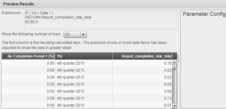
Av. completion period 1 is what I want to find, report completion rate is what i want to average for each quarter (YQ). The problem seems to be here as the values are showing 0 to 3sf for Av. completion period 1
- Mark as New
- Bookmark
- Subscribe
- Mute
- RSS Feed
- Permalink
- Report Inappropriate Content
Catch up on SAS Innovate 2026
Nearly 200 sessions are now available on demand with the SAS Innovate Digital Pass.
Explore Now →See how to use one filter for multiple data sources by mapping your data from SAS’ Alexandria McCall.
Find more tutorials on the SAS Users YouTube channel.


