- Home
- /
- SAS Viya
- /
- Visual Analytics
- /
- Re: Integer values instead of Decimals in Bar chart
- RSS Feed
- Mark Topic as New
- Mark Topic as Read
- Float this Topic for Current User
- Bookmark
- Subscribe
- Mute
- Printer Friendly Page

- Mark as New
- Bookmark
- Subscribe
- Mute
- RSS Feed
- Permalink
- Report Inappropriate Content
Hi,
I am using bar chart for representing the patients in SAS VA. In the data, I have only 1 patient. How ever, the values on the Y-axis have 0.1, 0.2, 0.3.. and so on till 1 which does not make sense for persons. I tried to change the options by setting the minimum and maximum value. But, does not look nice because we could not predict how many maximum patients are available in the future.So, any other options, how to represent the values as only positive integers.
Thanks.
Kind regards,
Ajay

- Mark as New
- Bookmark
- Subscribe
- Mute
- RSS Feed
- Permalink
- Report Inappropriate Content
Hello Ajay,
Thanks for your question!
Would it be possible for you to share some more information about your data and what you are trying to do? A screen capture of your bar chart might also help us to help you.
Thanks,
Sam
- Mark as New
- Bookmark
- Subscribe
- Mute
- RSS Feed
- Permalink
- Report Inappropriate Content
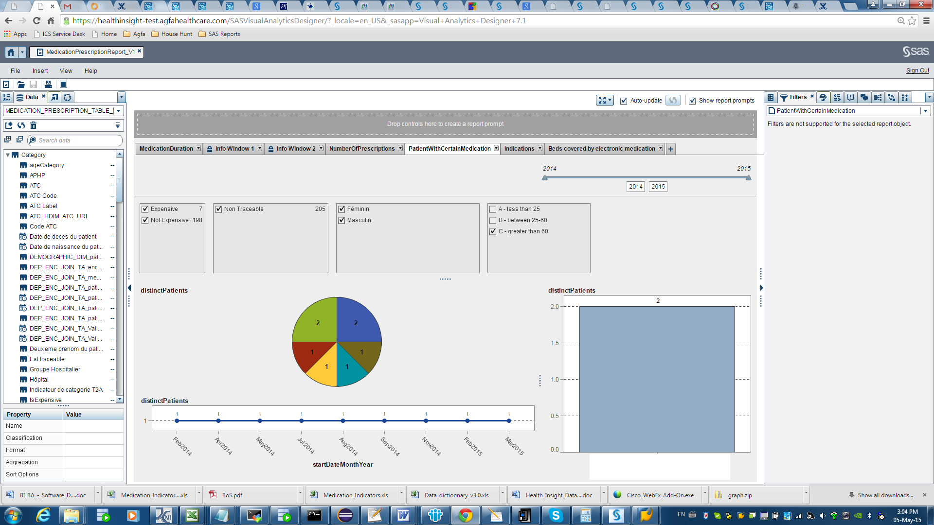
Hi Sam,
thank you for replying. Here is the screen shot of the chart I am trying to achieve.If you see the bar chart on the right bottom, I have values 0.0. 0.5...2. But, instead I want them to 1, 2 ..and so on. I am not sure how to achieve this. Since this is aggregated value, I could not change the aggregation.
Thanks.
Kind regards,
Ajay
- Mark as New
- Bookmark
- Subscribe
- Mute
- RSS Feed
- Permalink
- Report Inappropriate Content
Hi Ajay,
If I understand correctly, the issue that you want to address is the value labels of the tick marks on the Y axis, rather than the actual data values in your plot.
Because the values for your DistinctPatients measure are integers, the tick marks on that axis should also be integers. That makes sense to me, but I'm not sure how to accomplish it.
If it is any consolation to you, this issue should go away when you have 4 or more distinct patients.
My expertise is with the Explorer, so hopefully someone else can help.
Thanks,
Sam

- Mark as New
- Bookmark
- Subscribe
- Mute
- RSS Feed
- Permalink
- Report Inappropriate Content
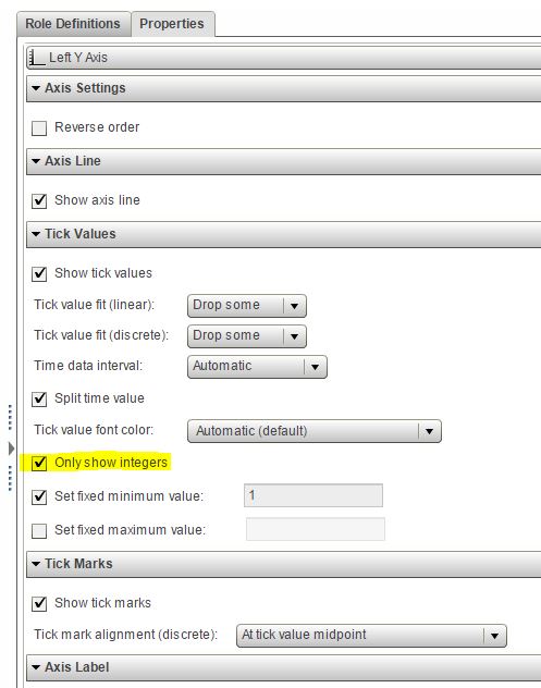
Hi,
I'm not sure if this solves the problem, but in the custom graph builder you have the possibility to choose "only show integers" in the properties for the Y-axis..So maybe you could try and build the bar-chart in the graph builder and see if it solves your problem?
Br,
Kia
- Mark as New
- Bookmark
- Subscribe
- Mute
- RSS Feed
- Permalink
- Report Inappropriate Content
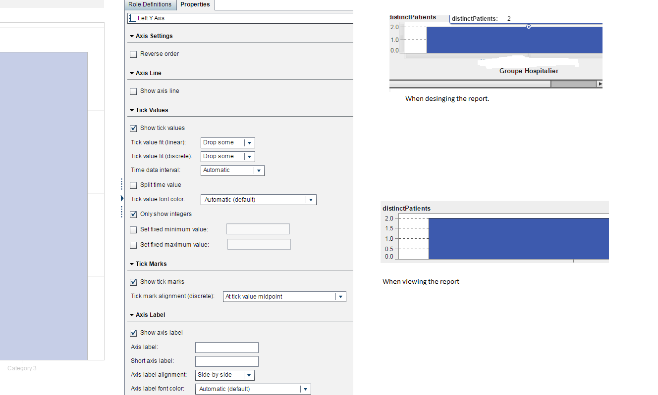
Hi,
unfortunately its not having the effect. I created a bar chat as mentioned but when viewing the report, I have 0.5, 1.5 values for patients ![]() . When designing the report it looks like when it take only integers. But when I view the report its again displaying the mid values as well.
. When designing the report it looks like when it take only integers. But when I view the report its again displaying the mid values as well.
Thanks.
Kind regards,
Ajay
.jpg")
Catch up on SAS Innovate 2026
Nearly 200 sessions are now available on demand in the Innovate Hub.
Watch Now →See how to use one filter for multiple data sources by mapping your data from SAS’ Alexandria McCall.

Find more tutorials on the SAS Users YouTube channel.
-
5 replies
-
05-04-2015 05:33 AM
-
5190 views
-
0 likes
-
3 in conversation
-
