- Home
- /
- SAS Viya
- /
- Visual Analytics
- /
- Creating graphs with 3 variables
- RSS Feed
- Mark Topic as New
- Mark Topic as Read
- Float this Topic for Current User
- Bookmark
- Subscribe
- Mute
- Printer Friendly Page
- Mark as New
- Bookmark
- Subscribe
- Mute
- RSS Feed
- Permalink
- Report Inappropriate Content
Hi everyone 😊
I have a dataset with three columns.
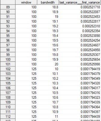
Here is an extract:
For a given line, the value for the third variable was obtained by fixing the first and second variables. The goal is to see how the third variable evolves for different combinations of the first and second variables.
I would like to make a graphic (3D or contour plot) where x= window, y=bandwidth and z=last_variance__first_variance, but I don't know how ... Could you please me ? 😅
Thank you in advance !
- Mark as New
- Bookmark
- Subscribe
- Mute
- RSS Feed
- Permalink
- Report Inappropriate Content
See examples here:
https://support.sas.com/sassamples/graphgallery/PROC_G3D.html
Link to code for each graphic is provided via a URL link in the page as well.
@_vichz wrote:
Hi everyone 😊
I have a dataset with three columns.
Here is an extract:
For a given line, the value for the third variable was obtained by fixing the first and second variables. The goal is to see how the third variable evolves for different combinations of the first and second variables.
I would like to make a graphic (3D or contour plot) where x= window, y=bandwidth and z=last_variance__first_variance, but I don't know how ... Could you please me ? 😅
Thank you in advance !
- Mark as New
- Bookmark
- Subscribe
- Mute
- RSS Feed
- Permalink
- Report Inappropriate Content
Thank you very much @Reeza !
- Mark as New
- Bookmark
- Subscribe
- Mute
- RSS Feed
- Permalink
- Report Inappropriate Content
Adding in this one as it's interesting 🙂
https://blogs.sas.com/content/graphicallyspeaking/2022/07/11/a-better-3d-scatter-plot-macro/
April 27 – 30 | Gaylord Texan | Grapevine, Texas
Registration is open
Walk in ready to learn. Walk out ready to deliver. This is the data and AI conference you can't afford to miss.
Register now and save with the early bird rate—just $795!
See how to use one filter for multiple data sources by mapping your data from SAS’ Alexandria McCall.
Find more tutorials on the SAS Users YouTube channel.


