- Home
- /
- Programming
- /
- Programming
- /
- Re: Simple way to label your boxplot?
- RSS Feed
- Mark Topic as New
- Mark Topic as Read
- Float this Topic for Current User
- Bookmark
- Subscribe
- Mute
- Printer Friendly Page
- Mark as New
- Bookmark
- Subscribe
- Mute
- RSS Feed
- Permalink
- Report Inappropriate Content
Hello,
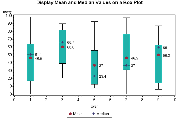
I would like a simple way to achieve the following boxplot chart with SAS:
I would like the mean, median, and max shown on the boxplot near the point on the graph. Please let me know if this is possible in a simple way.
Thanks in advance,
J Fuchsia
Accepted Solutions
- Mark as New
- Bookmark
- Subscribe
- Mute
- RSS Feed
- Permalink
- Report Inappropriate Content
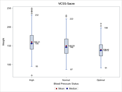
data have;
 set sashelp.heart(obs=1000);
run;


/***********箱型图***************/
%macro box_plot(dsn=,x=,y=,title=);
ods select none;
ods output sgplot=sgplot1;
proc sgplot data=&dsn.  ;
vbox &y./category=&x. ;
run;
ods select all;

%let dsid=%sysfunc(open(sgplot1));
%let first=%sysfunc(nliteral(%sysfunc(varname(&dsid,1))));
%let second=%sysfunc(nliteral(%sysfunc(varname(&dsid,2))));
%let third=%sysfunc(nliteral(%sysfunc(varname(&dsid,3))));
%let dsid=%sysfunc(close(&dsid));

data temp(rename=(&third.=&x. &first.=_y &second.=_stat));
 set sgplot1;
 _value=round(&first.,0.01);
 if not missing(&second.) and &second. in ('MIN' 'MAX' 'MEDIAN' 'MEAN' 'Q1' 'Q3');
 keep _value &first. &second. &third.;
run;
data want;
 set &dsn. temp;
 if _stat  in ( 'MEDIAN') then _value1=_value;
 if _stat  in ( 'MIN' 'MAX') then _value2=_value;
 if _stat  in ( 'MEAN' ) then _value3=_value;
run;
title  c=black  "&title.";
proc sgplot data=want noautolegend ;
vbox &y./category=&x. nomean boxwidth=0.1 ;
scatter x=&x. y=_y /discreteoffset=0.15  markerchar=_value1 labelstrip  markercharattrs=(size=8) ;
scatter x=&x. y=_y /discreteoffset=0.15  markerchar=_value2 labelstrip  markercharattrs=(size=8) ;
scatter x=&x. y=_y /discreteoffset=0.15  markerchar=_value3 labelstrip  markercharattrs=(size=8)  ;

scatter x=&x. y=_value3 /markerattrs=(color=darkred symbol=circlefilled) name='mean' legendlabel='Mean';
scatter x=&x. y=_value1 /markerattrs=(color=navy symbol=diamondfilled) name='median' legendlabel='Median';

yaxis integer;
keylegend 'mean' 'median'/AUTOITEMSIZE;
run;
title;
%mend;

%box_plot(dsn=have,x=bp_status,y=weight, title=VCSS-Socre)
- Mark as New
- Bookmark
- Subscribe
- Mute
- RSS Feed
- Permalink
- Report Inappropriate Content
Simple? I would say the answer is NO.
If you want to do some rather detailed programming ... but that's not simple, so I'll stop there.
Paige Miller
- Mark as New
- Bookmark
- Subscribe
- Mute
- RSS Feed
- Permalink
- Report Inappropriate Content
Thanks for your reply! Just wondering. I am up to the task. What do I need to do?
- Mark as New
- Bookmark
- Subscribe
- Mute
- RSS Feed
- Permalink
- Report Inappropriate Content
PROC SGplot with the SGANNO= option.
Simpler, but not exactly what you asked for is the VBOX option DISPLAYSTATS
Paige Miller
- Mark as New
- Bookmark
- Subscribe
- Mute
- RSS Feed
- Permalink
- Report Inappropriate Content
First you should start with which procedure you intend to use. There are at least 4 different procedures that will draw boxplots excluding some of the analysis procedures.
You also want to clarify which "MAX" you might mean. One of the options for some of the BOXPLOT syntax MAX is for the largest value below the box upper fence.
You may want to consider starting with something like this:
proc sgplot data=sashelp.class;
   vbox height /  category=sex displaystats=(mean median datamax )
   ;
run;
The values of the largest value, mean and median appear below the box with a marker for the Mean in the box and bar across the box for the location of the Median. The order of the DISPLAYSTATS will be in order in the option with the first appearing closest to the Xaxis and the others above.
- Mark as New
- Bookmark
- Subscribe
- Mute
- RSS Feed
- Permalink
- Report Inappropriate Content
Hello,
The "displaystats" procedure does not give me the same chart. I need the values to be right at the point on the boxplot not along the x axis. I am ready for a more detailed example if needed. Also, I definitely need MAX ("the largest value below the box upper fence") as defined below.
I am using a grouping variable (see below) so "displaystats " will not work, also I am willing to use whichever boxplot procedure is simpler to code. I have several plots to make and will want to reiterate the code.
proc sgplot data=sashelp.cars;
vbox MPG_City / category=type group=origin displaystats=(mean median max )
;
run;
Thank you so much!
- Mark as New
- Bookmark
- Subscribe
- Mute
- RSS Feed
- Permalink
- Report Inappropriate Content
data have;
 set sashelp.heart(obs=1000);
run;


/***********箱型图***************/
%macro box_plot(dsn=,x=,y=,title=);
ods select none;
ods output sgplot=sgplot1;
proc sgplot data=&dsn.  ;
vbox &y./category=&x. ;
run;
ods select all;

%let dsid=%sysfunc(open(sgplot1));
%let first=%sysfunc(nliteral(%sysfunc(varname(&dsid,1))));
%let second=%sysfunc(nliteral(%sysfunc(varname(&dsid,2))));
%let third=%sysfunc(nliteral(%sysfunc(varname(&dsid,3))));
%let dsid=%sysfunc(close(&dsid));

data temp(rename=(&third.=&x. &first.=_y &second.=_stat));
 set sgplot1;
 _value=round(&first.,0.01);
 if not missing(&second.) and &second. in ('MIN' 'MAX' 'MEDIAN' 'MEAN' 'Q1' 'Q3');
 keep _value &first. &second. &third.;
run;
data want;
 set &dsn. temp;
 if _stat  in ( 'MEDIAN') then _value1=_value;
 if _stat  in ( 'MIN' 'MAX') then _value2=_value;
 if _stat  in ( 'MEAN' ) then _value3=_value;
run;
title  c=black  "&title.";
proc sgplot data=want noautolegend ;
vbox &y./category=&x. nomean boxwidth=0.1 ;
scatter x=&x. y=_y /discreteoffset=0.15  markerchar=_value1 labelstrip  markercharattrs=(size=8) ;
scatter x=&x. y=_y /discreteoffset=0.15  markerchar=_value2 labelstrip  markercharattrs=(size=8) ;
scatter x=&x. y=_y /discreteoffset=0.15  markerchar=_value3 labelstrip  markercharattrs=(size=8)  ;

scatter x=&x. y=_value3 /markerattrs=(color=darkred symbol=circlefilled) name='mean' legendlabel='Mean';
scatter x=&x. y=_value1 /markerattrs=(color=navy symbol=diamondfilled) name='median' legendlabel='Median';

yaxis integer;
keylegend 'mean' 'median'/AUTOITEMSIZE;
run;
title;
%mend;

%box_plot(dsn=have,x=bp_status,y=weight, title=VCSS-Socre)
- Mark as New
- Bookmark
- Subscribe
- Mute
- RSS Feed
- Permalink
- Report Inappropriate Content
This is just what I need. But how do I make it work for data that is grouped (by year)?
Thanks!
- Mark as New
- Bookmark
- Subscribe
- Mute
- RSS Feed
- Permalink
- Report Inappropriate Content
Also, I would like to account for scale in my data.
Something like, "where 0 <= &y. <=500;" is not working correctly.
Thank you!!!
- Mark as New
- Bookmark
- Subscribe
- Mute
- RSS Feed
- Permalink
- Report Inappropriate Content
@JFuchsia wrote:
Also, I would like to account for scale in my data.
Something like, "where 0 <= &y. <=500;" is not working correctly.
Thank you!!!
"Not working correctly" is awful vague.
Are there errors in the log?: Post the code and log in a code box opened with the "<>" to maintain formatting of error messages.
No output? Post any log in a code box.
Unexpected output? Provide input data in the form of data step code pasted into a code box, the actual results and the expected results. Instructions here: https://communities.sas.com/t5/SAS-Communities-Library/How-to-create-a-data-step-version-of-your-dat... will show how to turn an existing SAS data set into data step code that can be pasted into a forum code box using the "</>" icon or attached as text to show exactly what you have and that we can test code against.
- Mark as New
- Bookmark
- Subscribe
- Mute
- RSS Feed
- Permalink
- Report Inappropriate Content
When I try to use the "Where 0 <= &y. <=500;" with the anywhere in the SGPLOT procedure statement then all of my annotation disappears on the subsequent plot.
When I try to use the grouping variable (year, in my case) I get the plot but without annotation, and the following statement in the log:
WARNING: Y=_Y is invalid. The option expects that the column not contain all missing values.
WARNING: Y=_Y is invalid. The option expects that the column not contain all missing values.
WARNING: Y=_Y is invalid. The option expects that the column not contain all missing values.
WARNING: Y=_VALUE3 is invalid. The option expects that the column not contain all missing values.
WARNING: Y=_VALUE1 is invalid. The option expects that the column not contain all missing values
- Mark as New
- Bookmark
- Subscribe
- Mute
- RSS Feed
- Permalink
- Report Inappropriate Content
I tweaked the previous scale statement in the current code to this :
yaxis integer values=(0 to 500 by 10);
and the scale is much better and I don't lose my plot labels (for mean, min, etc.)
however, how can I group the data by each year?
Thank you!!
- Mark as New
- Bookmark
- Subscribe
- Mute
- RSS Feed
- Permalink
- Report Inappropriate Content
Did you try adapting @Ksharp 's macro to supper grouped data?
I would think you would add the group to the initial SGPLOT which calculates the statistics. Not sure how the output from that step would change, but the general approach of use SGPLOT to calculate statistics, then combine the calculated statistics with your main data, then you SGPLOT again to generate the box plot and display the calculates statistics via SCATTER should work.
If you're doing this for the first time, you might want to do it in 'open code', i.e. outside of a macro definition. That should make it easier to develop and test. Then once the non-macro version is working, if you would benefit from having a general macro, you can write the macro as step 2.
Register now at https://www.basug.org/events.
- Mark as New
- Bookmark
- Subscribe
- Mute
- RSS Feed
- Permalink
- Report Inappropriate Content
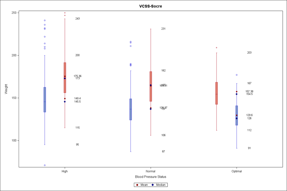
I did adapt the Macro, the only issue now is that the scatter plot portions are off since the data is now grouped as well as categorized.
The scatter plot of the stats data is all along one axis, it's correct but I need it to group along the bar that it belongs to within the group. A snapshot is coming.
- Mark as New
- Bookmark
- Subscribe
- Mute
- RSS Feed
- Permalink
- Report Inappropriate Content
So,
when I add group= sex, I get the following code:
data have;
 set sashelp.heart(obs=1000);
run;

%macro box_plot(dsn=,x=,y=,title=);
ods select none;
ods output sgplot=sgplot1;
proc sgplot data=&dsn.  ;
vbox &y./group=sex category=&x. ;
run;
ods select all;

%let dsid=%sysfunc(open(sgplot1));
%let first=%sysfunc(nliteral(%sysfunc(varname(&dsid,1))));
%let second=%sysfunc(nliteral(%sysfunc(varname(&dsid,2))));
%let third=%sysfunc(nliteral(%sysfunc(varname(&dsid,3))));
%let dsid=%sysfunc(close(&dsid));

data temp(rename=(&third.=&x. &first.=_y &second.=_stat));
 set sgplot1;
 _value=round(&first.,0.01);
 if not missing(&second.) and &second. in ('MIN' 'MAX' 'MEDIAN' 'MEAN' 'Q1' 'Q3');
 keep _value &first. &second. &third.;
run;
data want;
 set &dsn. temp;
 if _stat  in ( 'MEDIAN') then _value1=_value;
 if _stat  in ( 'MIN' 'MAX') then _value2=_value;
 if _stat  in ( 'MEAN' ) then _value3=_value;
run;
title  c=black  "&title.";
proc sgplot data=want noautolegend ;
vbox &y./group=sex category=&x. nomean boxwidth=0.1 ;
scatter x=&x. y=_y /discreteoffset=0.15  markerchar=_value1 labelstrip  markercharattrs=(size=8) ;
scatter x=&x. y=_y /discreteoffset=0.15  markerchar=_value2 labelstrip  markercharattrs=(size=8) ;
scatter x=&x. y=_y /discreteoffset=0.15  markerchar=_value3 labelstrip  markercharattrs=(size=8)  ;

scatter x=&x. y=_value3 /markerattrs=(color=darkred symbol=circlefilled) name='mean' legendlabel='Mean';
scatter x=&x. y=_value1 /markerattrs=(color=navy symbol=diamondfilled) name='median' legendlabel='Median';

yaxis integer;
keylegend 'mean' 'median'/AUTOITEMSIZE;
run;
title;
%mend;

%box_plot(dsn=have,x=bp_status,y=weight, title=VCSS-Socre)
The following plot results:
HOW can I fix the plot so that the numbers align appropriately. Sorry for the confusion.
Thanks!!! 🙂
Catch up on SAS Innovate 2026
Nearly 200 sessions are now available on demand with the SAS Innovate Digital Pass.
Explore Now →Learn how use the CAT functions in SAS to join values from multiple variables into a single value.
Find more tutorials on the SAS Users YouTube channel.
SAS Training: Just a Click Away
Ready to level-up your skills? Choose your own adventure.


