- Home
- /
- SAS Communities Library
- /
- Taking a Look at Central Park's Squirrels with SAS
- RSS Feed
- Mark as New
- Mark as Read
- Bookmark
- Subscribe
- Printer Friendly Page
- Report Inappropriate Content
Taking a Look at Central Park's Squirrels with SAS
- Article History
- RSS Feed
- Mark as New
- Mark as Read
- Bookmark
- Subscribe
- Printer Friendly Page
- Report Inappropriate Content
SAS programming concepts in this and other Free Data Friday articles remain useful, but SAS OnDemand for Academics has replaced SAS University Edition as a free e-learning option. Hit the orange button below to start your journey with SAS OnDemand for Academics:
You may be aware that there is currently a general election campaign underway in the UK. These tend to be quite lively affairs and one story in particular caught my attention recently. Jo Swinson, the leader of the Liberal Democrat Party, was the subject of a spoof article on a web site claiming that she was in the habit of shooting squirrels in her garden with a slingshot. Bizarrely this story gained traction on social media with so many people believing it to be true that she was forced to deny it in a radio interview.
At the same time I was noticing that in the local park where I regularly walk our dog the local squirrel population was booming. They seemed to be everywhere, usually being chased up trees by dogs who thankfully weren't fast enough to catch them! This led me to think about squirrels generally, and so I was intrigued to find that volunteers had carried out a squirrel census in New York's Central Park and published the data in New York's Open Data Portal. In this edition of Free Data Friday we will be taking a look at this data to examine the distribution of the squirrel population by its primary fur color.
Get the Data
You can download the data from the New York City Open Data portal as a CSV file and import it into SAS with the following PROC IMPORT code
filename sqfile
'/folders/myshortcuts/Dropbox/2018_Central_Park_Squirrel_Census_-_Squirrel_Data.csv';

proc import datafile=sqfile
	dbms=csv
	out=work.squirrels
	replace;
	getnames=yes;
	datarow=2;
	guessingrows=500;
run;
The data imports without any issues and has a large number of fields relating to fur color, behaviour, sound and location.
Get Started with SAS OnDemand for Academics
Getting the Data Ready
Normally, my go-to procedure for basic data analysis is PROC MEANS. However, given that nearly all of the fields in this file contain categorical variables I will be using a simple PROC FREQ to create counts and percentages of the squirrel population by primary fur color.
proc freq data=squirrels noprint;
	tables primary_fur_color / out=colorfreq;
run;
This gives me a file looking like this:
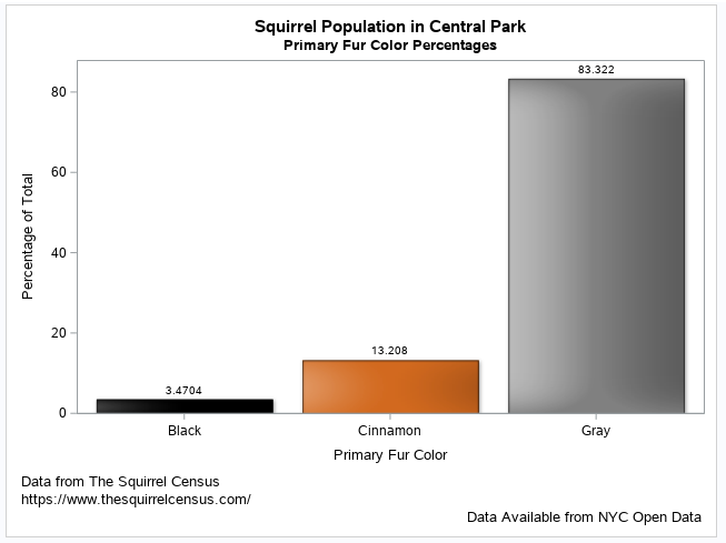
Gray squirrels are by far the most numerous, followed by cinnamon and then black squirrels. A little Google searching told me that cinnamon and black squirrels are not separate species from grey squirrels, but are carriers of recessive genes that alter their fur color. We will ignore the 55 records for which no color is recorded.
The Results
Firstly I decided to create a vertical bar chart of the data in the color frequency file. I wanted the color of the bars to match the fur color (gray for the grey category, cinnamon for the cinnamon category and black for the black category). In order to do that I created an attribute map data set. When I want to use specific colours I normally get the codes from this page on the cloford.com web site.
data getattrs;
	retain id 'Color';
	infile datalines dlm=",";
	length value $20 fillcolor $8;
	input value fillcolor;
	datalines;
Cinnamon,cxD2691E
Gray,cx808080
Black,cx000000
;
run;
Now that I have my attribute map here is the code for the bar chart along with the output:
ods graphics on;

title1 'Squirrel Population in Central Park';
title2 'Primary Fur Color Percentages';
footnote1 j=l 'Data from The Squirrel Census';
footnote2 j=l 'https://www.thesquirrelcensus.com/';
footnote3 j=r 'Data Available from NYC Open Data';

proc sgplot data=colorfreq dattrmap=getattrs noautolegend;
	vbar primary_fur_color / response=percent
	group=primary_fur_color
	groupdisplay=cluster
	dataskin=matte
	datalabel=percent
	attrid=color;
	yaxis label="Percentage of Total";
	xaxis label="Primary Fur Color";
run;
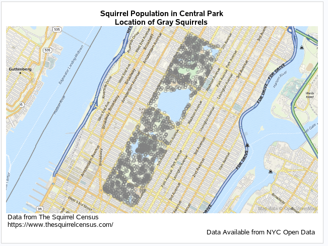
Following on from that, it seemed that the distribution of squirrels around such a large park might be interesting, so I used PROC SGMap to map the locations of the squirrels. Here is the code and map for grey squirrels:
ods graphics on;

title1 'Squirrel Population in Central Park';
title2 'Location of Gray Squirrels';
footnote1 j=l 'Data from The Squirrel Census';
footnote2 j=l 'https://www.thesquirrelcensus.com/';
footnote3 j=r 'Data Available from NYC Open Data';

proc sgmap plotdata=squirrels(where=(primary_fur_color="Gray")) noautolegend;
openstreetmap;
scatter x=x y=y /group=primary_fur_color markerattrs=(color=cx808080);
run;
We can see that grey squirrels are, not surprisingly, everywhere in the park! There are no discernible clusters.
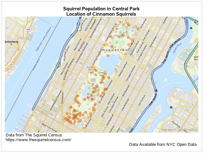
Here is the corresponding code and output for cinnamon colored squirrels:
title2 'Location of Cinnamon Squirrels';

proc sgmap plotdata=squirrels(where=(primary_fur_color="Cinnamon")) noautolegend;
openstreetmap;
scatter x=x y=y /group=primary_fur_color markerattrs=(color=cxD2691E);
run;
Firstly notice how I have only changed title2 - I want all the other headers and footers to be the same as the first map and they will carry forward on all the output until they are reset or changed. This map is more interesting as there is a definite trend for cinnamon squirrels to be seen more in the southern half of the park than the north with a concentration in the extreme southern area.
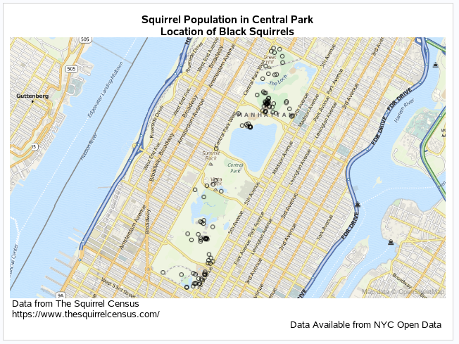
Finally here is the code and map for black squirrels:
title2 'Location of Black Squirrels';

proc sgmap plotdata=squirrels(where=(primary_fur_color="Black")) noautolegend;
openstreetmap;
scatter x=x y=y /group=primary_fur_color markerattrs=(color=cx000000);
run;
This is the most interesting map of all - there are two clusters of black squirrels; one in the extreme south east corner of the park and one in the north with only a small number in the central area. I can't say I'm familiar enough with Central Park to say for sure, but it might be interesting if a genetic test could be carried out on the black squirrel population to see if they form two separate communities or if they are related and have simply migrated to these clusters. If the latter is true, then why are there so few in the central part of the park?
Now it's your Turn!
Did you find something else interesting in this data? Share in the comments. I’m glad to answer any questions.
Visit [[this link]] to see all the Free Data Friday articles.
- Mark as Read
- Mark as New
- Bookmark
- Permalink
- Report Inappropriate Content
A friend of mine from California loves coming to Toronto to visit because we have black squirrels and apparently they do not live in California. I would be interested to see if there is a proportion difference of black versus grey squirrels by region - we do not have cinnamon coloured squirrels here (so far as I know), and we're not that far from NYC. Fascinating article @ChrisBrooks !
CBat 🙂
Catch up on SAS Innovate 2026
Dive into keynotes, announcements and breakthroughs on demand.
Explore Now →SAS AI and Machine Learning Courses
The rapid growth of AI technologies is driving an AI skills gap and demand for AI talent. Ready to grow your AI literacy? SAS offers free ways to get started for beginners, business leaders, and analytics professionals of all skill levels. Your future self will thank you.
- Find more articles tagged with:
- Data for learning
- Free Data Friday
