- Home
- /
- Programming
- /
- Graphics
- /
- graph bar
- RSS Feed
- Mark Topic as New
- Mark Topic as Read
- Float this Topic for Current User
- Bookmark
- Subscribe
- Mute
- Printer Friendly Page

- Mark as New
- Bookmark
- Subscribe
- Mute
- RSS Feed
- Permalink
- Report Inappropriate Content
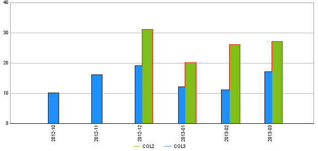
I want to use two different outline color for each bar from below code. i.e. want to use red outline for col2 bar and black outline color col3 bar
data temp1;
infile datalines4;
input COL1 : DATE9. COL2 COL3 ;
format col1 date9.;
datalines4;
06Dec2012 31 .
06Jan2013 20 .
06Feb2013 26 .
06Mar2013 27 .
01Oct2012 . 10
01Nov2012 . 16
01Dec2012 . 19
01Jan2013 . 12
01Feb2013 . 11
01Mar2013 . 17
;;;;
run;

- Mark as New
- Bookmark
- Subscribe
- Mute
- RSS Feed
- Permalink
- Report Inappropriate Content
Hi:
Although I think you can do what you want with SAS/GRAPH and annotate, I think that if you restructure your data a bit, that the SGPLOT procedure with an attribute map is a more straightforward way to change the line color and the fill color based on the "group" values (Col2/Col3).
Here's some code and a screen shot of the output in PDF. You did not say what your destination of choice was, so I picked PDF. This code seems much, much simpler and more direct to me.
Cynthia
data temp1;
infile datalines4;
input COL1 : DATE9. COL2 COL3 ;
format col1 date9.;
datalines4;
06Dec2012 31 .
06Jan2013 20 .
06Feb2013 26 .
06Mar2013 27 .
01Oct2012 . 10
01Nov2012 . 16
01Dec2012 . 19
01Jan2013 . 12
01Feb2013 . 11
01Mar2013 . 17
;;;;
run;
**restructure data for PROC SGPLOT;
data newbar(keep=date type val);
set temp1;
Date=col1;
type='Col2';
val = col2;
output;
type='Col3';
val=col3;
output;
format date date9.;
run;
ods listing;
proc print data=newbar;
title 'See new structure for data';
run;
title;
** create a dataset with the line color and fill color you want;
data myattrmap;
length linecolor $ 9 fillcolor $ 9;
input ID $ value $ linecolor $ fillcolor $;
datalines;
myid Col2 CXff0000 CX80BF1A
myid Col3 CX000000 CX1E90FF
;
run;
** create your output graph using the attribute map;
ods _all_ close;
ods pdf file='c:\temp\vbar.pdf';
proc sgplot data=newbar dattrmap=myattrmap;
title 'See Graph Created with SGPLOT and Restructured Data';
vbar date / group=type groupdisplay=cluster response=val stat=sum attrid=myid;
format date monyy5.;
run;
ods _all_ close;

- Mark as New
- Bookmark
- Subscribe
- Mute
- RSS Feed
- Permalink
- Report Inappropriate Content
getting attached error by using above code, i think proc sgplot dattrmap is not using in 9.2


- Mark as New
- Bookmark
- Subscribe
- Mute
- RSS Feed
- Permalink
- Report Inappropriate Content
One way would be to overlay the same 'needle' bars twice, the first time a little wider & taller than the 2nd time (and in the desired outline color). Here's some code that will do it...
data temp1; set temp1;
col3_background=col3+.1;
col2_background=col2+.1;
run;
symbol3 value=none interpol=needle width=21 color=black;
symbol4 value=none interpol=needle width=21 color=red;
proc gplot data=temp1 anno=anno1;
format COL1 yymmd9.;
format COL2 nlnum20.;
format COL3 nlnum20.;
label COL2 ='COL2';
label COL3 ='COL3';
plot
COL3_background*COL1=3
COL2_background*COL1=4
COL3*COL1=1
COL2*COL1=2
/ overlay autovref lautovref=1 wautovref=1 cautovref=CXB1B3B4
vaxis=axis1 haxis=axis2 legend=legend1 vzero frame;
run; quit;
.jpg")
Catch up on SAS Innovate 2026
Nearly 200 sessions are now available on demand in the Innovate Hub.
Watch Now →Learn how use the CAT functions in SAS to join values from multiple variables into a single value.

Find more tutorials on the SAS Users YouTube channel.
SAS Training: Just a Click Away
Ready to level-up your skills? Choose your own adventure.
-
3 replies
-
08-10-2014 02:48 AM
-
3032 views
-
0 likes
-
3 in conversation
-
