- Home
- /
- Programming
- /
- Graphics
- /
- Re: bar plot for last list of variables
- RSS Feed
- Mark Topic as New
- Mark Topic as Read
- Float this Topic for Current User
- Bookmark
- Subscribe
- Mute
- Printer Friendly Page
- Mark as New
- Bookmark
- Subscribe
- Mute
- RSS Feed
- Permalink
- Report Inappropriate Content
Hi,
this may seem like a really simple question but I just cannot get it to work! I have a very large list of variables (~100) with some respective variables (say x and y). I want to simply do a hbar or vbar plot of these but because of the large number of variables either the all the labels are not printed or I get an error message "the left vertical axis could be fit. There was not enough room in the graphs display area to fit the group axis."
I have tried making the font as small as possible, the bar width as small as possible etc but nothing seems to work. Any help would be greatly appreciated
Code:
proc sgplot data=t022;
hbarparm category=variable response=PCT_ADJ / discreteoffset=-0.17 barwidth=0.2;
hbarparm category=variable response=PCT_NA_ADJ / discreteoffset=0.17 barwidth=0.2;
yaxis valueattrs=(color=gray size=0.5pt) offsetmin=0.1 offsetmax=0.1;
run;
- Mark as New
- Bookmark
- Subscribe
- Mute
- RSS Feed
- Permalink
- Report Inappropriate Content
Do you mean observations? Can you show a representative example of your data and expected output.
- Mark as New
- Bookmark
- Subscribe
- Mute
- RSS Feed
- Permalink
- Report Inappropriate Content
sorry yes I meant observations.
example of what I am trying to plot:
PCT_ADJ
| Row Labels | x | |
| var 1 | 1.00 | 1.00 |
| var 2 | 1.00 | 1.00 |
| var 3 | 0.90 | 0.88 |
| var 4 | 0.90 | 0.88 |
| var 5 | 0.79 | 0.75 |
| var 6 | 0.79 | 0.75 |
| var 7 | 0.55 | 0.46 |
| var 8 | 0.55 | 0.46 |
| var 9 | 0.48 | 0.37 |
| var 10 | 0.41 | 0.28 |
| var 11 | 0.39 | 0.26 |
| var 12 | 0.38 | 0.25 |
| var 13 | 0.38 | 0.25 |
| var 14 | 0.38 | 0.25 |
| var 15 | 0.38 | 0.25 |
| var 16 | 0.37 | 0.24 |
- Mark as New
- Bookmark
- Subscribe
- Mute
- RSS Feed
- Permalink
- Report Inappropriate Content
- Mark as New
- Bookmark
- Subscribe
- Mute
- RSS Feed
- Permalink
- Report Inappropriate Content
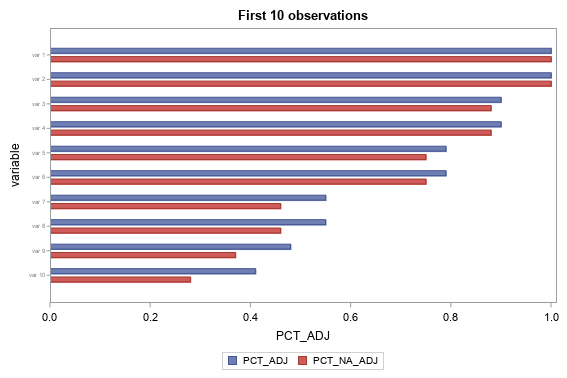
You could number the rows (observations) in your dataset, and then when you specify the data= in sgplot, you could specify which rows to plot. In the example below, I add a variable called 'obsnum' to do this.
data t022;
input variable $ 1-7 PCT_ADJ PCT_NA_ADJ;
datalines;
var 1 1.00 1.00
var 2 1.00 1.00
var 3 0.90 0.88
var 4 0.90 0.88
var 5 0.79 0.75
var 6 0.79 0.75
var 7 0.55 0.46
var 8 0.55 0.46
var 9 0.48 0.37
var 10 0.41 0.28
var 11 0.39 0.26
var 12 0.38 0.25
var 13 0.38 0.25
var 14 0.38 0.25
var 15 0.38 0.25
var 16 0.37 0.24
;
run;
data t022; set t022;
obsnum=_n_;
run;
title "First 1 observations";
proc sgplot data=t022 (where=(obsnum between 1 and 10));
hbarparm category=variable response=PCT_ADJ / discreteoffset=-0.17 barwidth=0.2;
hbarparm category=variable response=PCT_NA_ADJ / discreteoffset=0.17 barwidth=0.2;
yaxis valueattrs=(color=gray size=0.5pt) offsetmin=0.1 offsetmax=0.1;
run;
Learn how use the CAT functions in SAS to join values from multiple variables into a single value.
Find more tutorials on the SAS Users YouTube channel.
SAS Training: Just a Click Away
Ready to level-up your skills? Choose your own adventure.


