- Home
- /
- Programming
- /
- Graphics
- /
- Bubble Plot Legend
- RSS Feed
- Mark Topic as New
- Mark Topic as Read
- Float this Topic for Current User
- Bookmark
- Subscribe
- Mute
- Printer Friendly Page
- Mark as New
- Bookmark
- Subscribe
- Mute
- RSS Feed
- Permalink
- Report Inappropriate Content
Hello SAS Experts,
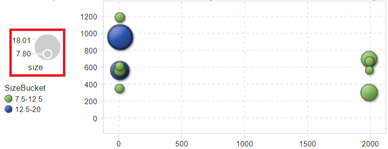
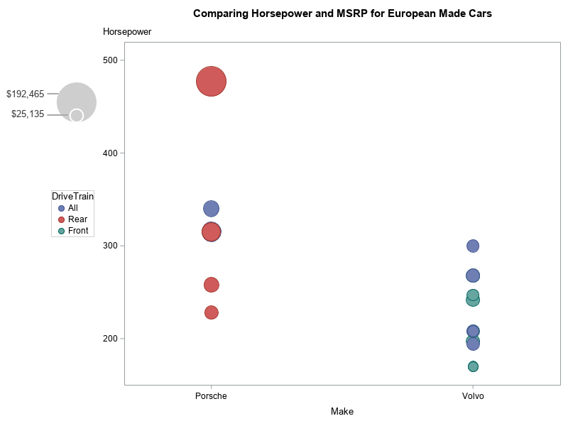
If someone can tell me how to have such a legend in the red square below (picture 2) in the bubble plot?
Size is a continuous variable, 7.80 and 18.01 are its minimum and maximum respectively. I created a new category variable named SizeBucket based on size.
Right now what I have is picture 1 and I would like to have a result like picture 2.
Thanks,
Relax
Accepted Solutions
- Mark as New
- Bookmark
- Subscribe
- Mute
- RSS Feed
- Permalink
- Report Inappropriate Content
Currently, I believe the only way to get a size legend with sgplot bubble is to annotate it, and unfortunately that takes a bit of code.
Here's an example, you might be able to re-use ...
data my_data; set sashelp.cars (where=(origin='Europe' and make in ('Porsche' 'Volvo')));
run;
proc sql noprint;
select min(msrp) format=dollar10.0 into :minmsrp separated by ' ' from my_data;
select max(msrp) format=dollar10.0 into :maxmsrp separated by ' ' from my_data;
quit; run;
data anno_bubble_legend;
length function x1space y1space display fillcolor linecolor textcolor anchor $50;
x1space='graphpercent'; y1space='graphpercent';
function='oval'; display='fill'; fillcolor='grayce';;
x1=13.5; y1=71.5; anchor='bottom';
height=45; width=45;
heightunit='pixel'; widthunit='pixel';
output;
function='oval'; display='outline'; linecolor='white';
x1=13.5; y1=71.5; anchor='bottom';
height=15; width=15;
heightunit='pixel'; widthunit='pixel';
output;
function='text'; anchor='right'; fillcolor=''; textcolor='gray33';
width=100; widthunit='percent';
x1=8.3; y1=78; label="&maxmsrp"; output;
x1=8.3; y1=73; label="&minmsrp"; output;
function='line'; linecolor='grayaa';
x1space='graphpercent'; y1space='graphpercent';
x2space='graphpercent'; y2space='graphpercent';
x1=8.3; y1=78; x2=x1+2; y2=y1; output;
x1=8.3; y1=73; x2=x1+3.7; y2=y1; output;
run;
title 'Comparing Horsepower and MSRP for European Made Cars';
ods graphics / width=800px height=600px noborder;
proc sgplot data=my_data pad=(left=15pct) sganno=anno_bubble_legend;
bubble x=make y=horsepower size=msrp / group=drivetrain;
xaxis offsetmin=.2 offsetmax=.2;
yaxis labelpos=top;
keylegend / position=left;
run;
- Mark as New
- Bookmark
- Subscribe
- Mute
- RSS Feed
- Permalink
- Report Inappropriate Content
- Mark as New
- Bookmark
- Subscribe
- Mute
- RSS Feed
- Permalink
- Report Inappropriate Content
The picture 2 was created using SAS VA, but I was trying to create a same plot in the SAS EG (picture 1):smileyhappy:
- Mark as New
- Bookmark
- Subscribe
- Mute
- RSS Feed
- Permalink
- Report Inappropriate Content
Currently, I believe the only way to get a size legend with sgplot bubble is to annotate it, and unfortunately that takes a bit of code.
Here's an example, you might be able to re-use ...
data my_data; set sashelp.cars (where=(origin='Europe' and make in ('Porsche' 'Volvo')));
run;
proc sql noprint;
select min(msrp) format=dollar10.0 into :minmsrp separated by ' ' from my_data;
select max(msrp) format=dollar10.0 into :maxmsrp separated by ' ' from my_data;
quit; run;
data anno_bubble_legend;
length function x1space y1space display fillcolor linecolor textcolor anchor $50;
x1space='graphpercent'; y1space='graphpercent';
function='oval'; display='fill'; fillcolor='grayce';;
x1=13.5; y1=71.5; anchor='bottom';
height=45; width=45;
heightunit='pixel'; widthunit='pixel';
output;
function='oval'; display='outline'; linecolor='white';
x1=13.5; y1=71.5; anchor='bottom';
height=15; width=15;
heightunit='pixel'; widthunit='pixel';
output;
function='text'; anchor='right'; fillcolor=''; textcolor='gray33';
width=100; widthunit='percent';
x1=8.3; y1=78; label="&maxmsrp"; output;
x1=8.3; y1=73; label="&minmsrp"; output;
function='line'; linecolor='grayaa';
x1space='graphpercent'; y1space='graphpercent';
x2space='graphpercent'; y2space='graphpercent';
x1=8.3; y1=78; x2=x1+2; y2=y1; output;
x1=8.3; y1=73; x2=x1+3.7; y2=y1; output;
run;
title 'Comparing Horsepower and MSRP for European Made Cars';
ods graphics / width=800px height=600px noborder;
proc sgplot data=my_data pad=(left=15pct) sganno=anno_bubble_legend;
bubble x=make y=horsepower size=msrp / group=drivetrain;
xaxis offsetmin=.2 offsetmax=.2;
yaxis labelpos=top;
keylegend / position=left;
run;
- Mark as New
- Bookmark
- Subscribe
- Mute
- RSS Feed
- Permalink
- Report Inappropriate Content
Awesome! Thanks a lot!
Catch up on SAS Innovate 2026
Dive into keynotes, announcements and breakthroughs on demand.
Explore Now →Learn how use the CAT functions in SAS to join values from multiple variables into a single value.
Find more tutorials on the SAS Users YouTube channel.
SAS Training: Just a Click Away
Ready to level-up your skills? Choose your own adventure.


