- Home
- /
- Programming
- /
- Graphics
- /
- Using proc gplot to display proportional symbols
- RSS Feed
- Mark Topic as New
- Mark Topic as Read
- Float this Topic for Current User
- Bookmark
- Subscribe
- Mute
- Printer Friendly Page
- Mark as New
- Bookmark
- Subscribe
- Mute
- RSS Feed
- Permalink
- Report Inappropriate Content
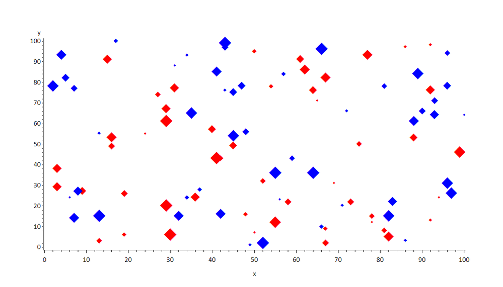
Here is the type of data and plot I am making. What I would like to do, is make the size of the plotting symbols (diamonds) proportional to variable ‘n’ in the dataset. In the real dataset there are about 100 rows.
If anyone could give me some assistance on this it would be greatly appreciated.
Data all;
Input os_2y op_percent treatment2 n;
Cards;
.70 .30 1 540
.85 1 2 42
.6 .55 1 95
;
Run;
proc sort data=all; by op_percent; run;
goptions reset=all htext=2;
axis1 width=3 offset=(5pct 5pct) label=('Operable Patients(%)') order=0 to 100 by 10;
axis2 width=3 label=(angle=90 'Overall Survival at 2 Years') order=0 to 1 by .1;
symbol1 value=diamondfilled height=3 color=red;
symbol2 value=diamondfilled height=3 color=blue;
symbol3 width=3 interpol=sm90 value=dot height=3 color=black;
*symbol3 width=3 interpol=RLCLM95 value=dot height=3 color=black;
proc gplot data=all;
plot os_2y*op_percent = treatment2 /haxis=axis1 vaxis=axis2 ;
*format treatment $trt.;
run;
- Mark as New
- Bookmark
- Subscribe
- Mute
- RSS Feed
- Permalink
- Report Inappropriate Content
hi ... here's one idea for creating symbols whose size varies by the level of a variable (N)
maybe you can adapt the idea to your data and plot
* fake data;
data test;
do i=1 to 100;
x = ceil(100*ranuni(999));
y = ceil(100*ranuni(999));
z = rantbl(999,.5);
n = ceil(1000*ranuni(999));
output;
end;
drop i;
run;
* put variable N into 10 groups;
proc rank data=test out=ranks groups=10;
var n;
ranks nr;
run;
* change variable Z to 1 through 10 within old Z=1 and 11 through 20 within old group Z=2;
data ranks;
set ranks;
z = (z-1)*10 + nr + 1;
run;
* write 20 symbol statements ... 10 red, 10 blue ... size starts at 1, increases to 5.5 within each color group;
filename sym temp;
data _null_;
array c(2) $4 _temporary_ ('red' 'blue');
file sym;
do i=1 to 2;
s = 0.5;
do j=1 to 10;
k = (i-1)*10 + j;
s + 0.5;
put "symbol" k "f='wingdings' v='75'x c=" c(i) "h=" s "pct;";
end;
end;
run;
goptions reset=all ftext='calibri' htext=2.5 gunit=pct;
* include the symbols;
%include sym / source2;
* white space;
title1 ls=2;
title2 a=90 ls=2;
title3 a=-90 ls=2;
* use new variable Z in the plots;
proc gplot data=ranks;
plot y*x=z / nolegend noframe;
run;
quit;

- Mark as New
- Bookmark
- Subscribe
- Mute
- RSS Feed
- Permalink
- Report Inappropriate Content
Here's another alternative. You could make the gplot markers really small/invisible points (or even value=none), and then annotate diamond font characters on top of them. This way, you wouldn't have to designate certain size "buckets" and map them to a set number of gplot symbols - the annotated diamonds could be continuously sized directly based on their numeric values:
data test;
do i=1 to 100;
x_var=ranuni(9207523);
y_var=ranuni(2835);
if ranuni(92305)<.5 then color_var=1;
else color_var=2;
size_var=ranuni(90237);
output;
end;
drop i;
run;
data my_anno; set test;
length function color $8;
xsys='2'; ysys='2'; hsys='3';
function='label'; style='albany amt/unicode'; text='2666'x;
x=x_var;
y=y_var;
size=2+size_var*8; /* you could tweak this as needed */
if color_var=1 then color='red';
else color='blue';
run;
symbol1 value=point color=blue;
proc gplot data=test anno=my_anno;
plot y_var*x_var=1;
run;
- Mark as New
- Bookmark
- Subscribe
- Mute
- RSS Feed
- Permalink
- Report Inappropriate Content
Hi ... I like Robert's idea more than mine since it does not require you to do much modification of your original SAS code. Annotate gives you a lot of control over the size of the plot symbols via the data step.
Catch up on SAS Innovate 2026
Nearly 200 sessions are now available on demand with the SAS Innovate Digital Pass.
Explore Now →Learn how use the CAT functions in SAS to join values from multiple variables into a single value.
Find more tutorials on the SAS Users YouTube channel.
SAS Training: Just a Click Away
Ready to level-up your skills? Choose your own adventure.


