- Home
- /
- Programming
- /
- Graphics
- /
- Re: Stacked bar chart with percentages
- RSS Feed
- Mark Topic as New
- Mark Topic as Read
- Float this Topic for Current User
- Bookmark
- Subscribe
- Mute
- Printer Friendly Page
- Mark as New
- Bookmark
- Subscribe
- Mute
- RSS Feed
- Permalink
- Report Inappropriate Content
Maybe I'm just having a bad Friday, but I'm struggling to make a stacked bar chart, and it feels like the kind of struggling that maybe I'm doing something dumb...
I have data with one record per person, with people from two states, and two years. For each person, I have a boolean
variable that indicates pass/fail. Data like:
data have ;
  input year state $2. Fail ;
  cards ;
2023 MA 1
2023 MA 1
2023 MA 0
2023 MA 0
2023 MA 0
2023 MA 0
2023 MA 0
2023 MA 0
2023 RI 1
2023 RI 0
2024 MA 1
2024 MA 1
2024 MA 1
2024 MA 1
2024 MA 0
2024 MA 0
2024 MA 0
2024 MA 0
2024 RI 1
2024 RI 1
;
run ;
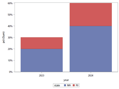
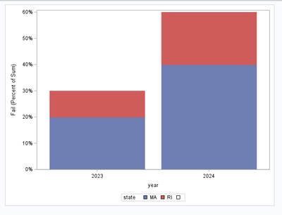
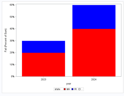
So there are 10 people in each year. My goal is to make a bar chart that shows that 30% failed in 2023 and 60% failed in 2024. I want it to be a stacked bar chart, with state as the group. It should show 30% failed in 2023 (20% MA, 10%RI) and 60%failed in 2024 (40% MA, 20%RI).
As I couldn't make the chart I want directly from this data (but would be happy if you can), I first thought I should calculate the percentages I want myself. Even that feels overly complex, because I need to get the sum of the failures for each state-year, and then divide that by the count of rows for the year. I can get what I want with SQL, but it feels like it should be easier...
proc sql ;
  create table want as
  select a.year,a.state,sum(fail)/n as pct
  from have as a
      ,(select year,n(fail) as n from have group by year) as b
  where a.year=b.year
  group by a.year,state
  ;
quit ;
That gives:
Obs    year    state    pct

 1     2023     MA      0.2
 2     2023     RI      0.1
 3     2024     MA      0.4
 4     2024     RI      0.2
Then to get my stacked bar chart:
proc sgplot data=want ;
  vbar  year/ response=pct group=state;
  format pct percent. ;
run;
Which gives me what I want:
Is there a better/easier way to do this?
The point is not to compare the failure rate for MA vs RI. I'm not calculating that percentage. The goal is to compare the failure rate by year. And in each year, see how many of those failures came from MA vs RI.
Accepted Solutions
- Mark as New
- Bookmark
- Subscribe
- Mute
- RSS Feed
- Permalink
- Report Inappropriate Content
Small update on "missing class" colour:
data have2;
  set have have(in=i drop=state);
  if i then Fail = NOT Fail;
run;

data MyAttrMap;
  ID='grpMiss';
  value=' '; /* missing group */
  fillcolor='Black';
  filltransparency=1;
  output;
run;

proc sgplot
  data=have2(where=(Fail))
  dattrmap=MyAttrMap
  PCTLEVEL=group
;
  vbar  year / group=state response=fail
    STAT=PERCENT
    GROUPORDER=DATA
    NOOUTLINE
    MISSING
    ATTRID=grpMiss
  ;
  yaxis max=0.6;
run;
Bart
Polish SAS Users Group: www.polsug.com and communities.sas.com/polsug
"SAS Packages: the way to share" at SGF2020 Proceedings (the latest version), GitHub Repository, and YouTube Video.
Hands-on-Workshop: "Share your code with SAS Packages"
"My First SAS Package: A How-To" at SGF2021 Proceedings
SAS Ballot Ideas: one: SPF in SAS, two, and three
SAS Documentation
- Mark as New
- Bookmark
- Subscribe
- Mute
- RSS Feed
- Permalink
- Report Inappropriate Content
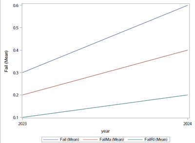
I usually stay away from stacked bar charts. Maybe the line chart version is easier to read(and make):
data want ;
  set have ;
  FailMa=(State='MA' and Fail) ;
  FailRI=(State='RI' and Fail) ;
run ;

proc sgplot data=want ;
  vline year /response=fail stat=mean ;
  vline year /response=failMA stat=mean ;
  vline year /response=failRI stat=mean ;
run ;
- Mark as New
- Bookmark
- Subscribe
- Mute
- RSS Feed
- Permalink
- Report Inappropriate Content
data have ;
  input year state $2. Fail ;
  cards ;
2023 MA 1
2023 MA 1
2023 MA 0
2023 MA 0
2023 MA 0
2023 MA 0
2023 MA 0
2023 MA 0
2023 RI 1
2023 RI 0
2024 MA 1
2024 MA 1
2024 MA 1
2024 MA 1
2024 MA 0
2024 MA 0
2024 MA 0
2024 MA 0
2024 RI 1
2024 RI 1
;
run ;

data have2;
  set have;
  state=".."; /* "extra" state to get 100% */
  Fail = NOT Fail;
run;

data have3;
  set have have2;
run;

ods graphics / reset attrpriority=color;
proc sgplot data=have3(where=(Fail)) PCTLEVEL=group ;
  styleattrs datacolors=(red blue white); /* last value white to hide in background */
  vbar  year / group=state
  RESPONSE=fail
  STAT=PERCENT
  GROUPORDER=DATA /* to keep "extra" group "on top" */
  NOOUTLINE;
  yaxis max=0.6; /* to scale (optionally)*/
run;
Polish SAS Users Group: www.polsug.com and communities.sas.com/polsug
"SAS Packages: the way to share" at SGF2020 Proceedings (the latest version), GitHub Repository, and YouTube Video.
Hands-on-Workshop: "Share your code with SAS Packages"
"My First SAS Package: A How-To" at SGF2021 Proceedings
SAS Ballot Ideas: one: SPF in SAS, two, and three
SAS Documentation
- Mark as New
- Bookmark
- Subscribe
- Mute
- RSS Feed
- Permalink
- Report Inappropriate Content
Small update on "missing class" colour:
data have2;
  set have have(in=i drop=state);
  if i then Fail = NOT Fail;
run;

data MyAttrMap;
  ID='grpMiss';
  value=' '; /* missing group */
  fillcolor='Black';
  filltransparency=1;
  output;
run;

proc sgplot
  data=have2(where=(Fail))
  dattrmap=MyAttrMap
  PCTLEVEL=group
;
  vbar  year / group=state response=fail
    STAT=PERCENT
    GROUPORDER=DATA
    NOOUTLINE
    MISSING
    ATTRID=grpMiss
  ;
  yaxis max=0.6;
run;
Bart
Polish SAS Users Group: www.polsug.com and communities.sas.com/polsug
"SAS Packages: the way to share" at SGF2020 Proceedings (the latest version), GitHub Repository, and YouTube Video.
Hands-on-Workshop: "Share your code with SAS Packages"
"My First SAS Package: A How-To" at SGF2021 Proceedings
SAS Ballot Ideas: one: SPF in SAS, two, and three
SAS Documentation
- Mark as New
- Bookmark
- Subscribe
- Mute
- RSS Feed
- Permalink
- Report Inappropriate Content
Very creative solution @yabwon , I would have never thought of adding fake data to let vbar calculate the percentage I want via percentage of sum. As Paul D. would say, thanks 1E6!
- Mark as New
- Bookmark
- Subscribe
- Mute
- RSS Feed
- Permalink
- Report Inappropriate Content
@Quentin wrote:
... I should calculate the percentages I want myself. Even that feels overly complex, ...
The percentages could also be calculated with PROC FREQ:
proc freq data=have noprint;
by year;
tables state*fail / out=want1(where=(fail));
run;
But then a format such as
proc format;
picture pctfmt low-high='009%';
run;
would be needed to get the percent signs into the tick mark labels. Also, the label of variable PERCENT ("Percent of Total Frequency") becomes the new default y-axis label.
- Mark as New
- Bookmark
- Subscribe
- Mute
- RSS Feed
- Permalink
- Report Inappropriate Content
Thanks @FreelanceReinh . I had mucked about with PROC TABULATE for a bit, but I'm trash at calculating percentages with PROC TABULATE. I never even thought to try PROC FREQ with a BY statement. Much better than my SQL step.
- Mark as New
- Bookmark
- Subscribe
- Mute
- RSS Feed
- Permalink
- Report Inappropriate Content
You could also make some small modifications to your proc sql step and then use VBARPARM:
proc sql ;
create table want as
select a.year,a.state,sum(fail)/n as pct "% failed" FORMAT=PERCENT8.
from have as a
,(select year,n(fail) as n from have group by year) as b
where a.year=b.year
group by a.year,state
;
quit ;
PROC SGPLOT DATA= WANT NOBORDER ;
styleattrs datacolors=(darkred darkblue) datacontrastcolors=(black) ;
vbarparm category= year response= pct / group= state seglabel seglabelattrs=(color=white weight=bold);
run ;
This gives you a stacked bar chart with each bar segment labelled with the percentage values from PROC SQL.
(Sorry- I'm new to the SAS community and not quite sure how to paste in the resulting graph.)
Learn how use the CAT functions in SAS to join values from multiple variables into a single value.
Find more tutorials on the SAS Users YouTube channel.
SAS Training: Just a Click Away
Ready to level-up your skills? Choose your own adventure.


