- Home
- /
- Programming
- /
- Graphics
- /
- Proc Gchart + Values dont Fit inside Stack Bar
- RSS Feed
- Mark Topic as New
- Mark Topic as Read
- Float this Topic for Current User
- Bookmark
- Subscribe
- Mute
- Printer Friendly Page
- Mark as New
- Bookmark
- Subscribe
- Mute
- RSS Feed
- Permalink
- Report Inappropriate Content
Hi Team,
i am working on creating Stacked Vertical Bar chart. and when my values are small they don't fit inside the bar. can you please help on this.
The code run good to this values:
data sold;
input city $ Sales Type$;
if type = 'customer' then color = '1';
else if type = 'employer' then color = '3';
else if type = 'manufact' then color = '2';
else color = '4';
datalines;
current 40 customer
previos 25 manufact
previos 10 customer
previos 5 employer
;
run;
In the below code employer values are not shown inside the bar. Also i would like to have the dollar values inside the midddle of the bar instead on the top.
Here is the code :
data sold;
input city $ Sales Type$;
if type = 'customer' then color = '1';
else if type = 'employer' then color = '3';
else if type = 'manufact' then color = '2';
else color = '4';
datalines;
current 20 customer
previos 12 manufact
previos 7 customer
previos 1 employer
;
run;
goptions reset = all border cback = white hsize=6in htitle =2.0 htext =5.0 imagestyle = vsize=3in;
goptions device=jpeg gsfname=out;
goptions xpixels=550 ypixels=650;
ods graphics on / width =2in;
ods graphics / height =20in;
ods listing close;
ods html path = 'mypath' body="test.htm" style =htmlblue gpath = '/mypath/test.jpg';
pattern1 v =solid color='#33ccff';
pattern2 v =solid color='#ff9900';
pattern3 v =solid color='#bfbfbf';
proc gchart data=sold;
vbar city/discrete sumvar=sales nozero group = city subgroup = color type = sum
width = 8 space =15 NOFRAME noaxis noloegend coutline = gray99 woutline =1 inside=sum;
format sales dollar8.
run;
quit;
ODS HTML CLOSE;
ODS LISTING;
Accepted Solutions
- Mark as New
- Bookmark
- Subscribe
- Mute
- RSS Feed
- Permalink
- Report Inappropriate Content
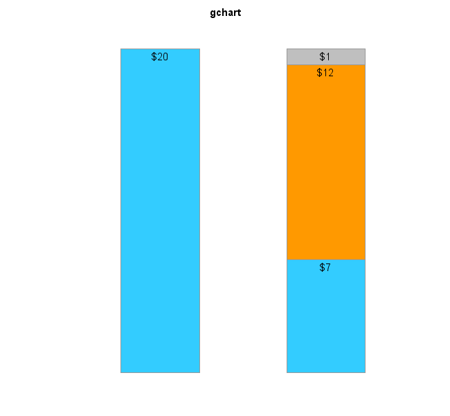
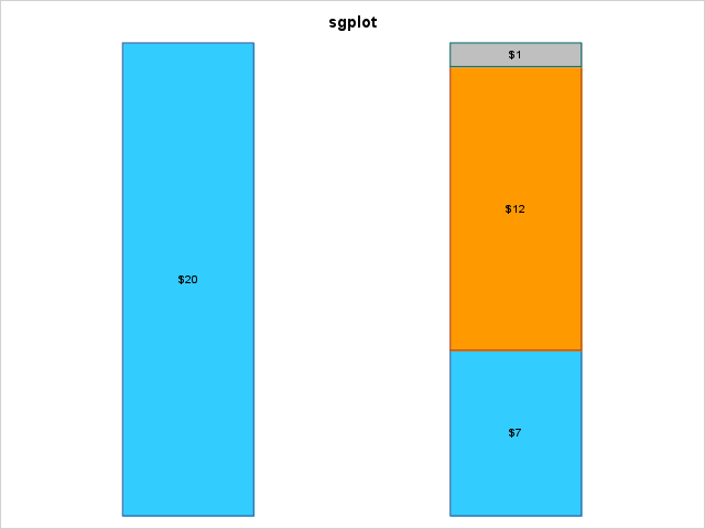
Here is the code I would recommend, in both Gchart and SGplot (and the output they produce):
data sold;
input city $ Sales Type$;
if type = 'customer' then color = '1';
else if type = 'employer' then color = '3';
else if type = 'manufact' then color = '2';
else color = '4';
datalines;
current 20 customer
previos 12 manufact
previos 7 customer
previos 1 employer
;
run;
goptions gunit=pct htext=11pt border xpixels=650 ypixels=600;
pattern1 v =solid color='#33ccff';
pattern2 v =solid color='#ff9900';
pattern3 v =solid color='#bfbfbf';
title ls=1.5 "gchart";
proc gchart data=sold;
vbar city / discrete sumvar=sales nozero group=city subgroup=color type=sum
width=20 space=20 NOFRAME noaxis nolegend coutline=gray99 woutline=1 inside=sum;
format sales dollar8.;
run;
title "sgplot";
proc sgplot data=sold noborder noautolegend;
styleattrs datacolors=('#33ccff' '#ff9900' '#bfbfbf');
vbar city / response=sales group=type seglabel groupdisplay=stack barwidth=0.4
grouporder=data baselineattrs=(thickness=0);
xaxis discreteorder=data;
xaxis display=(noline nolabel noticks novalues);
yaxis display=(noline nolabel noticks novalues);
format sales dollar8.;
run;
- Mark as New
- Bookmark
- Subscribe
- Mute
- RSS Feed
- Permalink
- Report Inappropriate Content
hi team,
i was able to get the vertical bar graphs using proc sgplot, now i have issue when the values are too small bar is shrinking, any suggestions please.
proc sgplot data=sold noborder;
styleattrs datacolors = ('#33ccff' '#ff9900' '#bfbfbf');
vbar city / response = sales group = type seglabel groupdisplay=stack barwidth=0.4
grouporder=data baselineattrs=(thickness=0);
x axis discreteorder = data;
xaxis display = (noline nolabel noticks novalues);
yaxis values = (0 to 100 by 10) display = (noline nolabel noticks novalues);
keylegend "mybar"/title="";
format sales dollar8.;
run.
Thanks,
Mahesh
- Mark as New
- Bookmark
- Subscribe
- Mute
- RSS Feed
- Permalink
- Report Inappropriate Content
In your 2nd code (the sgplot version), when you say "when the values are too small bar is shrinking" I assume you mean the stacked bars are shorter than the axis space(?) ...
If so, that is because you are forcing the yaxis to go from 0 to 100, even if the data values being plotted are not near 100 (as in your sample data, which the bar heights are approximately 20). It sounds like you would prefer the yaxis to auto-scale, so that it always 'fits' the data(?) If that's the case, leave out this on the yaxis definition "values = (0 to 100 by 10)".
- Mark as New
- Bookmark
- Subscribe
- Mute
- RSS Feed
- Permalink
- Report Inappropriate Content
Here is the code I would recommend, in both Gchart and SGplot (and the output they produce):
data sold;
input city $ Sales Type$;
if type = 'customer' then color = '1';
else if type = 'employer' then color = '3';
else if type = 'manufact' then color = '2';
else color = '4';
datalines;
current 20 customer
previos 12 manufact
previos 7 customer
previos 1 employer
;
run;
goptions gunit=pct htext=11pt border xpixels=650 ypixels=600;
pattern1 v =solid color='#33ccff';
pattern2 v =solid color='#ff9900';
pattern3 v =solid color='#bfbfbf';
title ls=1.5 "gchart";
proc gchart data=sold;
vbar city / discrete sumvar=sales nozero group=city subgroup=color type=sum
width=20 space=20 NOFRAME noaxis nolegend coutline=gray99 woutline=1 inside=sum;
format sales dollar8.;
run;
title "sgplot";
proc sgplot data=sold noborder noautolegend;
styleattrs datacolors=('#33ccff' '#ff9900' '#bfbfbf');
vbar city / response=sales group=type seglabel groupdisplay=stack barwidth=0.4
grouporder=data baselineattrs=(thickness=0);
xaxis discreteorder=data;
xaxis display=(noline nolabel noticks novalues);
yaxis display=(noline nolabel noticks novalues);
format sales dollar8.;
run;
- Mark as New
- Bookmark
- Subscribe
- Mute
- RSS Feed
- Permalink
- Report Inappropriate Content
Thank You. But there could be situation where the values could be less than dollar like .80 cents. in that situation the stacked bar doesnt show the values as they are really small. I used seglabelfitpolicy=noclip and that helps. Thanks for the reply.
proc sgplot data=sold noborder noautolegend;
styleattrs datacolors=('#33ccff' '#ff9900' '#bfbfbf');
vbar city / response=sales group=type seglabel groupdisplay=stack barwidth=0.3
grouporder=data baselineattrs=(thickness=0)seglabelfitpolicy=noclip seglabel seglabelattrs=(size=8);
xaxis discreteorder=data;
xaxis display=(noline nolabel noticks novalues);
yaxis display=(noline nolabel noticks novalues);
format sales dollar8.;
run;
Catch up on SAS Innovate 2026
Dive into keynotes, announcements and breakthroughs on demand.
Explore Now →Learn how use the CAT functions in SAS to join values from multiple variables into a single value.
Find more tutorials on the SAS Users YouTube channel.
SAS Training: Just a Click Away
Ready to level-up your skills? Choose your own adventure.


