- Home
- /
- Programming
- /
- Graphics
- /
- How to create nested bars within a bar in base SAS?
- RSS Feed
- Mark Topic as New
- Mark Topic as Read
- Float this Topic for Current User
- Bookmark
- Subscribe
- Mute
- Printer Friendly Page
- Mark as New
- Bookmark
- Subscribe
- Mute
- RSS Feed
- Permalink
- Report Inappropriate Content
Hi,
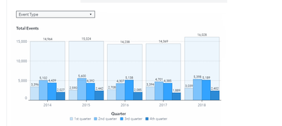
I would be grateful if anyone could show how to create the nested bar within a bar graph looks like below in base SAS 9.4 M7.
The input SAS data set can be used here
data retail; set sashelp.retail;
run;
Thanks,
Ethan
- Mark as New
- Bookmark
- Subscribe
- Mute
- RSS Feed
- Permalink
- Report Inappropriate Content
This is one basic approach:
proc sgplot data=sashelp.retail;
   where year < 1985;
   vbarbasic year/ response=sales barwidth=1 fillattrs=(color=verylightblue)
      datalabel
   ;
   vbarbasic year/ response= sales group= date groupdisplay=cluster clusterwidth=1
      datalabel;
   format date qtr.;
   label date= 'Quarter';
run;
Note the BARWIDTH for the non-grouped data and the CLUSTERWIDTH for the grouped data. These are ratios of the total space and I think from your example you want the values the same though if you use less than 1 there will be space between the years.
The VBARBASIC version is needed instead of VBAR to allow different group options between the plot statements.
- Mark as New
- Bookmark
- Subscribe
- Mute
- RSS Feed
- Permalink
- Report Inappropriate Content
Thanks so much for your help.
Below is my code based on your suggestion. It's not perfect. For instance, the edge of colors on nested bars doesn't match the colors of bars ifself. Also don't know how to customized legend to match the the example of graph.
I'm appreciative of any help you may provide.
Ethan
%let name=Nested_bars;
filename odsout '.';
ODS LISTING CLOSE;
ODS HTML path=odsout body="&name..htm"
 (title="&name.")
 style=htmlblue;
ods graphics /
 noscale /* if you don't use this option, the text will be resized */
 imagemap tipmax=2500
 imagefmt=png imagename="&name"
 width=800px height=600px noborder;

title1 h=13pt color=purple "Retail Sales";
proc sgplot data=sashelp.retail noborder;
   where year < 1985;
   styleattrs backcolor=white wallcolor=white datacolors=(cxe6eef7  cxc7e3ff cx89cbf2 cx1d94da cx377eb8 );
   vbarbasic year/ response=sales barwidth=0.95 fillattrs=(color=aliceblue) transparency=0.4
      datalabel DATALABELATTRS=(Color=grey55 Family="Arial" Size=8
        Style=normal Weight=Bold)
   ;
   vbarbasic year/ response= sales group= date BARWIDTH=0.85 transparency=0.4 groupdisplay=cluster clusterwidth=0.97
      datalabel DATALABELATTRS=(Color=black Family="Arial" Size=6
        Style=normal Weight=Bold);
	xaxis display=(noline  nolabel)

 valueattrs=(color=black size=8.0pt Weight=Bold)

 ;

		yaxis display=(noline noticks)

 labelattrs=(color=gray33 size=8pt Weight=Bold)
 labelpos=top
 values=(0 to 1600 by 400)
 valueattrs=(color=gray33 size=8pt Weight=Bold)

 offsetmin=0 offsetmax=0 ;
 refline  400  800 1200 1600 /axis=y lineattrs=(color=lightgray thickness=1.2 pattern=shortDash);
    *keylegend /   noborder position=bottom ;
   format date qtr.;
   label date= 'Quarter' ;
run;
quit;
ODS HTML CLOSE;
ODS LISTING;
- Mark as New
- Bookmark
- Subscribe
- Mute
- RSS Feed
- Permalink
- Report Inappropriate Content
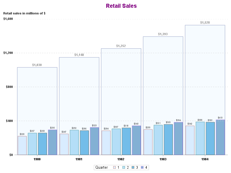
Here is the result.
- Mark as New
- Bookmark
- Subscribe
- Mute
- RSS Feed
- Permalink
- Report Inappropriate Content
Given the code you have, the best two options to fix your outlines are one of the following:
1. Duplicate the DATACOLORS colors in the DATACONTRASTCOLORS option. This will override the style line colors and set them to be the same as the fill colors.
2. Use OUTLINEATTRS=(color=black) on the VBARBASIC statement to set all of the outline colors to black. I think this is the better option to help the interior bars to stand out from the large bar.
Hope this helps!
Dan
- Mark as New
- Bookmark
- Subscribe
- Mute
- RSS Feed
- Permalink
- Report Inappropriate Content
Thank you so much again for all your help @DanH_sas.
I obtained the desired result based on your the 2nd suggestion.
Ethan
- Mark as New
- Bookmark
- Subscribe
- Mute
- RSS Feed
- Permalink
- Report Inappropriate Content
Hi:
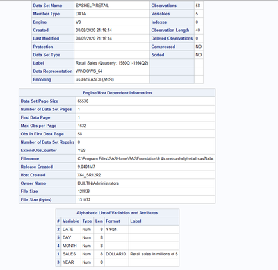
Did you do any other manipulations on SASHELP.RETAIL? The reason I ask is that I only see 58 total rows in the file, so I wonder what constitutes an event for the Y axis:
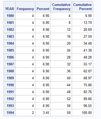
In addition, regarding your YEAR value, when I do a PROC FREQ on YEAR, I only see values from 1980-1994, as shown below:
So I wonder where the dates in your example came from.
A partial PROC PRINT shows the data to be like this:
Note that DATE is formatted with the YYQ4 format.
I'm just curious what code you tried or if you used sashelp.retail for your example of desired output.
Cynthia
- Mark as New
- Bookmark
- Subscribe
- Mute
- RSS Feed
- Permalink
- Report Inappropriate Content
Cynthia,
Thanks for the response.
The input SAS data set named "SASHELP.RETAIL" is not same as the data set used for building the graph in SAS Viya from the link below.
Catch up on SAS Innovate 2026
Nearly 200 sessions are now available on demand with the SAS Innovate Digital Pass.
Explore Now →Learn how use the CAT functions in SAS to join values from multiple variables into a single value.
Find more tutorials on the SAS Users YouTube channel.
SAS Training: Just a Click Away
Ready to level-up your skills? Choose your own adventure.


