- Home
- /
- Programming
- /
- Graphics
- /
- Define Color Ramp for Heatmapparm using Graph Template Language SAS
- RSS Feed
- Mark Topic as New
- Mark Topic as Read
- Float this Topic for Current User
- Bookmark
- Subscribe
- Mute
- Printer Friendly Page
- Mark as New
- Bookmark
- Subscribe
- Mute
- RSS Feed
- Permalink
- Report Inappropriate Content
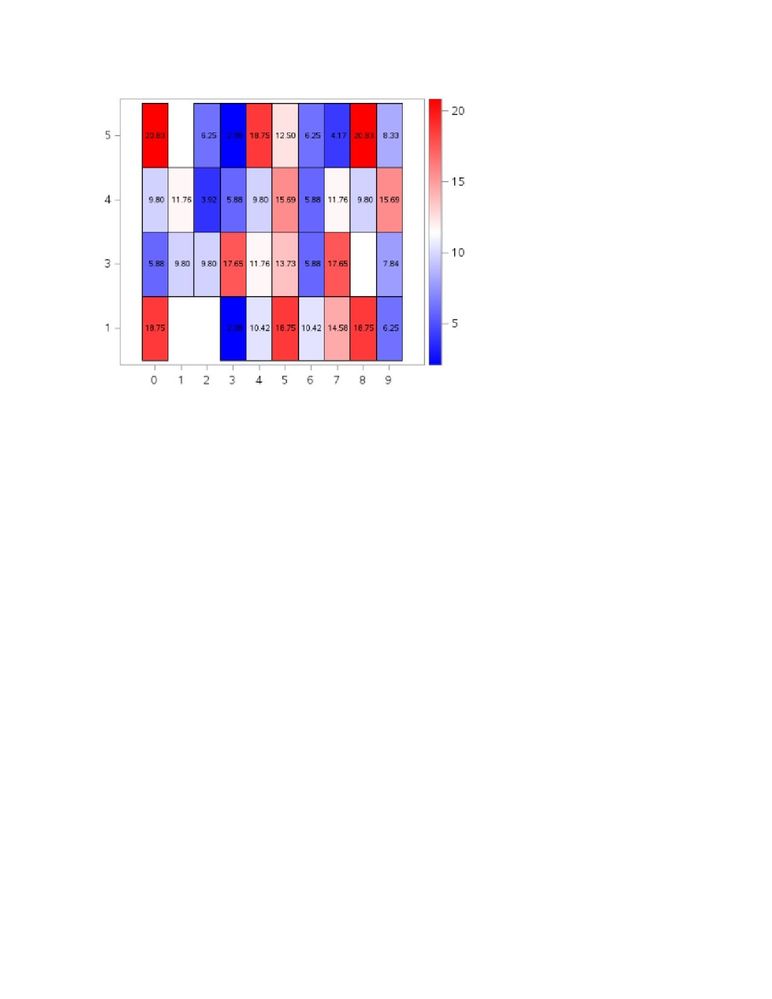
I want to change the color ramp of my heatmap plot. I make a heatmap plot using a graphical template language. My response variable is in percentage form. So, I want to make the colormodel represent the value between 0 to 100 percent, blue color for low percentage (0% to 10%), white color for 10% to 20%, and red color for more than 20%. But my response variable (colorresponse) is range between 0 to around 20 percent, which caused different output from what I want. The color range follow the response variable's range (0 to 20%). Here is the code I've tried.
proc template;
define statgraph training;
begingraph /DESIGNHEIGHT=550px DESIGNWIDTH=650px;
entrytitle 'Heatmap of Digit Check';
layout overlay /yaxisopts=(label="Date" tickvalueattrs=(size=8pt)) xaxisopts=(label="Last Digit" tickvalueattrs=(size=8pt));
heatmapparm y=day x=ld colorresponse=percent / display=all name='percent' colormodel=(blue white red);
scatterplot x=sbp_ld y=day /markercharacter=percent markercharacterattrs=(size=8);
continuouslegend 'percent';
endlayout;
endgraph;
end;
run;
proc sgrender data=digit_check template=training;
run;
Here is the result.
Could anyone help me on this? Thank you for any help you can offer.
Regards,
Mifta
Accepted Solutions
- Mark as New
- Bookmark
- Subscribe
- Mute
- RSS Feed
- Permalink
- Report Inappropriate Content
- Mark as New
- Bookmark
- Subscribe
- Mute
- RSS Feed
- Permalink
- Report Inappropriate Content
- Mark as New
- Bookmark
- Subscribe
- Mute
- RSS Feed
- Permalink
- Report Inappropriate Content
proc template;
define statgraph training;
begingraph/DESIGNHEIGHT=500px DESIGNWIDTH=550px;
rangeattrmap name="ResponseRange";
range MIN - 10 / rangeColorModel=(blue lightblue);
range 10 < - 20 / rangeColorModel=(lightblue white lightred);
range 20 < - MAX / rangeColorModel=(lightred red);
endrangeattrmap;
rangeattrvar var=percent /* specify response variable in data set */
attrmap="ResponseRange" /* specify custom color ramp */
attrvar=RangeVar; /* alias for this variable/ramp combination */
entrytitle "Heat Map";
layout overlay /yaxisopts=(label="Employee" tickvalueattrs=(size=8pt)) xaxisopts=(label="Last Digit" tickvalueattrs=(size=8pt));
heatmapparm y=employee x=last_digit colorresponse=RangeVar / display=all name='percent';
scatterplot x=last_digit y=employee /markercharacter=percent markercharacterattrs=(size=6.5);
continuouslegend 'percent' / title='Percentage';
endlayout;
endgraph;
end;
run;
Regards,
Mifta
Catch up on SAS Innovate 2026
Dive into keynotes, announcements and breakthroughs on demand.
Explore Now →Learn how use the CAT functions in SAS to join values from multiple variables into a single value.
Find more tutorials on the SAS Users YouTube channel.
SAS Training: Just a Click Away
Ready to level-up your skills? Choose your own adventure.


