- Home
- /
- Programming
- /
- Graphics
- /
- GTL Continuouslegend for scattterplot with markercolorgradient
- RSS Feed
- Mark Topic as New
- Mark Topic as Read
- Float this Topic for Current User
- Bookmark
- Subscribe
- Mute
- Printer Friendly Page
- Mark as New
- Bookmark
- Subscribe
- Mute
- RSS Feed
- Permalink
- Report Inappropriate Content
Hi,
I'm struggling with a quite simple issue.
As an example I'm using:
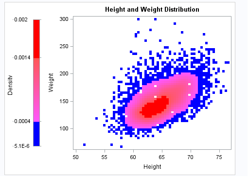
What I want to achieve is to move continuouslegend to the left side and also title and values to left side of the legend.
Final image should look like this:
Accepted Solutions
- Mark as New
- Bookmark
- Subscribe
- Mute
- RSS Feed
- Permalink
- Report Inappropriate Content
Try some combination of a LAYOUT LATTICE and a SIDEBAR. This isn't perfect, but maybe it will give you some ideas to pursue:
proc template;
define statgraph attrmap;
  begingraph;
    entrytitle "Height and Weight Distribution" ;

    /* Define the attribute map and assign the name "densityrange." */
    rangeattrmap name="densityrange" ;
      range MIN - 0.0004     / rangealtcolor=blue ;
      range 0.0004 < - 0.0014 / rangealtcolormodel=(lightpurple lightred) ;
      range 0.0014 < - 0.002  / rangealtcolor=red ;
    endrangeattrmap ;

    /* Associate the attribute map with input data column Density and
       assign variable name RANGEVAR to the named association */
    rangeattrvar attrvar=rangevar var=density attrmap="densityrange" ;

    /* Reference RANGEVAR in the SCATTTERPLOT statement */
    layout lattice / columns=2 columnweights=(0.1 0.9);
       sidebar / align=left;
           entry halign=left "Density" / rotate=90 ;
       endsidebar;
      continuouslegend "scatter" / orient=vertical
        halign=left title="";
      scatterplot x=height y=weight / markercolorgradient=rangevar
        markerattrs=(symbol=squarefilled size=6px) name="scatter";
    endlayout;
  endgraph;
end;

ods graphics / reset width=475px;
proc sgrender data=sashelp.gridded(where=(count>0)) template=attrmap;
run;- Mark as New
- Bookmark
- Subscribe
- Mute
- RSS Feed
- Permalink
- Report Inappropriate Content
Bump
- Mark as New
- Bookmark
- Subscribe
- Mute
- RSS Feed
- Permalink
- Report Inappropriate Content
Try some combination of a LAYOUT LATTICE and a SIDEBAR. This isn't perfect, but maybe it will give you some ideas to pursue:
proc template;
define statgraph attrmap;
  begingraph;
    entrytitle "Height and Weight Distribution" ;

    /* Define the attribute map and assign the name "densityrange." */
    rangeattrmap name="densityrange" ;
      range MIN - 0.0004     / rangealtcolor=blue ;
      range 0.0004 < - 0.0014 / rangealtcolormodel=(lightpurple lightred) ;
      range 0.0014 < - 0.002  / rangealtcolor=red ;
    endrangeattrmap ;

    /* Associate the attribute map with input data column Density and
       assign variable name RANGEVAR to the named association */
    rangeattrvar attrvar=rangevar var=density attrmap="densityrange" ;

    /* Reference RANGEVAR in the SCATTTERPLOT statement */
    layout lattice / columns=2 columnweights=(0.1 0.9);
       sidebar / align=left;
           entry halign=left "Density" / rotate=90 ;
       endsidebar;
      continuouslegend "scatter" / orient=vertical
        halign=left title="";
      scatterplot x=height y=weight / markercolorgradient=rangevar
        markerattrs=(symbol=squarefilled size=6px) name="scatter";
    endlayout;
  endgraph;
end;

ods graphics / reset width=475px;
proc sgrender data=sashelp.gridded(where=(count>0)) template=attrmap;
run;Catch up on SAS Innovate 2026
Dive into keynotes, announcements and breakthroughs on demand.
Explore Now →Learn how use the CAT functions in SAS to join values from multiple variables into a single value.
Find more tutorials on the SAS Users YouTube channel.
SAS Training: Just a Click Away
Ready to level-up your skills? Choose your own adventure.


