- Home
- /
- Programming
- /
- Graphics
- /
- How to get Grouped (not Stacked or overlapped) Histograms from PROC SG...
- RSS Feed
- Mark Topic as New
- Mark Topic as Read
- Float this Topic for Current User
- Bookmark
- Subscribe
- Mute
- Printer Friendly Page
- Mark as New
- Bookmark
- Subscribe
- Mute
- RSS Feed
- Permalink
- Report Inappropriate Content
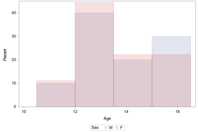
proc sgplot data=sashelp.class;
    histogram age/group=sex transparency=0.8;
run;
produces this plot
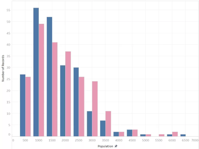
but I want the blue and red bars grouped instead of overlapped, such as this example found on the Internet:
How can I get this from PROC SGPLOT?
Paige Miller
- Mark as New
- Bookmark
- Subscribe
- Mute
- RSS Feed
- Permalink
- Report Inappropriate Content
Use a VBAR instead of a HISTOGRAM:
proc sgplot data=sashelp.class;
    vbar age / group=sex groupdisplay=cluster;
run;
Hope this helps!
Dan
- Mark as New
- Bookmark
- Subscribe
- Mute
- RSS Feed
- Permalink
- Report Inappropriate Content
Sorry, @DanH_sas , VBAR doesn't work since it produces percentages that do not add up to 100 in each group, as HISTOGRAM does (and like the G100 option of PROC GCHART). So VBAR does not produce the plot I want.
Paige Miller
- Mark as New
- Bookmark
- Subscribe
- Mute
- RSS Feed
- Permalink
- Report Inappropriate Content
Sorry, I did not know you needed that. You just need to add two options to the previous code:
proc sgplot data=sashelp.class pctlevel=group;
    vbar age / group=sex groupdisplay=cluster stat=pct;
run;
Thanks!
Dan
- Mark as New
- Bookmark
- Subscribe
- Mute
- RSS Feed
- Permalink
- Report Inappropriate Content
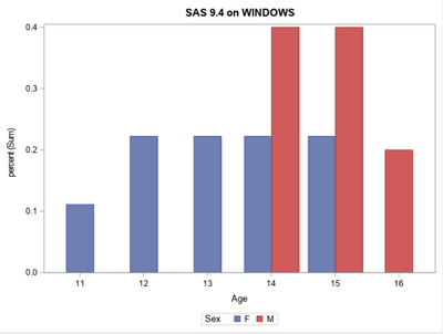
Nope, those percentages don't add to 100 in each group (100% for males and 100% for females).
If I exclude some data to exaggerate the differences and make the problem more visible, you can see that the red bars don't add to 100% and the blue bars don't either.
data class;
	set sashelp.class;
	if sex='M' and age<14 then delete;
run;
proc sgplot data=class;
    vbar age/group=sex groupdisplay=cluster stat=pct;
run;
Paige Miller
- Mark as New
- Bookmark
- Subscribe
- Mute
- RSS Feed
- Permalink
- Report Inappropriate Content
Perhaps you just need to generate the percentages yourself and then plot them?
proc summary data=class ;
  class sex age ;
  output out=stats ;
run;
data summary;
  merge
        stats(where=(_type_ in (2)) rename=(_freq_=bign))
        stats(where=(_type_ in (3)) rename=(_freq_=littlen))
  ;
  by sex ;
  percent=littlen/bign;
run;
proc sgplot data=summary;
  vbar age/group=sex groupdisplay=cluster responce=percent stat=sum;
run;- Mark as New
- Bookmark
- Subscribe
- Mute
- RSS Feed
- Permalink
- Report Inappropriate Content
@PaigeMiller wrote:
Nope, those percentages don't add to 100 in each group (100% for males and 100% for females).
If I exclude some data to exaggerate the differences and make the problem more visible, you can see that the red bars don't add to 100% and the blue bars don't either.
data class;
	set sashelp.class;
	if sex='M' and age<14 then delete;
run;
proc sgplot data=class;
    vbar age/group=sex groupdisplay=cluster stat=pct;
run;
Then you would need to pre-summarize the data to get the percentage of age and sex.
proc tabulate data=sashelp.class out=work.summary;
   class age sex;
   table age,
         sex*colpctn
         ;
run;

proc sgplot data=work.summary;
   vbar age/response=pctn_01 group=sex groupdisplay=cluster
   ;
   label pctn_01='Percent';
run;
- Mark as New
- Bookmark
- Subscribe
- Mute
- RSS Feed
- Permalink
- Report Inappropriate Content
- Mark as New
- Bookmark
- Subscribe
- Mute
- RSS Feed
- Permalink
- Report Inappropriate Content
@PaigeMiller wrote:
Thanks, I guessed that was the case, but I was hoping there was some option in SGPLOT I was missing.
Going back to GCHART in SAS 6 I was always fighting with the procedure options for percentages and just gave up and always did my summary. At least then when something looked off I knew who to blame...![]()
Learn how use the CAT functions in SAS to join values from multiple variables into a single value.
Find more tutorials on the SAS Users YouTube channel.
SAS Training: Just a Click Away
Ready to level-up your skills? Choose your own adventure.


