- Home
- /
- Programming
- /
- Graphics
- /
- Fun With SAS ODS Graphics: 5-4-3-2-1 AP Exam Scores!
- RSS Feed
- Mark Topic as New
- Mark Topic as Read
- Float this Topic for Current User
- Bookmark
- Subscribe
- Mute
- Printer Friendly Page
- Mark as New
- Bookmark
- Subscribe
- Mute
- RSS Feed
- Permalink
- Report Inappropriate Content
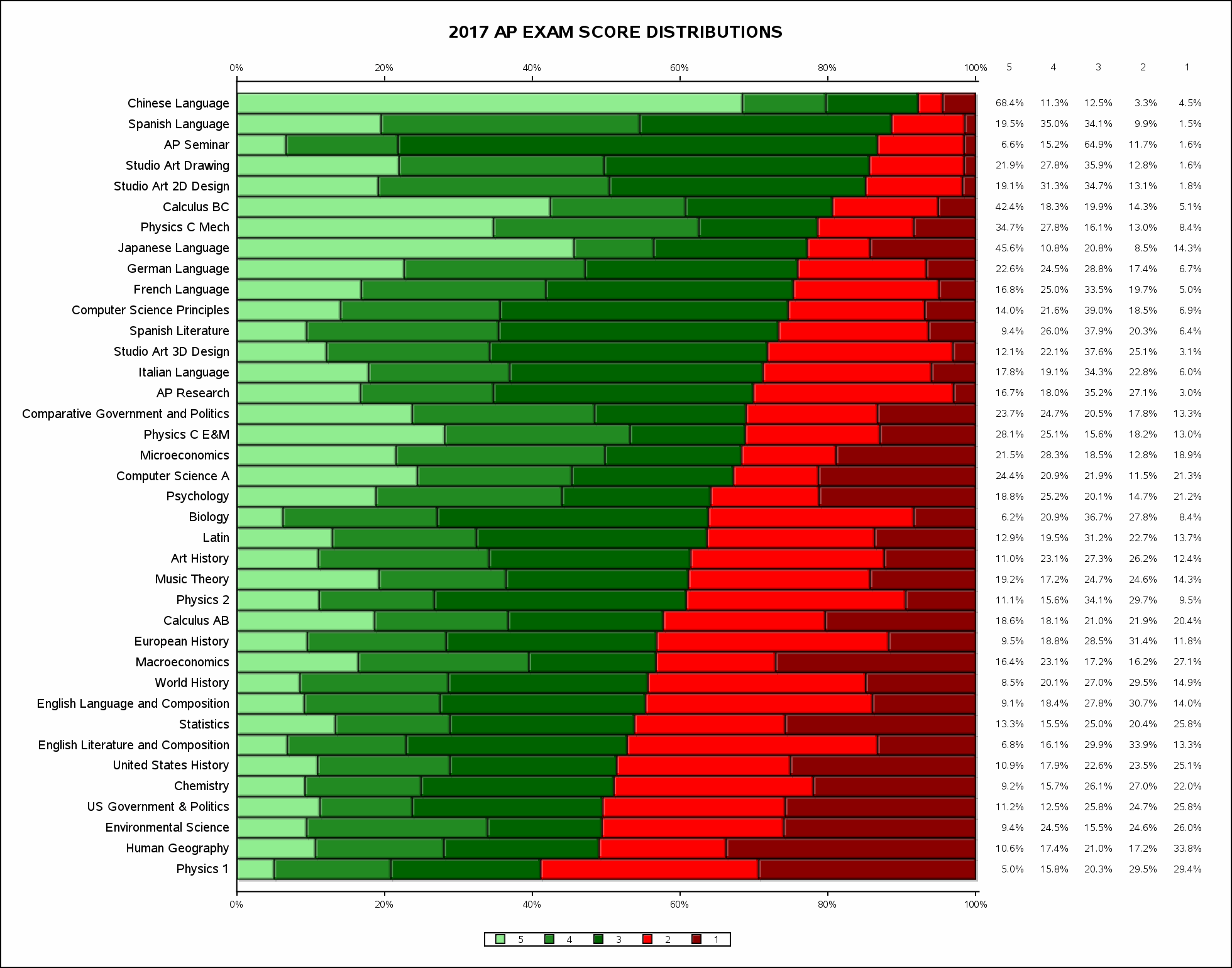
SAS OUTPUT (CLICK TO VIEW LARGER IMAGE)
Was wondering what might be a good way to plot the just-released 2017 AP Exam Score Distributions posted by Total Registration, when I stumbled across Robert Allison's fine How to 'stack the deck' for a better graph! Eureka!
SAS CODE
*-> Fun w/SAS ODS Graphics: 5-4-3-2-1 AP Exam Scores! (2017 AP exam score distributions by subject)
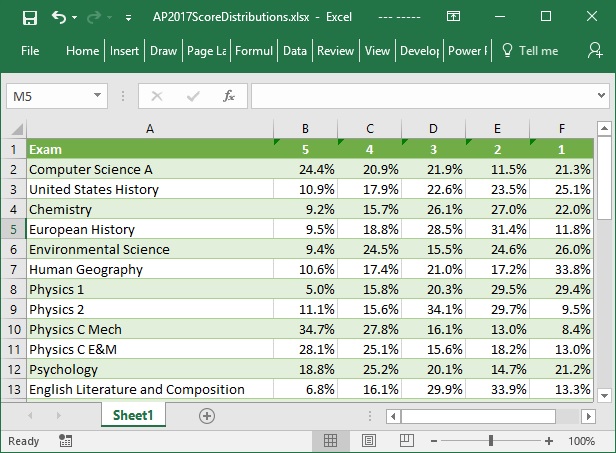
    Data from totalregistration.net/AP-Exam-Registration-Service/2017-AP-Exam-Score-Distributions.php (1 row per exam);

proc import datafile='/folders/myfolders/AP2017ScoreDistributions.xlsx' dbms=xlsx out=APscores replace;

                                                      /* Transform to 1 row per exam/score */
proc transpose data=APscores out=APscores2(rename=(_label_=Score col1=Pct));
by exam notsorted;

proc sql;                                             /* Calculate pass rate (pass=3/4/5) */
create table APscores3 as
select t1.*, t2.pctpass
from APscores2 t1
join (select exam, sum(pct) as pctpass from APscores2
      where score between '3' and '5' group by 1) t2 on t1.exam=t2.exam
order by pctpass, exam;                               /* Subjects displayed in hi->lo pass % order */

data ScoresAttrMap;                                   /* Use attribute map to assign colors */
retain id "scoresID";                                 /* Greens=Pass (5/4/3), Reds=Fail (2/1) */
input value : $1. fillcolor : $15.@@;
cards;
5 LIGHTGREEN 4 FORESTGREEN 3 DARKGREEN 2 RED 1 DARKRED
;                                                     /* Plot score distributions */
ods listing image_dpi=140 gpath='/folders/myfolders';
ods graphics on / reset antialias width=14in height=11in imagename="2017APSCORES" imagefmt=gif;
proc sgplot data=APscores3 dattrmap=ScoresAttrMap noborder;
title bold "2017 AP EXAM SCORE DISTRIBUTIONS";
xaxis valueattrs=(size=6pt) display=(nolabel) refticks=(values);
yaxis valueattrs=(size=8pt) display=(nolabel noline noticks) discreteorder=data reverse;
hbar exam / response=pct group=score datalabel=pct barwidth=1
            attrid=scoresID dataskin=crisp name="scores" grouporder=descending;
yaxistable pct / labelattrs=(size=7pt) valueattrs=(size=7pt) titleattrs=(size=7pt);
keylegend "scores" / position=bottom valueattrs=(size=7pt);
INPUT DATA SCREENSHOT (cut-and-pasted from totalregistration.net)
Accepted Solutions
- Mark as New
- Bookmark
- Subscribe
- Mute
- RSS Feed
- Permalink
- Report Inappropriate Content
Very nice, TC. If you have SAS 9.40M3, you can make the color swatches of the legend bigger. See FILLHEIGHT, FILLASPECT or AUTOITEMSIZE in KEYLEGEND statement.
Also, I wonder how the visual would look if you were to center the boundry between "Pass" and "Fail".
Sort of like the 3rd graph in this article: http://blogs.sas.com/content/graphicallyspeaking/2014/10/30/likert-graphs/
- Mark as New
- Bookmark
- Subscribe
- Mute
- RSS Feed
- Permalink
- Report Inappropriate Content
Thanks for this @tc. I shared with my daughter, who took 4 of these exams this past May (Stat, Psych, Eng Lit, and Music Theory). She hasn't yet received her scores, but she certainly hopes to be "in the green" for all of them!
Catch up on SAS Innovate 2026
Dive into keynotes, announcements and breakthroughs on demand.
Explore Now →Learn how use the CAT functions in SAS to join values from multiple variables into a single value.
Find more tutorials on the SAS Users YouTube channel.
SAS Training: Just a Click Away
Ready to level-up your skills? Choose your own adventure.


