- Home
- /
- Programming
- /
- Graphics
- /
- Bar plot with overlaying scatterpoints - sgrender?
- RSS Feed
- Mark Topic as New
- Mark Topic as Read
- Float this Topic for Current User
- Bookmark
- Subscribe
- Mute
- Printer Friendly Page
- Mark as New
- Bookmark
- Subscribe
- Mute
- RSS Feed
- Permalink
- Report Inappropriate Content
Hi,
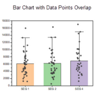
I want to do a graphic like this one:
for a grouped bar chart.
Can anyone help me, with a code example?
The following code is working for a grouped bar chart but without scatterpoints.
Its example data, so there are no point values, but an example with random numbers would help me.
Thanks in advance 🙂
proc format;
   value xvarf
     1 = 'Week 1'
     2 = 'Week 2'
     3 = 'Week 4'
     4 = 'Week 6'
     5 = 'Week 8'
     6 = 'End Point';
   value groupf
     1 = 'Placebo'
     2 = 'Drug A'
     3 = 'Drug B';
run;

data eyeIrritation;
   attrib param length=$100 label='PARAMETER';
   attrib percent length=8 label='Percentage';
   attrib time length=3 format=XVARF.;
   attrib chartvar length=3 label='Treatment group:' format=GROUPF.;
   attrib lcl length=8 label='Lower confidential limit';
   attrib ucl length=8 label='Upper confidential limit';
   attrib n length=8 label='Number of subjects';
   infile datalines dsd;
   input param percent time chartvar lcl ucl n ;
   datalines4;
EYES ITCHY/GRITTY,40,1,1,25.6864468502627,54.3135531497372,45
EYES ITCHY/GRITTY,60.8695652173913,1,2,49.3541134082639,72.3850170265186,69
EYES ITCHY/GRITTY,52.0547945205479,1,3,40.5946624842483,63.5149265568476,73
EYES ITCHY/GRITTY,55.5555555555555,2,1,41.0373038182218,70.0738072928893,45
EYES ITCHY/GRITTY,68.6567164179104,2,2,57.549008527785,79.7644243080359,67
EYES ITCHY/GRITTY,52.7777777777777,2,3,41.2464158522305,64.309139703325,72
EYES ITCHY/GRITTY,54.5454545454545,3,1,39.8328454913776,69.2580635995314,44
EYES ITCHY/GRITTY,65.625,3,2,53.9887212682038,77.2612787317961,64
EYES ITCHY/GRITTY,63.3802816901408,3,3,52.1742073602962,74.5863560199855,71
EYES ITCHY/GRITTY,72.0930232558139,4,1,58.6864780295777,85.4995684820501,43
EYES ITCHY/GRITTY,65.5737704918032,4,2,53.6505663007898,77.4969746828166,61
EYES ITCHY/GRITTY,64.6153846153846,4,3,52.9910897128346,76.2396795179345,65
EYES ITCHY/GRITTY,64.2857142857143,5,1,49.7946038219732,78.7768247494554,42
EYES ITCHY/GRITTY,75,5,2,63.6589121767657,86.3410878232342,56
EYES ITCHY/GRITTY,58.7301587301587,5,3,46.5732039054999,70.8871135548175,63
EYES ITCHY/GRITTY,62.2222222222222,6,1,48.0566932486829,76.3877511957615,45
EYES ITCHY/GRITTY,69.5652173913043,6,2,58.7083453077565,80.4220894748521,69
EYES ITCHY/GRITTY,57.5342465753424,6,3,46.1953891907295,68.8731039599554,73
;;;;

title;
proc template;
   define style styles.blue;
      parent = styles.default;
      class GraphColors
         "Abstract colors used in graph styles" /
         'gdata'  = cxaFb3cF
         'gdata3' = cx8CaEdF
         'gdata2' = cx5A96DE
         'gdata1' = cx42659C;
      style color_list from color_list
         "Abstract colors used in graph styles" /
         'bgA'   = cxe0e7e7;
   end;
run;

proc template;
  define statgraph EyeIrritation;
    begingraph / datacolors=(CX87CEFA CX6495ED CXE0FFFF	 CXC4DA5A CX404040 );
    entrytitle 'Distribution of Eye Irritation (Redness)';
    entryfootnote halign=left 'X Axis shows the number of subjects by treatment for each week';
    layout gridded / border=false;
      layout datalattice columnvar=time / headerlabeldisplay=value cellwidthmin=50
             columnheaders=bottom border=false columndatarange=union
             columnaxisopts=(display=(line tickvalues))
             rowaxisopts=(offsetmin=0 linearopts=(viewmax=100 tickvaluepriority=true)
             label='% Subjects' griddisplay=on);
        layout prototype / walldisplay=(fill);
          barchart x=n y=percent / group=chartvar name='a' barlabel=true skin=modern
                                   outlineattrs=(color=black);
          scatterplot x=n y=percent / yerrorlower=lcl yerrorupper=ucl markerattrs=(size=0)
                                      errorbarattrs=(thickness=1) datatransparency=0.6;
        endlayout;
      endlayout;
      entry ' ';
      discretelegend 'a' / title='Treatment Group: '  border=true ;
    endlayout;
  endgraph;
end;
run;

ods listing close;
ods html style=styles.blue image_dpi=100 file='EyeIrritation.html' path='.';
ods graphics / reset noborder width=600px height=400px
               imagename='EyeIrritation' imagefmt=gif noscale;

proc sgrender data=eyeIrritation template=EyeIrritation;
   format percent 5.1;
run;

ods html close;
ods listing;
- Mark as New
- Bookmark
- Subscribe
- Mute
- RSS Feed
- Permalink
- Report Inappropriate Content
Is it a requirement to use Proc Template / SgRender?
- Mark as New
- Bookmark
- Subscribe
- Mute
- RSS Feed
- Permalink
- Report Inappropriate Content
- Mark as New
- Bookmark
- Subscribe
- Mute
- RSS Feed
- Permalink
- Report Inappropriate Content
- Mark as New
- Bookmark
- Subscribe
- Mute
- RSS Feed
- Permalink
- Report Inappropriate Content
The key here is that your data is pre-summarized. To get a "raw" data plot against the summarized chart, you will need to merge the raw data set with the summarized data. Then, you can just add an additional SCATTERPLOT in your GTL to reference the raw X/Y columns.
Catch up on SAS Innovate 2026
Dive into keynotes, announcements and breakthroughs on demand.
Explore Now →Learn how use the CAT functions in SAS to join values from multiple variables into a single value.
Find more tutorials on the SAS Users YouTube channel.
SAS Training: Just a Click Away
Ready to level-up your skills? Choose your own adventure.


