- Home
- /
- Programming
- /
- Graphics
- /
- Appearance of percentage on pie chart (annotate)
- RSS Feed
- Mark Topic as New
- Mark Topic as Read
- Float this Topic for Current User
- Bookmark
- Subscribe
- Mute
- Printer Friendly Page
- Mark as New
- Bookmark
- Subscribe
- Mute
- RSS Feed
- Permalink
- Report Inappropriate Content
We have to produce a number of pie charts where we show the value inside the slices and the percentages outside. The values are in the European notation so with a comma for separating the decimals and periods for separating the…. whatever you call them in English 😉
Now, the percentages created by proc gchart are in the standard format with the period separating the decimals. Up until now we got away with that because they were
clearly percentages and did not confuse any readers. The periods and commas are very small so nobody noticed the difference. However, in some cases proc gchart suddenly decides to show 3 decimals in the percentages instead of 2. For instance, it will show 23.136% on the outside and 536.822 on the inside of a slice. This is confusing for the readers and is thus unacceptable.
Apparently there is no way to set the format for percentages on a pie chart. Yes, you can create a dataset where the percentages become data themselves and show that in a pie chart. But then you can’t show the original values in that same pie. So that is not an option.
The only other idea I can think of is the annotate option… and I hate annotate. It always makes me swear and scream at the screen because it never does what I want. And the documentation on annotate is horrible.
So before heading down that path: is there any other way to influence the format of the percentages? If not, is there a clear example of adding percentages to a pie chart with annotate? I noticed that you can’t use coordinate systems 1, 2, 7 and 8 on pie charts, and that would probably make it hard to achieve.
- Mark as New
- Bookmark
- Subscribe
- Mute
- RSS Feed
- Permalink
- Report Inappropriate Content
Yes - you can do this in gchart, without annotate ...
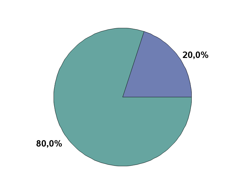
You'll want to pre-summarize the data, and have the actual percent values in the dataset you plot (rather than letting gchart calculate the % values for you), and then use the value=outside option to have the labels print with the % values. You'll want to use one of the 'nl' (nls) formats for your percent values, and then set the locale option to one of the countries that print percent values with the comma like you want.
Here's some example code, and the pie it produces:
data foo;
my_slice=1; my_value=.2; output;
my_slice=2; my_value=.8; output;
run;
options locale=french_france;
proc gchart data=foo;
format my_value nlpctn7.1;
pie my_slice / noheading type=sum sumvar=my_value value=outside slice=none;
run;

- Mark as New
- Bookmark
- Subscribe
- Mute
- RSS Feed
- Permalink
- Report Inappropriate Content
No, I can't. As I explained in my original posting, we have to be able to show both the percentage and the original value. This turns the percentage into that value and that is exactly what we don't want.
- Mark as New
- Bookmark
- Subscribe
- Mute
- RSS Feed
- Permalink
- Report Inappropriate Content
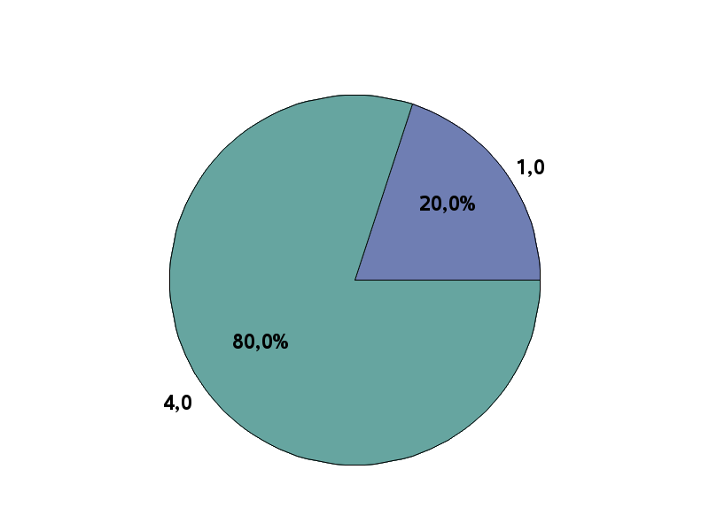
To show both the values, you could create 1 pie for the values, and one pie for the percents, and then overlay them with greplay ...
data foo;
my_slice=1; my_pct=.2; my_value=1; output;
my_slice=2; my_pct=.8; my_value=4; output;
run;
goptions ftext="albany amt/bold" htext=4pct;
options locale=french_france;
proc gchart data=foo;
format my_pct nlpctn7.1 my_value nlnum7.1;
pie my_slice / radius=35 noheading type=sum sumvar=my_pct value=inside slice=none name='pie1';
pie my_slice / radius=35 noheading type=sum sumvar=my_value value=outside slice=none name='pie2';
run;
proc greplay nofs tc=sashelp.templt template=whole igout=work.gseg;
treplay 1:pie2 1:pie1;
run;

- Mark as New
- Bookmark
- Subscribe
- Mute
- RSS Feed
- Permalink
- Report Inappropriate Content
Now that is a brilliant idea! Thank you very much. You saved me a lot of work.
- Mark as New
- Bookmark
- Subscribe
- Mute
- RSS Feed
- Permalink
- Report Inappropriate Content
You could also move to Graph Template Language. Has a fair bit more customization. For instance you could run a pie chart of the percentages, and have the values passed in as dynamic values to apply to labels. Here is an example (programs at end of the post):
http://blogs.sas.com/content/graphicallyspeaking/2012/03/26/let-them-eat-pie/
- Mark as New
- Bookmark
- Subscribe
- Mute
- RSS Feed
- Permalink
- Report Inappropriate Content
D*MN! Yes, the idea of making two pies and overlapping them with greplay was great. Unfortunately the pies aren't the same size when you generate them in pdf. So the percentages disappear behind the front pie, even if you place the value with arrow.
Using GTL is not an option because the pies are part of a much bigger document with all kinds of graphs. If we start using GTL for the pies then we will have to change all the graphs to GTL. And since we have never used GTL before that is going to take way too long.
I think this is one of the rare occassions where I'm going to say no to the client. There simply isn't enought time to figure it out using annotate or GTL.
- Mark as New
- Bookmark
- Subscribe
- Mute
- RSS Feed
- Permalink
- Report Inappropriate Content
You're using the radius= option, right?
- Mark as New
- Bookmark
- Subscribe
- Mute
- RSS Feed
- Permalink
- Report Inappropriate Content
Right... I had been looking for options that have something to do with sizing. Couldn't find one. But radius does seem to do the trick. Thanks again!
Catch up on SAS Innovate 2026
Dive into keynotes, announcements and breakthroughs on demand.
Explore Now →Learn how use the CAT functions in SAS to join values from multiple variables into a single value.
Find more tutorials on the SAS Users YouTube channel.
SAS Training: Just a Click Away
Ready to level-up your skills? Choose your own adventure.


