- Home
- /
- Programming
- /
- Graphics
- /
- SGRender: adjust tick options
- RSS Feed
- Mark Topic as New
- Mark Topic as Read
- Float this Topic for Current User
- Bookmark
- Subscribe
- Mute
- Printer Friendly Page

- Mark as New
- Bookmark
- Subscribe
- Mute
- RSS Feed
- Permalink
- Report Inappropriate Content
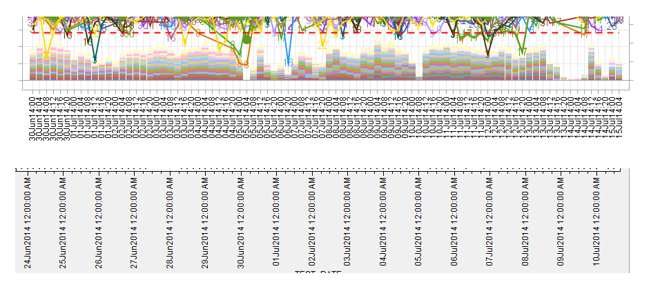
I want to adjust the x-axis tick marks for the first chart below to look like the one on the 2nd chart. (The tick value would only display the datetime of 12am per day)
The x-axis is datetime. format. Tried the timeopts option but can't get it to work.
Thanks !

- Mark as New
- Bookmark
- Subscribe
- Mute
- RSS Feed
- Permalink
- Report Inappropriate Content
It helps if you include your working program with data (simulated if necessary), so anyone trying to help does not have to start from scratch to try out different options. Without code and data,I suggest trying xaxisopts=(timeopts=(interval=day))
- Mark as New
- Bookmark
- Subscribe
- Mute
- RSS Feed
- Permalink
- Report Inappropriate Content
Hi, I attached the data and here's the program for the chart:
-----------------------------------------------------------------------------------------------------------------------------------------------------------------------------
proc template;
define statgraph Graph3;
dynamic V1 V2 V3 v4 v5 v6;
begingraph / designwidth=1050 designheight=380;
entrytitle halign=center "xxxxxxxxxxxxxxxxxxxxxxxxxx" / textattrs=(size=14 );
layout lattice / rowdatarange=data columndatarange=data rows=1 rowgutter=10 columngutter=10;
layout overlay / xaxisopts=(discreteopts=( tickvaluefitpolicy=splitrotate tickvaluerotation=vertical)
type=discrete griddisplay=on labelattrs=(size=12 style=NORMAL weight=BOLD ))
yaxisopts=( griddisplay=on label=('%sDET Yield') labelattrs=(size=12 style=NORMAL weight=BOLD )
linearopts=(viewmax=1.0 viewmin=0.7)) y2axisopts=( label=('VOLUME') labelattrs=(size=12 style=NORMAL weight=BOLD )
linearopts=(viewmin=0))
;
barchart x=V2 y=V5 / group=V1 name='bar' yaxis=Y2 display=(FILL)
groupdisplay=Stack dataskin=pressed clusterwidth=1.0
;
scatterplot x=V2 y=V3 / group=V1 name='scatter' MARKERCHARACTERATTRS=(size=11 ) MARKERCHARACTER=toolmark
rolename=(tip1=PRODUCT tip2=TOOL tip3=TEST_DATE tip4=DET_YIELD tip5=VOLUME tip6=TARGET)
tip=(tip1 tip2 tip3 tip4 tip5 tip6 );
seriesplot x=V2 y=V3 / group=V1 name='series' connectorder=xaxis lineattrs=(pattern=SOLID thickness=2 );
seriesplot x=V2 y=V6 / name='series2' display=(markers) connectorder=xaxis
lineattrs=(color=CX639A21 pattern=SOLID thickness=3 )
markerattrs=(color=CX639A21 symbol=CIRCLEFILLED size=14 );
seriesplot x=V2 y=LCL / name='LL' connectorder=xaxis lineattrs=(color=red pattern=DASH thickness=2 );
seriesplot x=V2 y=UCL / name='UL' connectorder=xaxis lineattrs=(color=red pattern=DASH thickness=2 );
seriesplot x=V2 y=TARGET / name='Target' connectorder=xaxis lineattrs=(color=black pattern=solid thickness=4 );
endlayout;
sidebar / align=bottom spacefill=false;
discretelegend 'scatter' / opaque=true border=true halign=center valign=center displayclipped=true
across=7 order=rowmajor;
endsidebar;
endlayout;
endgraph;
end;
run;
proc sgrender data=temp(where=(head_type="DN")) template=Graph3;
dynamic V1="TOOL" V2="TEST_DATE" V3="DET_YIELD" v4="TARGET" v5="VOLUME" v6="DET_YIELD_OA";
run;
-----------------------------------------------------------------------------------------------------------------------------------------------------------------------------
Thanks!
.jpg")
Catch up on SAS Innovate 2026
Nearly 200 sessions are now available on demand in the Innovate Hub.
Watch Now →Learn how use the CAT functions in SAS to join values from multiple variables into a single value.

Find more tutorials on the SAS Users YouTube channel.
SAS Training: Just a Click Away
Ready to level-up your skills? Choose your own adventure.
-
2 replies
-
07-14-2014 07:59 PM
-
2885 views
-
0 likes
-
2 in conversation
-
