- Home
- /
- Programming
- /
- Graphics
- /
- 3D scatter plots in sgplot?
- RSS Feed
- Mark Topic as New
- Mark Topic as Read
- Float this Topic for Current User
- Bookmark
- Subscribe
- Mute
- Printer Friendly Page
- Mark as New
- Bookmark
- Subscribe
- Mute
- RSS Feed
- Permalink
- Report Inappropriate Content
Hello,
Is there a way to make a 3D scatter plot in SAS that has more customization and smoother graphics than G3D? A macro for sgplot would be amazing.
I found an older SAS macro (https://blogs.sas.com/content/graphicallyspeaking/2015/03/10/a-3d-scatter-plot-macro/) that doesn't seem to work when I run it in SAS studio.
Many error codes that all seem to do with the following recurring error:
ERROR 251-185: The subroutine MATMULT is unknown, or cannot be accessed. Check your spelling.
Any help to move me towards a publication quality 3d scatter plot would be greatly appreciated.
- Mark as New
- Bookmark
- Subscribe
- Mute
- RSS Feed
- Permalink
- Report Inappropriate Content
Go back to the blog and include the matrix functions from the second link. I don't know if this will fix all of your problems, but it should get you further.
- Mark as New
- Bookmark
- Subscribe
- Mute
- RSS Feed
- Permalink
- Report Inappropriate Content
You can resort to proc iml instead of using matmult which gives you an error.
it requieres a license.
furthermore in sas viya / visual analytics you can use Data-driven content for advanced visualisations.
and another - not tested - possibility is using SAS Viya's open source gateway and run R or python graph libraries which do offer more 3-D visualisations.
Good luck
- Mark as New
- Bookmark
- Subscribe
- Mute
- RSS Feed
- Permalink
- Report Inappropriate Content
You could find many 3D graph from
https://robslink.com/SAS/democd41/aaaindex.htm
that is website of @GraphGuy
- Mark as New
- Bookmark
- Subscribe
- Mute
- RSS Feed
- Permalink
- Report Inappropriate Content
Let me play "devil's advocate" a little first ...
Are you 100% certain that a 2d snapshot of one view of a 3d scatter plot is a good way to display/analyze your data? I find that 3d plots often look interesting/fancy, but aren't really good for analytics. Make sure to answer that question, before investing too much time & money on trying to get 3d plots! 🙂
- Mark as New
- Bookmark
- Subscribe
- Mute
- RSS Feed
- Permalink
- Report Inappropriate Content
I fully agree with Robert (GraphGuy) about the use of 3D plots to display data. If your data is really 3D, with X, Y and Z variables, then it does make sense to view it in a 3D view. You are really trying to see the shape of the data and not the actual values. The macro does this but adding axis details will only clutter it.
But, if data is 2D, one should avoid trying to view it in 3D just for the "glitz" value. See example:
https://blogs.sas.com/content/graphicallyspeaking/2018/04/24/3d-waterfall-chart-redux/
- Mark as New
- Bookmark
- Subscribe
- Mute
- RSS Feed
- Permalink
- Report Inappropriate Content
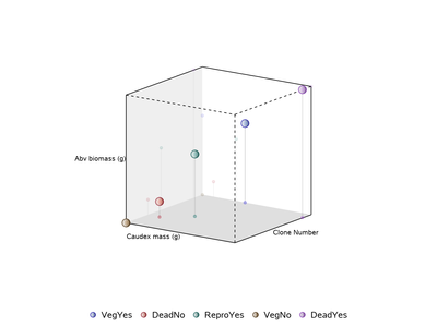
I found a slightly modified macro (https://github.com/Jiangtang/Programming-SAS/blob/master/ODS/Graphics/3D%20Scatter%20Plot%20Animatio...) that I managed to tweak to my needs and updated a few lines of code for use in SAS studio. The figure is nice looking, but not quite what I need because there are no values on the axes and the axes labels aren't parallel to the axes. Also, the z-axis label cuts off because it is a long variable name.
Any thoughts on how to modify the program to resolve the aesthetics?
Catch up on SAS Innovate 2026
Dive into keynotes, announcements and breakthroughs on demand.
Explore Now →Learn how use the CAT functions in SAS to join values from multiple variables into a single value.
Find more tutorials on the SAS Users YouTube channel.
SAS Training: Just a Click Away
Ready to level-up your skills? Choose your own adventure.


