- Home
- /
- Programming
- /
- Graphics
- /
- Re: 2 bars and 2 lines - Counts & Percents
- RSS Feed
- Mark Topic as New
- Mark Topic as Read
- Float this Topic for Current User
- Bookmark
- Subscribe
- Mute
- Printer Friendly Page
- Mark as New
- Bookmark
- Subscribe
- Mute
- RSS Feed
- Permalink
- Report Inappropriate Content
Hi All,
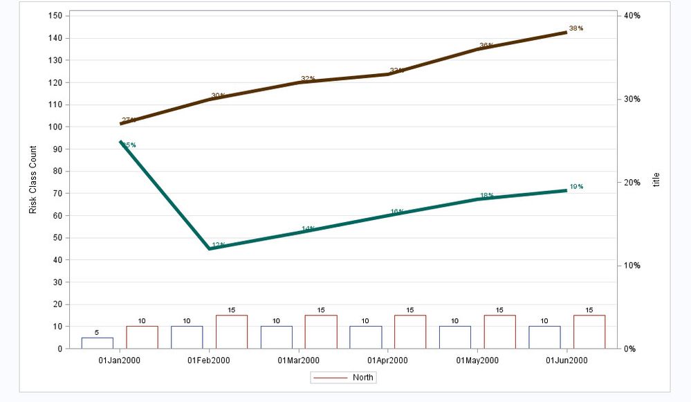
I have a question for you. I was trying to graph 2 bars and 2 lines on the one chart. The bars are discrete and the lines are percentages. The table is already calculated
Region | month | Count_1 | Count_2 | Percent_1 | Percent_2 |
North | 01/01/2000 | 5 | 10 | 25% | 27% |
North | 01/01/2000 | 10 | 15 | 10% | 30% |
%let gpath = 'C:\Users\\Downloads\';
ods listing style=htmlblue gpath=&gpath;
ods graphics / reset width=10in height=6in imagename='BarLine3';
proc sgplot data=FILTER_FOR_REGION_DATA;
title 'My Graph';
vbar month / response= Count_1 group=region nostatlabel datalabel dataskin=gloss name='a' nofill;
vbar month / response= Count_2 group=region nostatlabel datalabel dataskin=gloss name='a' nofill;
vline month / response= Percent_1 group=region nostatlabel y2axis lineattrs=(thickness=5) datalabel=RSQUOTETOBMPREM_NB;
vline month / response= Percent_2 group=region nostatlabel y2axis lineattrs=(thickness=5) datalabel=RSQUOTETOBMPREM_RNL;
yaxis min=0 offsetmin=0 values=(0 to 1500 by 100) grid label=’';
y2axis min=0 offsetmin=0 label='title';
xaxis display=(nolabel);
keylegend 'a' / title='';
run;
This works ok as you can see the bars through each other. I’d love to have them side by side.
- Mark as New
- Bookmark
- Subscribe
- Mute
- RSS Feed
- Permalink
- Report Inappropriate Content
Hi, I'm guessing that you may need to use the GROUPDISPLAY = CLUSTER to achieve the side by side look. Can you please send me your dataset or upload a picture so I can see how it looks at the moment?
Thanks.
- Mark as New
- Bookmark
- Subscribe
- Mute
- RSS Feed
- Permalink
- Report Inappropriate Content
Can you use the dataset in the my original post? That is the data what I want to graph.
- Mark as New
- Bookmark
- Subscribe
- Mute
- RSS Feed
- Permalink
- Report Inappropriate Content
I think this code will create the a dataset containing the data in the printed table:
data FILTER_FOR_REGION_DATA;
infile datalines dlm=':';
length Region $10;
format month date9.;
format Percent_1 Percent_2 percent7.0;
informat month anydtdte10.;
informat Percent_1 Percent_2 percent7.0;
input Region month Count_1 Count_2 Percent_1 Percent_2;
datalines;
North:01/01/2000:5:10:25%:27%
North:01/01/2000:10:15:10%:30%
;
run;
- Mark as New
- Bookmark
- Subscribe
- Mute
- RSS Feed
- Permalink
- Report Inappropriate Content
I'm not sure of your SAS version, but try using the DISCRETEOFFSET and BARWIDTH options together:
vbar month / response= Count_1 group=region discreteoffet=-0.2 barwidth=0.4 nostatlabel datalabel dataskin=gloss name='a' nofill;
vbar month / response= Count_2 group=region discreteoffet=0.2 barwidth=0.4 nostatlabel datalabel dataskin=gloss name='a' nofill;
- Mark as New
- Bookmark
- Subscribe
- Mute
- RSS Feed
- Permalink
- Report Inappropriate Content
hi folks, here is the full code. It works. Thank you so much. i think the graph looks great.
data FILTER_FOR_REGION_DATA;
infile datalines dlm=':';
length Region $10;
format month date9.;
format Percent_1 Percent_2 percent7.0;
informat month anydtdte10.;
informat Percent_1 Percent_2 percent7.0;
input Region month Count_1 Count_2 Percent_1 Percent_2;
datalines;
North:01/01/2000:5:10:25%:27%
North:01/02/2000:10:15:12:30%
North:01/03/2000:10:15:14%:32%
North:01/04/2000:10:15:16%:33%
North:01/05/2000:10:15:18%:36%
North:01/06/2000:10:15:19%:38%
run;
proc sgplot data=work.FILTER_FOR_REGION_DATA;
title 'My Graph';
vbar month / response= Count_1 group=region discreteoffet=-0.25 barwidth=0.35 nostatlabel datalabel dataskin=gloss name='a' nofill;
vbar month / response= Count_2 group=region discreteoffet=0.25 barwidth=0.35 nostatlabel datalabel dataskin=gloss name='a' nofill;
vline month / response=Percent_1 group=region y2axis lineattrs=(thickness=5) datalabel=Percent_1;
vline month / response=Percent_2 group=region y2axis lineattrs=(thickness=5) datalabel=Percent_2; yaxis min=0 offsetmin=0 values=(0 to 150 by 10) grid label='Risk Class Count'; y2axis min=0 offsetmin=0 label='title'; xaxis display=(nolabel);
keylegend 'a' / title='';
run;

- Mark as New
- Bookmark
- Subscribe
- Mute
- RSS Feed
- Permalink
- Report Inappropriate Content
Thank you for the code to generate the dataset Robert.
Tgalliga, the GROUPDISPLAY = CLUSTER option I mentioned is when the data is in a different format. I suggest that you use Dan's method for the side by side look.
Thanks.
April 27 – 30 | Gaylord Texan | Grapevine, Texas
Registration is open
Walk in ready to learn. Walk out ready to deliver. This is the data and AI conference you can't afford to miss.
Register now and save with the early bird rate—just $795!
Learn how use the CAT functions in SAS to join values from multiple variables into a single value.
Find more tutorials on the SAS Users YouTube channel.
SAS Training: Just a Click Away
Ready to level-up your skills? Choose your own adventure.


