- Home
- /
- Analytics
- /
- Stat Procs
- /
- Re: Perform ANOVA and multiple comparisons with PROC surveymeans and m...
- RSS Feed
- Mark Topic as New
- Mark Topic as Read
- Float this Topic for Current User
- Bookmark
- Subscribe
- Mute
- Printer Friendly Page

- Mark as New
- Bookmark
- Subscribe
- Mute
- RSS Feed
- Permalink
- Report Inappropriate Content
Dear Steve:
How to control this SAS code to get the plot of the row percents.
ods graphics on;
ods output wtfreqplot=wtfreqplot;
proc surveyfreq data = prepregnancystrata12Tier;
strata STRATUM1;
weight WTANAL;
table PREV_LB*Tier/ CL clwt row nowt wchisq chisq chisq1 plots(only)=wtfreqplot(type=dotplot scale=percent); /*orient=vertical*/
run;
ods graphics off;
It gives the graph of the percent of the ones out of the table total. But instead, I do not to get the graph of the row percent.
many thanks
Steven
- Mark as New
- Bookmark
- Subscribe
- Mute
- RSS Feed
- Permalink
- Report Inappropriate Content
Dear Steve:
I tried to use this one, but it still gives me the plot for the table total percent.
So, how to modify it to be able to get the graph of the row percents.
ods graphics on;
proc surveyfreq data = prepregnancystrata12Tier;
strata STRATUM1;
weight WTANAL;
table PREV_LB*Tier/row plots=(wtfreqplot(cl));
run;
many thanks
Steven
- Mark as New
- Bookmark
- Subscribe
- Mute
- RSS Feed
- Permalink
- Report Inappropriate Content
Dear Steve:
For 11 months, a linear trend in the means would be:
LSMESTIMATE months 'Linear trend' -5 -4 -3 -2 -1 0 1 2 3 4 5/cl;
If we have only 4 months, how is the linear trend in the means looks like?
Thank you very much
Steven

- Mark as New
- Bookmark
- Subscribe
- Mute
- RSS Feed
- Permalink
- Report Inappropriate Content
-3 -1 1 3
Google is your friend. Try "orthogonal polynomial" as a search term. There are multiple sites that will calculate the coefficients for you.
Steve Denham
- Mark as New
- Bookmark
- Subscribe
- Mute
- RSS Feed
- Permalink
- Report Inappropriate Content
When request the graph of the lsmeans In Proc Surveyreg, within Plots = options in LSMEANS statement, can we get something like this graph for the confidence interval of means.
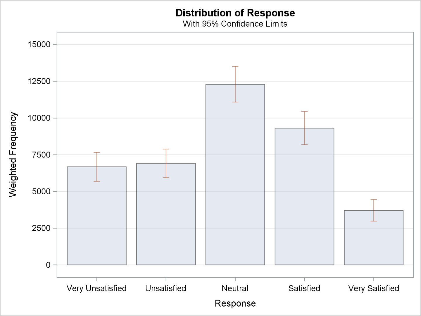
Steven
- Mark as New
- Bookmark
- Subscribe
- Mute
- RSS Feed
- Permalink
- Report Inappropriate Content
Dear Steve:
In proc surveyfreq: how can I force the plots = to plot the row percent NOT just percent.
Thanks
Steve
- Mark as New
- Bookmark
- Subscribe
- Mute
- RSS Feed
- Permalink
- Report Inappropriate Content
I would have to search the documentation on this one. I don't generally use the plots.
Steve Denham
- « Previous
-
- 1
- 2
- Next »
.jpg")
Catch up on SAS Innovate 2026
Nearly 200 sessions are now available on demand with the SAS Innovate Digital Pass.
Explore Now →ANOVA, or Analysis Of Variance, is used to compare the averages or means of two or more populations to better understand how they differ. Watch this tutorial for more.

Find more tutorials on the SAS Users YouTube channel.
-
21 replies
-
06-10-2013 10:11 AM
-
11055 views
-
3 likes
-
2 in conversation
-
