- Home
- /
- Analytics
- /
- Stat Procs
- /
- How to Create Some Specific Graphs on SAS
- RSS Feed
- Mark Topic as New
- Mark Topic as Read
- Float this Topic for Current User
- Bookmark
- Subscribe
- Mute
- Printer Friendly Page
- Mark as New
- Bookmark
- Subscribe
- Mute
- RSS Feed
- Permalink
- Report Inappropriate Content
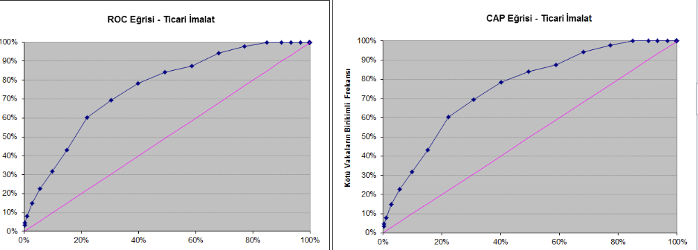
Following reports are created on Excel. My purpose is to learn how i can create these reports by SAS code or on EG.
I just want you to guide me i will spare time 🙂
Is it possible to create ROC Curve by using Line Plot and Scatter Plot. Maybe i have to use ANNOVA graphic’s on EG.
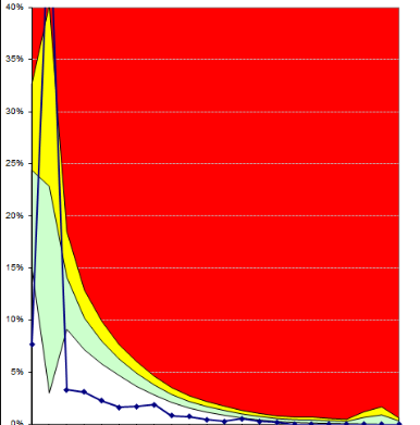
If i create the Traffic Lights Report by using Line Plot how i can add the colors. I created the colors on table by using Proc Report through IF-ELSE Condition now i have to add colors on Line Plot.
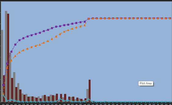
I think I should use Bar-Line graphic for following graphic but there is a limit on Bar statement.
I guess i can create following report on EG in an easy way.
This was the first time i tried to create following reports. So i haven’t got many information related to these reports i f i get some helps it will be beneficial for me.
Could you lead me, please ?
Thank you.
- Mark as New
- Bookmark
- Subscribe
- Mute
- RSS Feed
- Permalink
- Report Inappropriate Content
Go over to this blog:
http://blogs.sas.com/content/graphicallyspeaking/
And look through the thousands of examples, with code in both GTL and sgplot. Everything you could possible want to know about graphs is there.
- Mark as New
- Bookmark
- Subscribe
- Mute
- RSS Feed
- Permalink
- Report Inappropriate Content
You can create ROC plots automatically by using PROC LOGISTIC.
ods graphics on;
proc logistic data=sashelp.class plots(only)=roc;
   model sex = height / outroc=roc;
run;
If you need to do something fancy, the OUTROC= option writes the ROC data to an output data set.
- Mark as New
- Bookmark
- Subscribe
- Mute
- RSS Feed
- Permalink
- Report Inappropriate Content
The non-ROC plots are merely graphs that overlay standard elements such as bars, lines, reference lines, bands, etc.
Post your particular questions along with sample data to the SAS/GRAPH and ODS Graphics Support Community and say "I want to learn how to create this graph by using PROC SGPLOT." They are easy to create once you learn the basic techniques.
- Mark as New
- Bookmark
- Subscribe
- Mute
- RSS Feed
- Permalink
- Report Inappropriate Content
Thank you,
During this period you helped me a lot and i think you are expert of SAS. I asked my question SAS/GRAPH and ODS Graphics Support Community page as you said. I've already tried proc logistic but i didn't get the desired result which Excel generated. MM and EM generate ROC Curve easily i wonder how i can see the code behind of program maybe i can get some helps. I think it is hard to discover how to create these report in the beginning ?
Thanks again
- Mark as New
- Bookmark
- Subscribe
- Mute
- RSS Feed
- Permalink
- Report Inappropriate Content
You are welcome. I'm sure that it won't be long before you that you are making awesome graphs in SAS.
The quickest way to get a helpful response is to provide sample data. Often someone will be able to respond with the exact procedure and statements that you need. Since you are interesting in creating graphs, see the article "How to ask a good question about graphing in SAS"
- Mark as New
- Bookmark
- Subscribe
- Mute
- RSS Feed
- Permalink
- Report Inappropriate Content
Rick,
Your replies are always very accurate. I can receive the information i need from you. I will consider your suggestion. As far as i understand the main point is to provide sample data.
Thanks.
- Mark as New
- Bookmark
- Subscribe
- Mute
- RSS Feed
- Permalink
- Report Inappropriate Content
- Mark as New
- Bookmark
- Subscribe
- Mute
- RSS Feed
- Permalink
- Report Inappropriate Content
Hello Reeza,
This is the first time you answered without being angry 🙂 also it is beneficial for me.
Thank you.
- Mark as New
- Bookmark
- Subscribe
- Mute
- RSS Feed
- Permalink
- Report Inappropriate Content
- Mark as New
- Bookmark
- Subscribe
- Mute
- RSS Feed
- Permalink
- Report Inappropriate Content
@Reeza never strikes me as anything but helpful and nice, but maybe we need to introduce a new badge to the communities!
- Tags:
- Angry Face
- Mark as New
- Bookmark
- Subscribe
- Mute
- RSS Feed
- Permalink
- Report Inappropriate Content
I created the Roc Curve by using PROC GPLOT procedure. I hope it is the correct method.
PROC GPLOT DATA = <dataset>;
PLOT column1* column2  column2*column2/
 OVERLAY
	VAXIS=AXIS1

	HAXIS=AXIS2

FRAME	CFRAME=CXD2D2D2
	LVREF=1
	CVREF=BLACK
	AUTOVREF
	NOLEGEND
;
	FORMAT column2 PERCENT8.
		column1 PERCENT8.;
RUN;
QUIT;
Thanks a lot.
- Mark as New
- Bookmark
- Subscribe
- Mute
- RSS Feed
- Permalink
- Report Inappropriate Content
Given a data set with variables containing the sensitivity and specificity values (such as the OUTROC= data set from PROC LOGISTIC), these statements effectively reproduce the ROC graph produced by PROC LOGISTIC. See the options in PROC SGPLOT if you want to makes alterations.
proc sgplot data=rocdata noautolegend aspect=1;
xaxis values=(0 to 1 by 0.25) grid offsetmin=.05 offsetmax=.05;
yaxis values=(0 to 1 by 0.25) grid offsetmin=.05 offsetmax=.05;
lineparm x=0 y=0 slope=1 / transparency=.7;
series x=_1mspec_ y=_sensit_;
run;
- Mark as New
- Bookmark
- Subscribe
- Mute
- RSS Feed
- Permalink
- Report Inappropriate Content
Thanks a lot @StatDave It's good to know this.
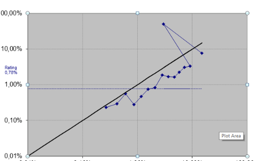
I created my last posted report which has logbase10 Axises. I used th GPLOT procedure again. You can see the code as below.
PROC GPLOT DATA = <dataset>
PLOT Column2* Column1
Column1* Column1
Column3* Column1
/
 OVERLAY
 GRID
	VAXIS=AXIS1

	HAXIS=AXIS2

	FRAME CFRAME=CXD4D4D4
	CVREF=CX969696
	CHREF=CX969696

FRAME	NOLEGEND;
FORMAT Column2 PERCENT11.4
		Column1 PERCENT11.4;
RUN;
QUIT;- Mark as New
- Bookmark
- Subscribe
- Mute
- RSS Feed
- Permalink
- Report Inappropriate Content
I created the traffic lights report by using Pattern and Areas option. You can see the code below
pattern1 v=s c=White;
pattern2 v=s c=Green;
pattern3 v=s c=yellow;
pattern4 v=s c=yellow;
PROC GPLOT DATA =<dataset>;
PLOT Column1* Column Column3* Column
Column2* Column Column4* Column/
 OVERLAY
	VAXIS=AXIS1

	HAXIS=AXIS2
	AREAS=1
	AREAS=2
	AREAS=3
	AREAS=4
	AUTOVREF

	HREVERSE
FRAME	 CFRAME=RED
LEGEND=LEGEND1
;
	FORMAT
		Column1 PERCENT8.
		Column2 PERCENT8.
		Column3 PERCENT8.
		Column4 PERCENT8.;

RUN;
QUIT;
On my third report, i would like to create both bars and lines. I'm working on EG and i'm also trying to use SAS codes but i couldn't create the both bars and both lines. Firstly, i tried to use PROC GCHART(Bar Chart on EG) i added the column1 into 'Column to chart' for horizontal axes and i added column1 and column2 into 'Sum of' which generated bars.By using this method i could create the bars which i wanted but i can't create the lines on PROC GHART. I also used PROC GBARLINE(Bar-Line on EG) i could create the lines and a bar but there is a bar limit on PROC GBARLINE for this reason i can't create two bars on PROC GBARLINE. I searched on google and some forums/blogs of SAS but i couldn't what i want. If somebody have knowledge about this can s/he share an example which includes two bars and three lines to help me, please ? I've already checked many procedure on google and some blogs. Seeing an example will be the best method for me to understand well.
Thank you.
Catch up on SAS Innovate 2026
Nearly 200 sessions are now available on demand with the SAS Innovate Digital Pass.
Explore Now →ANOVA, or Analysis Of Variance, is used to compare the averages or means of two or more populations to better understand how they differ. Watch this tutorial for more.
Find more tutorials on the SAS Users YouTube channel.


