- Home
- /
- SAS Viya
- /
- Visual Analytics
- /
- VA Reports and X-axis typography
- RSS Feed
- Mark Topic as New
- Mark Topic as Read
- Float this Topic for Current User
- Bookmark
- Subscribe
- Mute
- Printer Friendly Page
- Mark as New
- Bookmark
- Subscribe
- Mute
- RSS Feed
- Permalink
- Report Inappropriate Content
Hi there
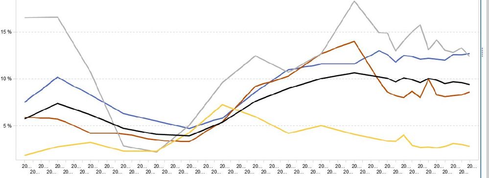
Anyone knows how I can change the typography on the x-axis?
Can I fx show every second quarterly x-axis value instead? Can I make the text smaller or is there any other possibilities making my graph prettier?
Se enclosed screenshot.
Thanks, MikA

Accepted Solutions
- Mark as New
- Bookmark
- Subscribe
- Mute
- RSS Feed
- Permalink
- Report Inappropriate Content
Hi Beverly
It's a time series. Actually i found out the problem is, that the date variable wasn't recognized. Thus, all values were plotted on the x-axis. When changing the format, SAS VA recognized the dates and adjusted the scale aotomatically.
Thanks for your intererst 🙂
/ Mik
- Mark as New
- Bookmark
- Subscribe
- Mute
- RSS Feed
- Permalink
- Report Inappropriate Content
Hi @MikA, it's hard to tell from the screen shot. Is this a time series or line chart?
- Mark as New
- Bookmark
- Subscribe
- Mute
- RSS Feed
- Permalink
- Report Inappropriate Content
Hi Beverly
It's a time series. Actually i found out the problem is, that the date variable wasn't recognized. Thus, all values were plotted on the x-axis. When changing the format, SAS VA recognized the dates and adjusted the scale aotomatically.
Thanks for your intererst 🙂
/ Mik
- Mark as New
- Bookmark
- Subscribe
- Mute
- RSS Feed
- Permalink
- Report Inappropriate Content
@MikA, glad it worked out! Thanks for letting me know.
Catch up on SAS Innovate 2026
Dive into keynotes, announcements and breakthroughs on demand.
Explore Now →See how to use one filter for multiple data sources by mapping your data from SAS’ Alexandria McCall.
Find more tutorials on the SAS Users YouTube channel.


