- Home
- /
- SAS Viya
- /
- Visual Analytics
- /
- Re: SAS Visual Analytics question
- RSS Feed
- Mark Topic as New
- Mark Topic as Read
- Float this Topic for Current User
- Bookmark
- Subscribe
- Mute
- Printer Friendly Page

- Mark as New
- Bookmark
- Subscribe
- Mute
- RSS Feed
- Permalink
- Report Inappropriate Content
Hi,
I am trying to upload an excel file into SAS VA personal folder with my name. The spreadsheet has only 1 tab with ~ 17000 rows. I have two measures - impressions and spend. I want the graph to have both measures on Y axis. Also I need the X axis to be time dimension (which means 1 bar for each month) and the bars to be split by product.
VA is allowing me to have 5 different graphs all adjacent to each other but I would like to combine them all and split the bars instead with different colors.
Hope this makes sense.
Thanks,
saspert
Message was edited by: Raj Addepalli

- Mark as New
- Bookmark
- Subscribe
- Mute
- RSS Feed
- Permalink
- Report Inappropriate Content
To assist with your question, it would help the community if you could provide a screenshot of what you have and what you are aiming for. Please elaborate on what you mean by "split the bars instead with different colors."... It seems that you may simply need some guidance on your data item properties and role assignment to match your requirements. Furthermore, please explain what version of SAS Visual Analytics you are using and whether this is in the Explorer or Designer interface.
A good article to read on how to get the most out of the SAS Support Communities can be found at How to ask a question in SAS Support Communities? Please review this and also the useful comments in the post.
In case you aren't aware, your question has been posted in the general Discussions group rather than the specific SAS Visual Analytics community where there are dedicated SAS Visual Analytics users who will be able to share their thoughts.
Anna Brown is the community manager of the group. Anna - can you please move this question into the SAS VA community?
Thanks,
Michelle

- Mark as New
- Bookmark
- Subscribe
- Mute
- RSS Feed
- Permalink
- Report Inappropriate Content
Thanks Michelle! I've just moved the question to the SAS Visual Analytics Community, Raj Addepalli, where I'm sure you'll receive perspective from other SAS Visual Analytics users.
Best,
Anna
- Mark as New
- Bookmark
- Subscribe
- Mute
- RSS Feed
- Permalink
- Report Inappropriate Content
Thanks Michelle - I did not notice the group for Visual Analytics. It has been a while since I am back in this community.

- Mark as New
- Bookmark
- Subscribe
- Mute
- RSS Feed
- Permalink
- Report Inappropriate Content
Hello Raj,
If I understand correctly, you want to make a stacked bar chart like this:
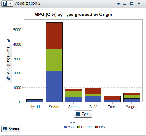
But with two measures on the Y axis.
Unfortunately, you cannot assign a grouping variable to a bar chart that has two measures on the response axis.
Was that what you wanted to do?
Thanks,
Sam
- Mark as New
- Bookmark
- Subscribe
- Mute
- RSS Feed
- Permalink
- Report Inappropriate Content
Thanks Sam for the note. This is every close to what I was looking for.

- Mark as New
- Bookmark
- Subscribe
- Mute
- RSS Feed
- Permalink
- Report Inappropriate Content
Hi,
Was this the sort of what you were after?
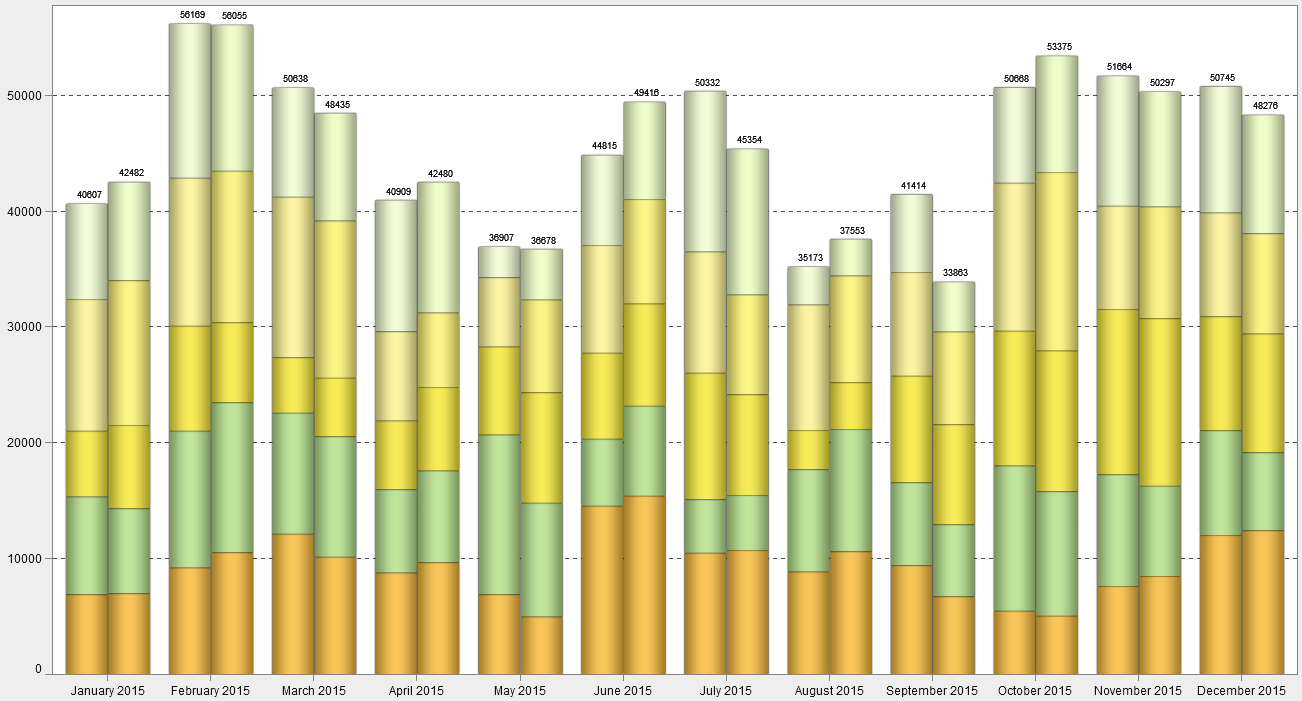
I'm not sure about the 2 bars but I can't see how it would work with the 2 bars stacked with the 2 groupings.
.jpg")
Catch up on SAS Innovate 2026
Nearly 200 sessions are now available on demand in the Innovate Hub.
Watch Now →See how to use one filter for multiple data sources by mapping your data from SAS’ Alexandria McCall.

Find more tutorials on the SAS Users YouTube channel.
-
6 replies
-
07-21-2015 02:55 PM
-
4336 views
-
4 likes
-
5 in conversation
-
