- Home
- /
- SAS Viya
- /
- Visual Analytics
- /
- SAS VA create weekly executive report
- RSS Feed
- Mark Topic as New
- Mark Topic as Read
- Float this Topic for Current User
- Bookmark
- Subscribe
- Mute
- Printer Friendly Page
- Mark as New
- Bookmark
- Subscribe
- Mute
- RSS Feed
- Permalink
- Report Inappropriate Content
Hi everyone,
I am completely new to SAS VA . I some transaction operation data (50k rows in 2 years) and I would like to use SAS VA to create a executive report to create reports with graphs which show (compare) metric for each week.
- Mark as New
- Bookmark
- Subscribe
- Mute
- RSS Feed
- Permalink
- Report Inappropriate Content
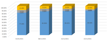
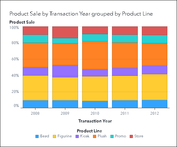
You can make a stacked bar chart like the one in your screen capture:
Make a bar chart and assign a category to the Group role. Set the Grouping Style option to stack the group values, and set the Grouping Scale option to Normalize to 100%.
You can also set a Week format on your date variable to give values like 22W04. I'm not sure if there is an easy way to get weekly values labeled with the first day of the week (01/03/2022)
Let us know if that helps,
Sam
- Mark as New
- Bookmark
- Subscribe
- Mute
- RSS Feed
- Permalink
- Report Inappropriate Content
Hi Sam,
Thank you for your reply. I think my biggest problem now is that I don't know how to group/filter transactional data into each week.
- Mark as New
- Bookmark
- Subscribe
- Mute
- RSS Feed
- Permalink
- Report Inappropriate Content
If you are fine with the "22W01" style of weekly date values, all you need to do is assign a weekly format to your date column.
If it is a requirement to have standard date values to represent each week, AND you have VA 8.3 or later, then here is one way to do it:
You need a calculated item and an advanced filter to get this.
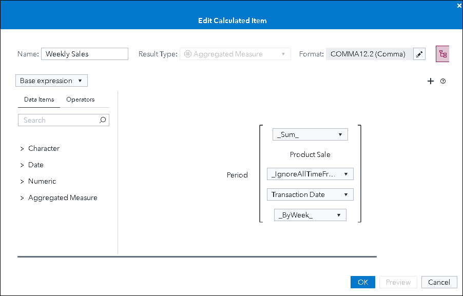
First we will create a calculated expression so that every row will contain the value for the entire week:
The Period() operator aggregates the values for the current time period. We need to select _ByWeek_ for the final drop-down here. If your VA is older than the 8.3 release, weekly intervals are not supported and this won't work.
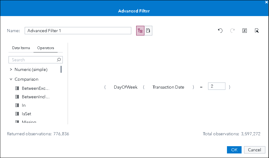
So now that we have a column that has each week's total, we'll want to hide all the date values other than the day of the week we want to show. We'll use an advanced filter to do this:
You make a filter like this by opening the Filters pane and selecting New Filter... Advanced Filter.
This filter uses the DayofWeek() operator and I am selecting "2" which is Monday. So each date displayed in your chart will be a Monday.
So if you create your bar chart using the calculated item above, and you apply the filter, then you can get a result like the bar chart at the top of this post.
Let us know if that helps,
Sam
Catch up on SAS Innovate 2026
Nearly 200 sessions are now available on demand with the SAS Innovate Digital Pass.
Explore Now →See how to use one filter for multiple data sources by mapping your data from SAS’ Alexandria McCall.
Find more tutorials on the SAS Users YouTube channel.


