- Home
- /
- SAS Viya
- /
- Visual Analytics
- /
- SAS VA 6.3 targeted bar chart outlines limit
- RSS Feed
- Mark Topic as New
- Mark Topic as Read
- Float this Topic for Current User
- Bookmark
- Subscribe
- Mute
- Printer Friendly Page

- Mark as New
- Bookmark
- Subscribe
- Mute
- RSS Feed
- Permalink
- Report Inappropriate Content
Hi,
in SAS VA 6.3 i am using the targeted bar chart in order to show the actual revenues vs the target revenues.
unfortunatly the max outlines limit number is 4 and there for the customer is complaining that the targets are not bold enoth.
Is there a better way to present a "revenues vs target" or is there a workaround?
Regards
Eldad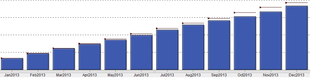

- Mark as New
- Bookmark
- Subscribe
- Mute
- RSS Feed
- Permalink
- Report Inappropriate Content
Hi Eldad,
If you can use simple bar chart with two measures- revenue and target , then it will be very clear for the customers.
Thanks,
Abhishek

- Mark as New
- Bookmark
- Subscribe
- Mute
- RSS Feed
- Permalink
- Report Inappropriate Content
Eldad,
Shurely you can also play with the color settings to give it a better contrast
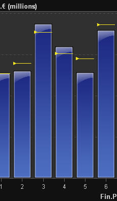
Or just use somthing like this
There are a lot of options, but just play with it to find the right solution. (Who has the right answer, thats up to you to find out with the customer)
Greetings and good luck
.jpg")
Catch up on SAS Innovate 2026
Nearly 200 sessions are now available on demand in the Innovate Hub.
Watch Now →See how to use one filter for multiple data sources by mapping your data from SAS’ Alexandria McCall.

Find more tutorials on the SAS Users YouTube channel.
-
2 replies
-
01-14-2014 07:19 AM
-
2812 views
-
4 likes
-
3 in conversation
-
