- Home
- /
- SAS Viya
- /
- Visual Analytics
- /
- Re: Problems with custom graph - line and stacked bar
- RSS Feed
- Mark Topic as New
- Mark Topic as Read
- Float this Topic for Current User
- Bookmark
- Subscribe
- Mute
- Printer Friendly Page

- Mark as New
- Bookmark
- Subscribe
- Mute
- RSS Feed
- Permalink
- Report Inappropriate Content
Hi,
I need to create the following stacked bar - line graph:
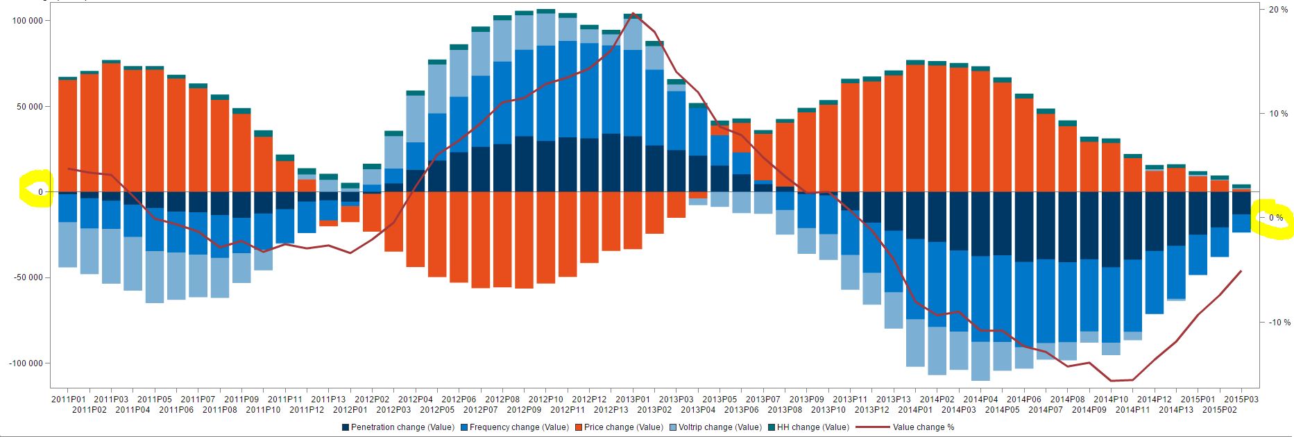
On the left Y axis, is the value change (in absolute value stacked bars), and on the right Y axis is the %-change in value (Line). All of this is ok, BUT, I need the 0 line to be at the same point for both axes (in the middle). As you can see here, the 0-value is a bit lower on the right Y-axis, and this can quickly be misleading. So is there a way for me to define so that the 0-axis would be the same for both axes?
Greatful for any answers ![]()
Br,
Kia

- Mark as New
- Bookmark
- Subscribe
- Mute
- RSS Feed
- Permalink
- Report Inappropriate Content
Which proc are you using to create your bar-line graph?
(there are a couple of different ways to create bar-lines in SAS, and the answer depends on which you are using)

- Mark as New
- Bookmark
- Subscribe
- Mute
- RSS Feed
- Permalink
- Report Inappropriate Content

- Mark as New
- Bookmark
- Subscribe
- Mute
- RSS Feed
- Permalink
- Report Inappropriate Content
Kia,
might sound simple, but could you use forced min-max axes values.
so 100/-100 and 20/-20
greetings, Peter
.jpg")
Catch up on SAS Innovate 2026
Dive into keynotes, announcements and breakthroughs on demand.
Explore Now →See how to use one filter for multiple data sources by mapping your data from SAS’ Alexandria McCall.

Find more tutorials on the SAS Users YouTube channel.
-
3 replies
-
05-04-2015 09:22 AM
-
2804 views
-
0 likes
-
4 in conversation
-
