- Home
- /
- SAS Viya
- /
- Visual Analytics
- /
- Re: Parallel period - How to solve this?
- RSS Feed
- Mark Topic as New
- Mark Topic as Read
- Float this Topic for Current User
- Bookmark
- Subscribe
- Mute
- Printer Friendly Page
- Mark as New
- Bookmark
- Subscribe
- Mute
- RSS Feed
- Permalink
- Report Inappropriate Content
Hi,
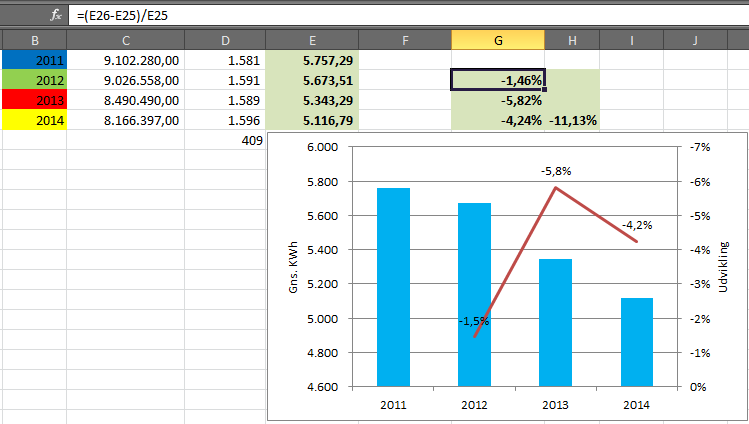
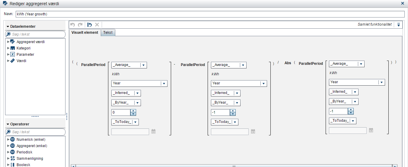
I'm trying to derive an aggregated percent-differential value from the picture below, for each year. I've done it in Excle, but would like to do it in SAS VA as well.
What I'm calculating is the differential kiloWattHours [kWh] from 2011-2014.
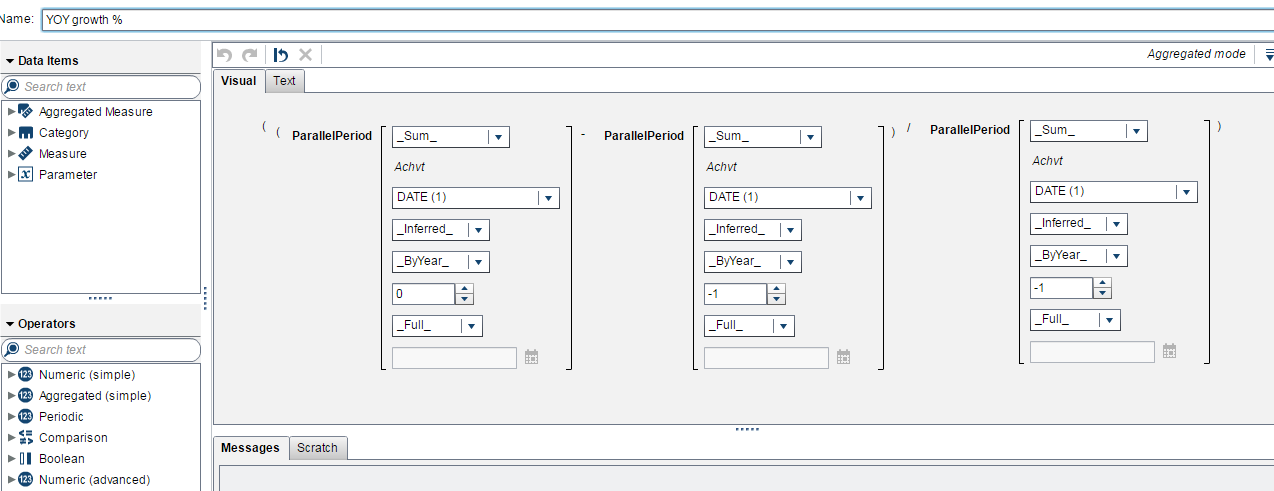
I'm on the track that I have to use the Parallel period function, but I'm not sure. I Hope the picture explains itself.
- Mark as New
- Bookmark
- Subscribe
- Mute
- RSS Feed
- Permalink
- Report Inappropriate Content
Hello Daha,
Instead of 'FULL', You can take 'Today', it depends on your requirement.
Hope this helps you..
Let me know...,
Thanks & Regards,
Teja Surapaneni
- Mark as New
- Bookmark
- Subscribe
- Mute
- RSS Feed
- Permalink
- Report Inappropriate Content
Hi Teja,
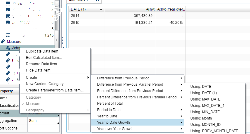
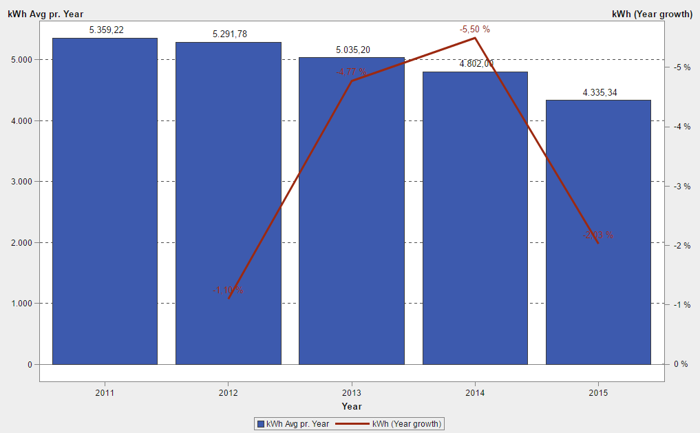
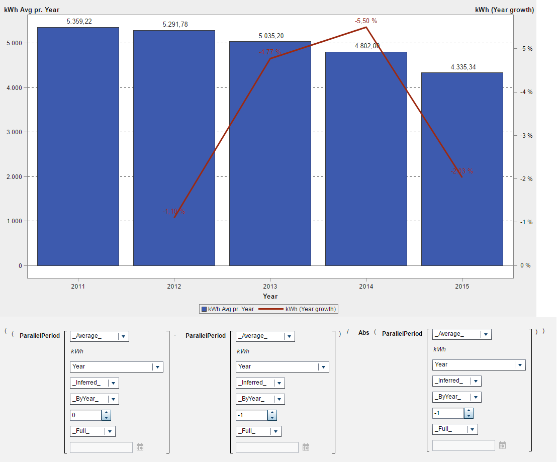
Thanks for your suggestion. I found the derived function 'Year to Date Growth' shortly after I posted my question. So now it looks like the picture below. (Be aware, it's new kWh Avg pr. Year values as the values in the thread-start were wrong, minor detail).
With the growth funtion:
But something seems to be wrong. If I manually calculate the growth:
'11-'12: [(5291-5359)/5359] = -1.2%
'12-'13: [(5035-5291)/5291] = -4.8%
'13-'14: [(4802-5035)/5035] = -4.6%
'14-'15: [(4335-4802)/4802] = -9.7%
I get these values from year to year. They somehow seem to approximate the values on the red-line graph with a little deviation, although the growth from '14-'15 is totally deviated by ~ -7%?
- Mark as New
- Bookmark
- Subscribe
- Mute
- RSS Feed
- Permalink
- Report Inappropriate Content
You should get a better result if you specify _Full_ rather than _ToToday_ for the last parameter of ParallelPeriod.
As I understand it, if you run a report today (4 January) and you specify _ToToday_, then you are only comparing the data through 4 January of each year.
- Mark as New
- Bookmark
- Subscribe
- Mute
- RSS Feed
- Permalink
- Report Inappropriate Content
@Sam_SAS, that didn't change much, as you can se below.
- Mark as New
- Bookmark
- Subscribe
- Mute
- RSS Feed
- Permalink
- Report Inappropriate Content
When I test this on 7.3 I can't seem to replicate the wrong numbers you are getting.
I noticed that your expressions use "kWh" but your graph uses "kWh Avr pr. Year". If you assign the "kWh" measure to the graph and set the aggregation to Average, does that make a difference?
- Mark as New
- Bookmark
- Subscribe
- Mute
- RSS Feed
- Permalink
- Report Inappropriate Content
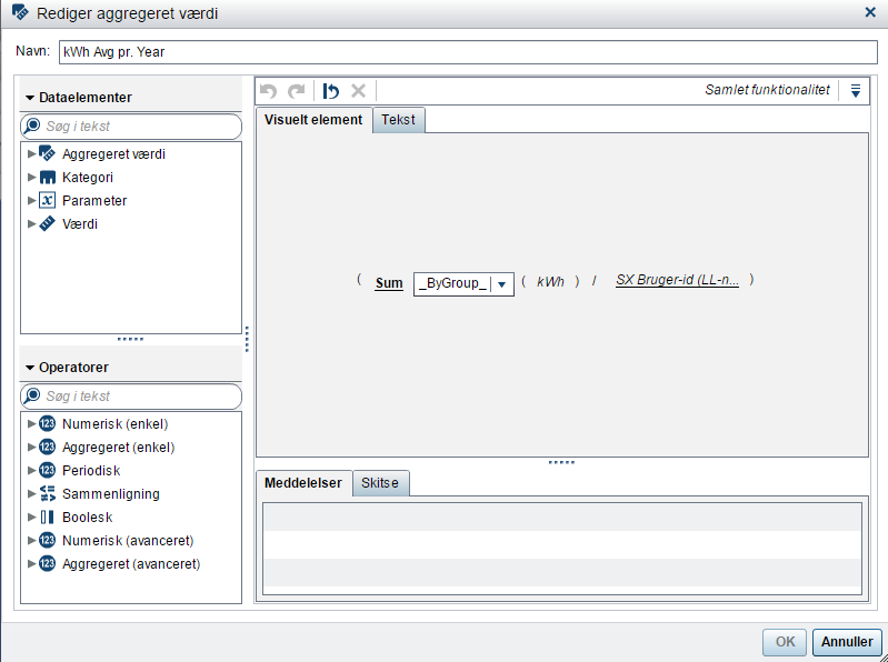
That also might seem to be the issue. The 'kWh Avg. pr. Year' is an aggregated value. This value is a subset of (Sum _ByGroup_ (kWh) / SX Bruger-id), as you can see on the illustration below. I needed this aggregated variable as I want to calculate the average kWh usage pr. year. The SX-Bruger-ID is just a uniqe ID for each customer/user.
This prevents me from right clicking on 'kWh Avg pr. Year' and creating the growth. Any ideas?
If I assign the "kWh" measure to the graph and set the aggregation to Average, then I',m getting the daily average pr. year, as my lowest level of kWh data is pr. day, but I want it presented as an average for the year. And to make it clear, no it doesn't change any numbers on the red growth line.
- Mark as New
- Bookmark
- Subscribe
- Mute
- RSS Feed
- Permalink
- Report Inappropriate Content
Hello Daha,
Can you share detailed logic for SX Burger-id (LL-n....
Thanks & Regards,
Teja Surapaneni.
- Mark as New
- Bookmark
- Subscribe
- Mute
- RSS Feed
- Permalink
- Report Inappropriate Content
Hi Teja,
Yes, there is not much to share else than it's a unique ID for each customer. For example LL000001, LL000002....etc.. It's just to use an ID to identify my customers.
- Mark as New
- Bookmark
- Subscribe
- Mute
- RSS Feed
- Permalink
- Report Inappropriate Content
Hello daha,
When you apply kWh to the bar chart and set the aggregation to Average, you would not expect the red line to change (that comes from your aggregated kWh Year Growth item) but the bar values should be different, and I would expect that the difference in the bar values would match the values shown on the red line.
For example, the difference between the 2014 and 2015 bars should match the -2.03 value indicated on the red growth line when calculated manually.
Thanks,
Sam
- Mark as New
- Bookmark
- Subscribe
- Mute
- RSS Feed
- Permalink
- Report Inappropriate Content
@Sam_SAS, thank you for that. You are right, I could replicate the numbers as my kWh is represented for each day in the dataset. Applying the kWh to the graph resulted in the average kWh pr. day pr. year which matched the growth function of the red-line and the numbers were correct. But I'm still interested in showing the kWh average pr. year (NOT average pr. day pr year) and add the growth line for these years. I'm missing something, but can't figure out what.
- Mark as New
- Bookmark
- Subscribe
- Mute
- RSS Feed
- Permalink
- Report Inappropriate Content
To get what you want though, I wonder if you should do some of the calculation as part of your data preparation. This sort of thing is not my expertise so maybe another poster can help you there.
- Mark as New
- Bookmark
- Subscribe
- Mute
- RSS Feed
- Permalink
- Report Inappropriate Content
@Sam_SAS, I just think this is a very basic thing. It's an regular average calculation saying expressing sum of kWh devided by sum of customers. On the other hand this gives me the experience of SAS VA not having the ability to create growth calculations on aggregated variables.
- Mark as New
- Bookmark
- Subscribe
- Mute
- RSS Feed
- Permalink
- Report Inappropriate Content
@Sam_SAS, Got the result. It's working 🙂 Although I had to do it in my backend.
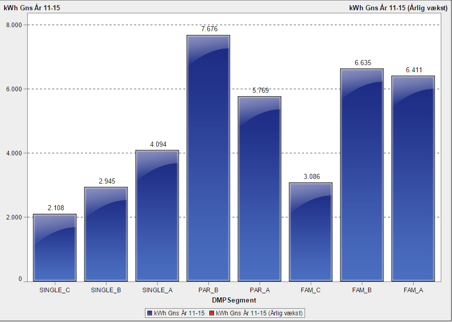
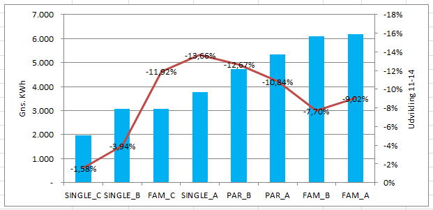
One additional question. On my x-axis I had years in the previous graph, what if I ie. used segments, and want the growth function to represent the growth from '11-'15 based on the segments. I see that I don't have any variable representing years, see below. Any ideas?
I would like the results to appear like on the graph below. OBS! Please don't take care about the values in the graph below as they are wrong.
- Mark as New
- Bookmark
- Subscribe
- Mute
- RSS Feed
- Permalink
- Report Inappropriate Content
Normally when you use an aggregated item with a periodic operator, your graph would contain a date or time variable and really it should be the same date variable that is the basis for the periodic operator.
When you add your Growth aggregated measure to a barline chart where the category axis does not contain a date/time variable, it returns missing values.
If you calculate the Growth measure as part of your data preparation, that might make a difference but I'm not sure I understand why you would want to plot growth against category values rather than date/time values.
See how to use one filter for multiple data sources by mapping your data from SAS’ Alexandria McCall.
Find more tutorials on the SAS Users YouTube channel.

