- Home
- /
- SAS Viya
- /
- Visual Analytics
- /
- Re: Multiple Charts side by side with different Date Ranges
- RSS Feed
- Mark Topic as New
- Mark Topic as Read
- Float this Topic for Current User
- Bookmark
- Subscribe
- Mute
- Printer Friendly Page

- Mark as New
- Bookmark
- Subscribe
- Mute
- RSS Feed
- Permalink
- Report Inappropriate Content
Hi Forum,
I've tried to create some charts & then put them into Horizontal containers so I can have a drop Down filter on each.
That was the theory anyway as the Drop Down filters the whole container.
Ideally, I want 2 or more charts showing weekly sales data for various Products side by side so I can compare one week with another for the Products.
Can anyone advise the best way to do this?
Thanks
Accepted Solutions

- Mark as New
- Bookmark
- Subscribe
- Mute
- RSS Feed
- Permalink
- Report Inappropriate Content
I guess where you are placing the dropdown that makes a difference. if you are placing both of them in report filter or section filter location.
Then they will behave as filters on report level like applicable for all sections in a report. and if you are putting them at section level then they will apply for all the graphs or reports you have in that section.
So I would suggest just place dropdowns in the big square box( report designer ) window and then add interaction to respective graph.
let me know if that helps.

- Mark as New
- Bookmark
- Subscribe
- Mute
- RSS Feed
- Permalink
- Report Inappropriate Content
Hi,
Have you tried Group option (which is available in Roles) to compare Week on Week productwise sales, achvt etc.......
Thanks & Regards,
Teja Surapaneni.
- Mark as New
- Bookmark
- Subscribe
- Mute
- RSS Feed
- Permalink
- Report Inappropriate Content
Thanks for your response Teja,
That's an idea, but I was thinking of something like 2 Line charts that display different periods based on the same data.
I've tried creating 2 separate reports with Sliders to give the user the option to choose a time period for each.
Is it possible to put a report into a container & have its filters only work for that report?
Cheers
- Mark as New
- Bookmark
- Subscribe
- Mute
- RSS Feed
- Permalink
- Report Inappropriate Content
Hello,
Can you pleases send dummy screenshot for us.
Thanks & Regards,
Teja Surapaneni
- Mark as New
- Bookmark
- Subscribe
- Mute
- RSS Feed
- Permalink
- Report Inappropriate Content
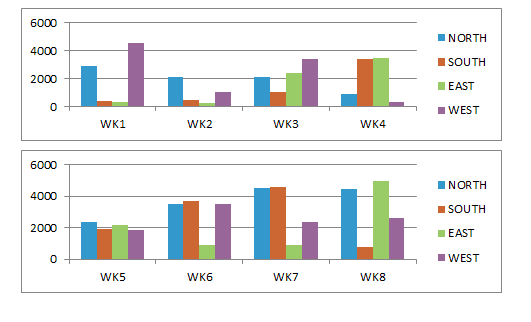
Hi Teja,
Here's a mockup from Excel, I would like something close to this if possible, otherwise I'll use your other suggestion,
I'd like to have the date ranges able to be selected independently for each chart so the User can select whatever periods to compare
Thanks
- Mark as New
- Bookmark
- Subscribe
- Mute
- RSS Feed
- Permalink
- Report Inappropriate Content
Hello,
The described excel example is possible in sas va.
Let me know.
Thanks & Regards,
Teja Surapaneni
- Mark as New
- Bookmark
- Subscribe
- Mute
- RSS Feed
- Permalink
- Report Inappropriate Content
I'm not sure what you mean?
Can you advise how to do this in SAS VA or not?
- Mark as New
- Bookmark
- Subscribe
- Mute
- RSS Feed
- Permalink
- Report Inappropriate Content
Hi,
The mentioned excel example is possible in sas va.
I am getting error to attach files in communities.
I don't understand what you are trying to do "I'd like to have the date ranges able to be selected independently for each chart so the User can select whatever periods to compare". can please about this
Thanks & Regards,
Teja Surapaneni.
- Mark as New
- Bookmark
- Subscribe
- Mute
- RSS Feed
- Permalink
- Report Inappropriate Content
Hi Teja,
I've found that I can create 2 Charts and have, for example, a drop down box that changes the filters for both charts in SAS VA, however, what I want is to have 2 charts that can have filters separately so a user can look at data from different periods in each chart in the same screenshot.
In my screenshot you could look at the WK1 - WK4 chart & compare the data from the same table for WK5 - WK8.
Hope that makes sense.
Peter
- Mark as New
- Bookmark
- Subscribe
- Mute
- RSS Feed
- Permalink
- Report Inappropriate Content
Hello Peter,
I am getting error to upload the screen shot in communities,
In theory, You have to split week column in two columns which is week1 & week2.
But you can't automate them.
I understood your requirement, i will try to upload the images in communities.
Thanks & Regards,
Teja Surapaneni.
- Mark as New
- Bookmark
- Subscribe
- Mute
- RSS Feed
- Permalink
- Report Inappropriate Content
Thanks Teja,
I won't need to animate the charts, just view them.
If you're having trouble uploading the images, you can just give me the roles & the fields I need to use to get the behaviour I need.
For the snapshot I posted, I used the software program 'Printkey' (free version is available on the net) & uploaded my charts as an image.
Peter

- Mark as New
- Bookmark
- Subscribe
- Mute
- RSS Feed
- Permalink
- Report Inappropriate Content
Teja and Peter,
We had some filters on that were blocking attachments to help with SPAM. I've just lifted those, if you want to try to upload the screenshot now, Teja.
Many thanks and I apologize for the inconvenience,
Anna
- Mark as New
- Bookmark
- Subscribe
- Mute
- RSS Feed
- Permalink
- Report Inappropriate Content
Hi Anna,
Thanks for your Response,
Now the problem had been solved,
Once again Thanks.
Thanks & Regards,
Teja Surapaneni
- Mark as New
- Bookmark
- Subscribe
- Mute
- RSS Feed
- Permalink
- Report Inappropriate Content
Great, I'm so glad Teja.
Thanks for all you do for the community!
Anna
- Mark as New
- Bookmark
- Subscribe
- Mute
- RSS Feed
- Permalink
- Report Inappropriate Content
Thanks Anna, ![]()
Hi Teja,
This looks great!
Can you run through how you built your example?
Do these use the same dataset?
Are they created separately & then imported into a new report?
Anything else relevant
Thanks Peter
.jpg")
Catch up on SAS Innovate 2026
Nearly 200 sessions are now available on demand in the Innovate Hub.
Watch Now →See how to use one filter for multiple data sources by mapping your data from SAS’ Alexandria McCall.

Find more tutorials on the SAS Users YouTube channel.
-
33 replies
-
07-14-2015 12:15 AM
-
8173 views
-
7 likes
-
4 in conversation
-
