- Home
- /
- SAS Viya
- /
- Visual Analytics
- /
- Re: Machine Event State Graph
- RSS Feed
- Mark Topic as New
- Mark Topic as Read
- Float this Topic for Current User
- Bookmark
- Subscribe
- Mute
- Printer Friendly Page
- Mark as New
- Bookmark
- Subscribe
- Mute
- RSS Feed
- Permalink
- Report Inappropriate Content
Hello,
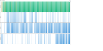
I saw one of these machine event graph and would like to know how to make one. There are different machines that are on the y-axis. Machines will also have different states such as production, standby, and downtime. They will be horizontally stacked by time which is the x-axis.
- Mark as New
- Bookmark
- Subscribe
- Mute
- RSS Feed
- Permalink
- Report Inappropriate Content
Hi!
You can create something similiar by using a bar chart.
Create a calculated measure with value 1 and add to the bar chart as measure.
Add your time dimension to the bar chart as categoy.
group the bar chart (rows) on your machine (or what you use), as in yourexample grd_a and grd_b.
Create calculated measures for each of your statAcronym
Create a display rule for each of the measures.
Could look something like this:
BR
Fredrik
Catch up on SAS Innovate 2026
Dive into keynotes, announcements and breakthroughs on demand.
Explore Now →See how to use one filter for multiple data sources by mapping your data from SAS’ Alexandria McCall.
Find more tutorials on the SAS Users YouTube channel.


