- Home
- /
- SAS Viya
- /
- Visual Analytics
- /
- Is there or will there be "By Group" ranking functionalities in VA?
- RSS Feed
- Mark Topic as New
- Mark Topic as Read
- Float this Topic for Current User
- Bookmark
- Subscribe
- Mute
- Printer Friendly Page

- Mark as New
- Bookmark
- Subscribe
- Mute
- RSS Feed
- Permalink
- Report Inappropriate Content
Hi All,
My client is using SAS Visual Analytics 7.1, and a basic requirement is to have a Bar Chart showing the top 3 sales person every quarter. If we set Ranking feature to "top 3", and with the chart as "Quarter" as the X, and "Actual sales performance of individual top 3" as the Y, then it comes with the top 3 sales persons and their sales performance by the total dataset or the filtered dataset (say that it select top 3 based on the total dataset). What the need is actually a "By Group Ranking" function, which means I can by "Quarter" select the top 3 sales based on their sales performance. Is there anyway to overcome this? Or is there any plan to enable the functionality? Thanks.
Teresa

- Mark as New
- Bookmark
- Subscribe
- Mute
- RSS Feed
- Permalink
- Report Inappropriate Content
Hi Teresa,
If I understood you question correctly.... the functionality can be achieved by creating other two objects in the dashboard--- 1) A list and 2) a Button Bar. Even you can select other objects as you desire.
1) Create format "Year" from your date time variable and assign it to "list object"( If you are having more than one year in your data).
2) Create "quarter" format from your date time variable and assign it to "Button Bar".
3) Assign Sales Category in X axis and its relevant Measure in Y axis of Bar Chart. Give the ranking of X axis Category for top 3 by Y Measure.
4) Give filter Interaction from List Object -----> Button Bar Object and Button Bar Object ---------> Bar Chart.
Now people can see top 3 sales by Quarter what they select in the "button Bar Object". Even if you are having multiple years, they will have a option to select a particular year or multiple years.
For the reference, I am attaching a screenshot.
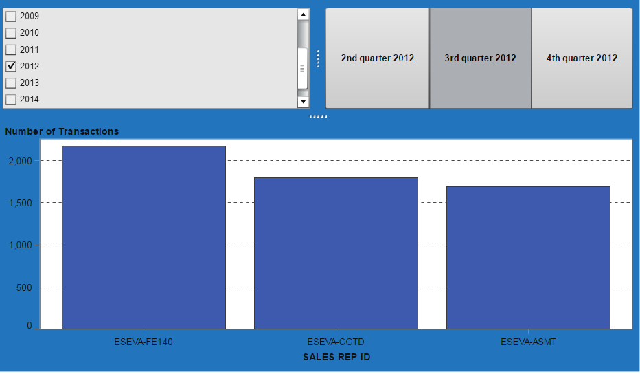
Hope this helps you.
Regards,
Abhishek
- Mark as New
- Bookmark
- Subscribe
- Mute
- RSS Feed
- Permalink
- Report Inappropriate Content
Hi Avvy,
Thanks for your quick response. But how about the case that if we remain "Year" as a "list object", but move "Quarter" into X axis, that means the design is to let the users choose a specific year from the "list object", but shows the top 3 sales for each quarter at the same time in X axis by using the ranking feature, is it possible to do that? A sample layout is as below, thanks a lot~~

Teresa
- Mark as New
- Bookmark
- Subscribe
- Mute
- RSS Feed
- Permalink
- Report Inappropriate Content
Hi Teresa,
I haven't tried but same approach should work for it too....
Assign "Quarter" as the "category" and "Sales" as "Group" category for bar chart. Use the top 3 ranking on the "Sales" Category by "Measure" assigned to bar chart.
Give it a try and please let us know weather it works or not.
Thanks & Regards,
Abhishek
- Mark as New
- Bookmark
- Subscribe
- Mute
- RSS Feed
- Permalink
- Report Inappropriate Content
Hi Avvy,
Thanks for your info, but it DOESN'T work, as what we have experimented before. I followed your instruction but the result is shown as below. It seems that if "Quarter" is the "category" and "Sales ID" is the "group category", and then use "rank" on "sales ID" by a measure, it will only show the same top 3 sales ID with their measure in each quarter, that's not the way we hope it to present every top 3 sales ID in each quarter (failed to attach the screen capture). Any other way to do that?
Best Regards,
Teresa
- Mark as New
- Bookmark
- Subscribe
- Mute
- RSS Feed
- Permalink
- Report Inappropriate Content
Hi Teresa,
ya you are correct, I didn't thought in this way that if we apply ranking to a particular object, it will be normalized and applied to whole group.
The only way right now which I can think is to have 4 different bar charts, each filtered by quarter i.e. first bar chart will show only quarter one, second bar chart as quarter 2 etc... and each bar graph ranked as top 3 or 4 .
Or the other way around is my first reply.
If I will get the solution to the actual output what you want, definitely I will let you know
Regards,
Abhishek

- Mark as New
- Bookmark
- Subscribe
- Mute
- RSS Feed
- Permalink
- Report Inappropriate Content
Can you try adding quarters as a lattice columns..
.jpg")
Catch up on SAS Innovate 2026
Nearly 200 sessions are now available on demand with the SAS Innovate Digital Pass.
Explore Now →See how to use one filter for multiple data sources by mapping your data from SAS’ Alexandria McCall.

Find more tutorials on the SAS Users YouTube channel.
-
6 replies
-
08-25-2015 12:00 AM
-
4231 views
-
0 likes
-
3 in conversation
-
