- Home
- /
- SAS Viya
- /
- Visual Analytics
- /
- Dynamic Value on Reference Line
- RSS Feed
- Mark Topic as New
- Mark Topic as Read
- Float this Topic for Current User
- Bookmark
- Subscribe
- Mute
- Printer Friendly Page
- Mark as New
- Bookmark
- Subscribe
- Mute
- RSS Feed
- Permalink
- Report Inappropriate Content
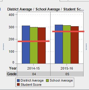
I have a bar chart with three clusters: District Avg, School Avg, and Student Avg. I then group by (using lattice columns) School Year, and Grade. I need a reference line that is dynamic because the Proficient Level changes from grade to grade.
Any ideas?
(I have attached a picture of what I would like the graph to look like when I'm done.)

- Mark as New
- Bookmark
- Subscribe
- Mute
- RSS Feed
- Permalink
- Report Inappropriate Content
Add it to the data 🙂
BR
Fredrik
- Mark as New
- Bookmark
- Subscribe
- Mute
- RSS Feed
- Permalink
- Report Inappropriate Content
- Mark as New
- Bookmark
- Subscribe
- Mute
- RSS Feed
- Permalink
- Report Inappropriate Content
Hm, maybe I don't follow you here 🙂
My thought was to add a meassure with your reference, and that it has different values depending on dimesnsion etc.
Then use a bar/line chart with the reference as the line, but that is maybe not what you want or isn't achievable that way?
BR
Fredrik
- Mark as New
- Bookmark
- Subscribe
- Mute
- RSS Feed
- Permalink
- Report Inappropriate Content
A "Targeted Bar Chart" does not allow for multiple Measures, so I cannot group the student, school, teacher and district results in one graph.
- Mark as New
- Bookmark
- Subscribe
- Mute
- RSS Feed
- Permalink
- Report Inappropriate Content
You should create a custom graph with Graph builder that will be combination of a bar chart and a line chart.
- Mark as New
- Bookmark
- Subscribe
- Mute
- RSS Feed
- Permalink
- Report Inappropriate Content
I tried, but was unsuccesful. Can you walk me through creating a custom graph to do this?
April 27 – 30 | Gaylord Texan | Grapevine, Texas
Registration is open
Walk in ready to learn. Walk out ready to deliver. This is the data and AI conference you can't afford to miss.
Register now and save with the early bird rate—just $795!
See how to use one filter for multiple data sources by mapping your data from SAS’ Alexandria McCall.
Find more tutorials on the SAS Users YouTube channel.


