- Home
- /
- SAS Viya
- /
- Visual Analytics
- /
- Display rule
- RSS Feed
- Mark Topic as New
- Mark Topic as Read
- Float this Topic for Current User
- Bookmark
- Subscribe
- Mute
- Printer Friendly Page
- Mark as New
- Bookmark
- Subscribe
- Mute
- RSS Feed
- Permalink
- Report Inappropriate Content
Hi Team,
I have a hierarchy(Name: ABC) created for 3 variables.
I need to create a drillable crosstab visualisation showing the x, y, z measures by hierarchy ABC.
How can I create a display rule which highlights the values( for example greater than 50 as Excellent and less than 50 as poor).
Accepted Solutions
- Mark as New
- Bookmark
- Subscribe
- Mute
- RSS Feed
- Permalink
- Report Inappropriate Content
Before I forget, you are also allowed to create alerts in order to send messages to people who want to know whether an indicator has reached its goal or not. You can configure it in the "alert options" sheet.
Personally, I don't know if it's possible to create text alerts instead of using color alerts but through this option, you can add a personalized message saying GOOD or BAD for each of your defined rules.
- Mark as New
- Bookmark
- Subscribe
- Mute
- RSS Feed
- Permalink
- Report Inappropriate Content
Hi,
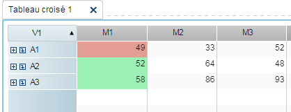
If I understood well your idea, this is what you should do:
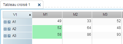
1) Create a cross-table and add your hierarchy and the measures to it;
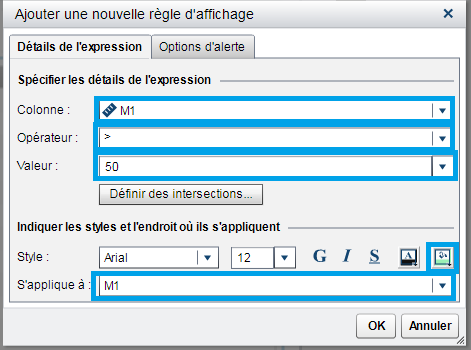
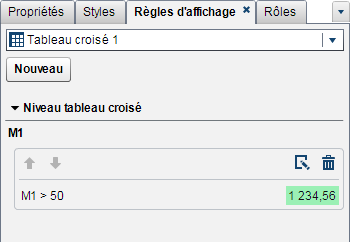
2) Go to the Display Rules panel and add a NEW rule (sorry mine is in French, then consider NOUVEAU);
3) Select the variable (or all variables) which contain the value that you want to use to create the display rules (they are not necessarily the same in which you will apply the rules (read the item 7);
4) Select the operator (for example <=);
5) Select the value (for example 50);
6) Now you have to choose a new style to it (for example, change the background color to red);
7) Pick the variable (or all variables) in which you want the rules to be applied and you will see the results in your crosstab just after your OK;
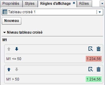
😎 If that is what you were looking for, you can add a new rule, change the operator to >, keep 50 as value but change the color to green (here I did the green first :));
Hope it helps!
- Mark as New
- Bookmark
- Subscribe
- Mute
- RSS Feed
- Permalink
- Report Inappropriate Content
Before I forget, you are also allowed to create alerts in order to send messages to people who want to know whether an indicator has reached its goal or not. You can configure it in the "alert options" sheet.
Personally, I don't know if it's possible to create text alerts instead of using color alerts but through this option, you can add a personalized message saying GOOD or BAD for each of your defined rules.
- Mark as New
- Bookmark
- Subscribe
- Mute
- RSS Feed
- Permalink
- Report Inappropriate Content
how can i add a personalized message for scores <50 as poor and >50 as excellent
- Mark as New
- Bookmark
- Subscribe
- Mute
- RSS Feed
- Permalink
- Report Inappropriate Content
Hello,
I am glad the first part of the answer has helped you but I think I made a mistake. Actually, I find you are not allowed to send a personalized written message by the alerts option (and in this case, I have assumpted that it was possible to write a message as we can do in the distribution option but I was wrong :().
Anyway, what you can do is set your alert like this:
1) Go to the Subscription and Notification sheet;
2) Check the box "create an alert based on this rule";
3) + Add one or more subscribers (pick them from the left list - if you don't see a list, contact your admin) and transfer them to the right pane;
4) In the second sheet (you will see a little man and a clock) you can add a name to show, an identifier and if you want you can add other subscribers.
After saving your report, if your rule is met, the subscribers will receive a message like this:
SAS Alert: A metric condition has been met
A metric condition has been met for <Name of your table> in the <Name of your report>
"M1" < 50
Click on the link to see the object or changing your parameters:
<Link to your report>
I personally couldn't find a way to add a message to the alert but I suggest you read the links below:
Catch up on SAS Innovate 2026
Nearly 200 sessions are now available on demand with the SAS Innovate Digital Pass.
Explore Now →See how to use one filter for multiple data sources by mapping your data from SAS’ Alexandria McCall.
Find more tutorials on the SAS Users YouTube channel.


