- Home
- /
- SAS Viya
- /
- Visual Analytics
- /
- Re: Conditionally Show or Hide a Time Series Data.
- RSS Feed
- Mark Topic as New
- Mark Topic as Read
- Float this Topic for Current User
- Bookmark
- Subscribe
- Mute
- Printer Friendly Page
- Mark as New
- Bookmark
- Subscribe
- Mute
- RSS Feed
- Permalink
- Report Inappropriate Content
Hi,
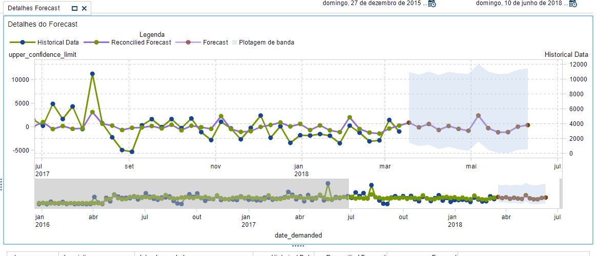
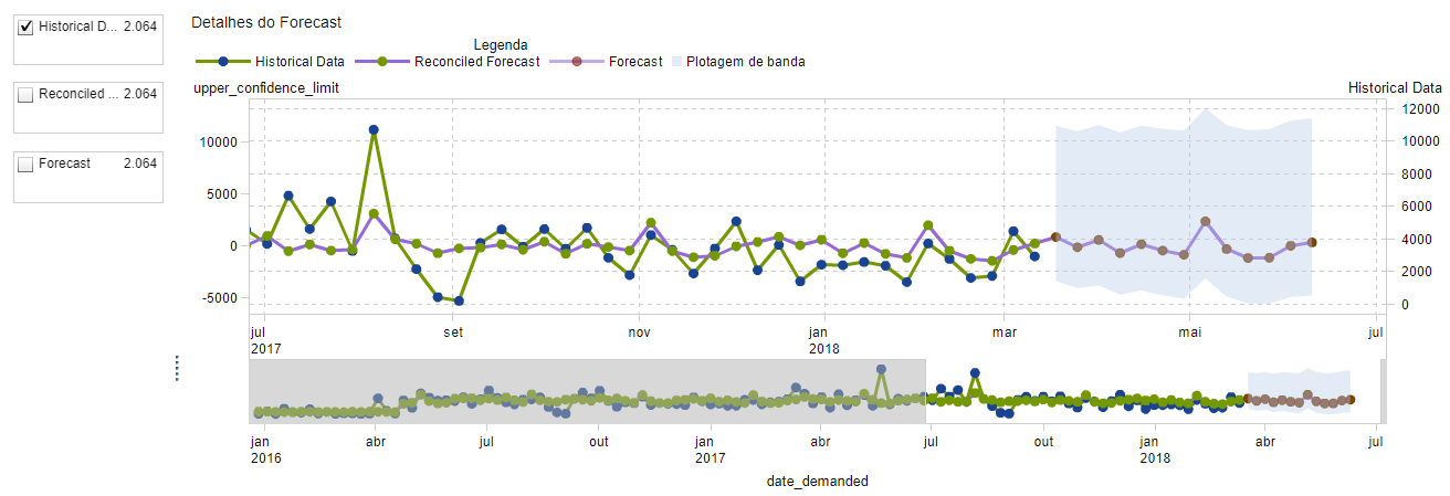
I'm trying to create a filter to show or hide a time series data. My dataset has three columns: a Historical Data, Reconciled Forecast, and Forecast. I want a filter to choose which of these columns will appear on my chart. My chart needs to dynamically design the data, is it possible to use a checkbox for this?
For example, if the checkbox for Historical Data is selected then the green line should be shown (Just like the image below), otherwise, the green line should disappear.
Thanks in Advance.
Accepted Solutions
- Mark as New
- Bookmark
- Subscribe
- Mute
- RSS Feed
- Permalink
- Report Inappropriate Content
Hi,
I found a solution to my problem and would like to thanks for the help! I based my solution on the Renato Answer in the following topic:
I make myself available to anyone who had the same problem and needs help beyond the link above, just contact me!
Thanks!
- Mark as New
- Bookmark
- Subscribe
- Mute
- RSS Feed
- Permalink
- Report Inappropriate Content
Hi,
you could do the following.
Create a `List` (From Objects / Controls) based on the field you want to filter ( Historical Data, Reconcilled Forecast, Forecast) and then Create an interaction between this List and your `Line Chart`.
- Mark as New
- Bookmark
- Subscribe
- Mute
- RSS Feed
- Permalink
- Report Inappropriate Content
Hi Amos, thanks for the answer.
I tried to use a List object, but just categorical data are accepted by this object so I tried to create a new custom categorical data based on the field I want to filter and created an interaction between this list and my time series plot, but nothing happens when I activate/deactivate the check box. Sorry, I don't know what I'm missing, I'm new with V.A!
- Mark as New
- Bookmark
- Subscribe
- Mute
- RSS Feed
- Permalink
- Report Inappropriate Content
Hi,
I found a solution to my problem and would like to thanks for the help! I based my solution on the Renato Answer in the following topic:
I make myself available to anyone who had the same problem and needs help beyond the link above, just contact me!
Thanks!
Catch up on SAS Innovate 2026
Nearly 200 sessions are now available on demand with the SAS Innovate Digital Pass.
Explore Now →See how to use one filter for multiple data sources by mapping your data from SAS’ Alexandria McCall.
Find more tutorials on the SAS Users YouTube channel.


