- Home
- /
- SAS Viya
- /
- Visual Analytics
- /
- Bar chart with count and percentage values.
- RSS Feed
- Mark Topic as New
- Mark Topic as Read
- Float this Topic for Current User
- Bookmark
- Subscribe
- Mute
- Printer Friendly Page
- Mark as New
- Bookmark
- Subscribe
- Mute
- RSS Feed
- Permalink
- Report Inappropriate Content
Hi community,
I have SAS Visual Analytics 7.5. Is it possible to create a bar chart that shows count and percentage values? Sample image.
I can use two or more measure in a bar chart, but it create two parallel graphics.
Thanks.
- Mark as New
- Bookmark
- Subscribe
- Mute
- RSS Feed
- Permalink
- Report Inappropriate Content
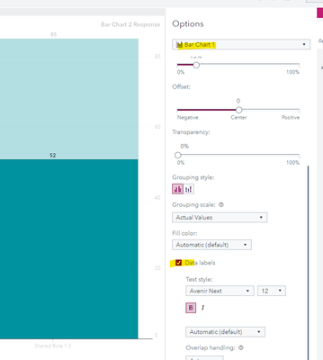
The only way you could achieve something close to this is to use the Custom Graph Builder and stack two bar charts on top of each other, using a Shared Category. I don't think you'll be able to get exactly this though but you might get something acceptable that way? When you create the custom graph, just make sure you turn on Data Labels in each of the Bar Charts:
Then you might play around with the Y-Axis or colors or offset the bars to see what might work for you.
Catch up on SAS Innovate 2026
Dive into keynotes, announcements and breakthroughs on demand.
Explore Now →See how to use one filter for multiple data sources by mapping your data from SAS’ Alexandria McCall.
Find more tutorials on the SAS Users YouTube channel.


