- Home
- /
- Programming
- /
- Programming
- /
- Re: how to plot this graph using proc sgpanel and hbar, plot y axis by...
- RSS Feed
- Mark Topic as New
- Mark Topic as Read
- Float this Topic for Current User
- Bookmark
- Subscribe
- Mute
- Printer Friendly Page
- Mark as New
- Bookmark
- Subscribe
- Mute
- RSS Feed
- Permalink
- Report Inappropriate Content
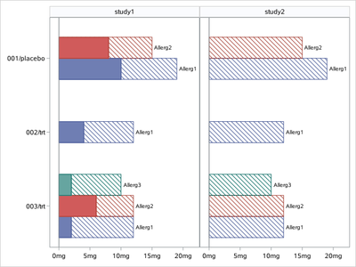
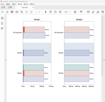
I am not sure how to plot two bars with hash marks on the study 1 portion with color filled verses dash line for the bar between two hash marks. Also need to show numeric data on x axis but show them categorical
Accepted Solutions
- Mark as New
- Bookmark
- Subscribe
- Mute
- RSS Feed
- Permalink
- Report Inappropriate Content
data have;
input study $ group : $20. value1 value2 sub_group $;
cards;
study1 001/placebo 19 10 Allerg1
study1 001/placebo 15  8 Allerg2
study1 002/trt 12 4 Allerg1
study1 003/trt 12 2 Allerg1
study1 003/trt 12 6 Allerg2
study1 003/trt 10 2 Allerg3
study2 001/placebo 19 . Allerg1
study2 001/placebo 15 . Allerg2
study2 002/trt 12 . Allerg1
study2 003/trt 12 . Allerg1
study2 003/trt 12 . Allerg2
study2 003/trt 10 . Allerg3
;

proc format;
picture fmt
low-high='00009mg';
run;

proc sgpanel data=have noautolegend nocycleattrs;
format value1 value2 fmt.;
panelby study/layout=columnlattice onepanel novarname;
hbarparm category=group response=value1/group=sub_group fillpattern nofill groupdisplay=cluster datalabel=sub_group;
hbarparm category=group response=value2/group=sub_group   groupdisplay=cluster;
colaxis display=(nolabel);
rowaxis display=(nolabel) ;
run;
- Mark as New
- Bookmark
- Subscribe
- Mute
- RSS Feed
- Permalink
- Report Inappropriate Content
- Mark as New
- Bookmark
- Subscribe
- Mute
- RSS Feed
- Permalink
- Report Inappropriate Content
An example of your data would be nice, best is to provide data as a working data step.
If we have your data then we can tell if something needs to be added or rearranged.
Make sure that it is very clear which variable holds which information. Your picture isn't very clear as to what might be a "treatement". You also seem to be stacking two different variables "var1" and "var2" in a single bar. That indicates that something in your data likely needs to be reshaped so a single variable indicates which "group" of data is from which variable.
Sgpanel. Panelby uses a variable to place data into a specific panel. From your hard to see picture because of orientation and size in PDF it looks you should have a variable that has values like "Study 1" and "Study 2". That would be your Panelby variable.
Your picture doesn't show anything that looks like a "by Subjid" which I have to guess is some sort of individual identifier. Do you actually have enough values and categories for a single subject to be worth plotting anything?
What stat is the bar length supposed to represent? What variable(s) has that information?
- Mark as New
- Bookmark
- Subscribe
- Mute
- RSS Feed
- Permalink
- Report Inappropriate Content
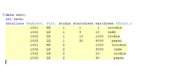
please see data below, I need to plot multiple bars per subjects so per fctrt variable. I have made up the data but basically, i need to break the bar with the values in startdosen and first half of the bar solid pattern. sec half will display value until exitdosen and pattern filled but in same colors for both portion of the bar, with lines,
and each color represent in this plot is by fctrt variable.
- Mark as New
- Bookmark
- Subscribe
- Mute
- RSS Feed
- Permalink
- Report Inappropriate Content
do this dummy data with the plot i am getting help? it is panel by studyn in the plot that i shared that i am getting.
- Mark as New
- Bookmark
- Subscribe
- Mute
- RSS Feed
- Permalink
- Report Inappropriate Content
- Mark as New
- Bookmark
- Subscribe
- Mute
- RSS Feed
- Permalink
- Report Inappropriate Content
Copy the text of your "data step" as text. On the forum open a text box using the </> icon that appears above the message window. Paste the text.
It is a good idea to run your data step and see that it will actually run but we can help with that.
If $Subject. $trt. and $fctrt. are supposed to be either informat or format names you need to include the definition Proc Format code as well. AS TEXT. Pictures don't run as code.
Half of your observations are missing Startdosen. So you need provide how a missing value is used to " break the bar with the values in startdosen". If "half" of the bar is supposed to be a different color/appearance then you need to provide that value.
- Mark as New
- Bookmark
- Subscribe
- Mute
- RSS Feed
- Permalink
- Report Inappropriate Content
data have;
input study $ group : $20. value1 value2 sub_group $;
cards;
study1 001/placebo 19 10 Allerg1
study1 001/placebo 15  8 Allerg2
study1 002/trt 12 4 Allerg1
study1 003/trt 12 2 Allerg1
study1 003/trt 12 6 Allerg2
study1 003/trt 10 2 Allerg3
study2 001/placebo 19 . Allerg1
study2 001/placebo 15 . Allerg2
study2 002/trt 12 . Allerg1
study2 003/trt 12 . Allerg1
study2 003/trt 12 . Allerg2
study2 003/trt 10 . Allerg3
;

proc format;
picture fmt
low-high='00009mg';
run;

proc sgpanel data=have noautolegend nocycleattrs;
format value1 value2 fmt.;
panelby study/layout=columnlattice onepanel novarname;
hbarparm category=group response=value1/group=sub_group fillpattern nofill groupdisplay=cluster datalabel=sub_group;
hbarparm category=group response=value2/group=sub_group   groupdisplay=cluster;
colaxis display=(nolabel);
rowaxis display=(nolabel) ;
run;
- Mark as New
- Bookmark
- Subscribe
- Mute
- RSS Feed
- Permalink
- Report Inappropriate Content
- Mark as New
- Bookmark
- Subscribe
- Mute
- RSS Feed
- Permalink
- Report Inappropriate Content
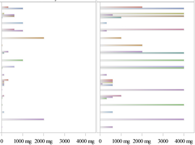
1)I have large data to display ,bars are very thin in the pic!
You could make graph very high. by ODS GRAPHICS/height= ;
2)Also my values on the x axis are not symmetric like you display
You could use UNISCALE= option of PANELBY.
data have;
input study $ group : $20. value1 value2 sub_group $;
cards;
study1 001/placebo 19 10 Allerg1
study1 001/placebo 15  8 Allerg2
study1 002/trt 12 4 Allerg1
study1 003/trt 12 2 Allerg1
study1 003/trt 12 6 Allerg2
study1 003/trt 10 2 Allerg3
study2 001/placebo 119 . Allerg1
study2 001/placebo 115 . Allerg2
study2 002/trt 112 . Allerg1
study2 003/trt 112 . Allerg1
study2 003/trt 112 . Allerg2
study2 003/trt 110 . Allerg3
;

proc format;
picture fmt
low-high='00009mg';
run;
ods graphics/height=2000px width=800px;
proc sgpanel data=have noautolegend nocycleattrs pad=0px;
format value1 value2 fmt.;
panelby study/layout=columnlattice onepanel novarname uniscale=row proportional;
hbarparm category=group response=value1/group=sub_group fillpattern nofill groupdisplay=cluster datalabel=sub_group;
hbarparm category=group response=value2/group=sub_group   groupdisplay=cluster;
colaxis display=(nolabel);
rowaxis display=(nolabel) ;
run;
- Mark as New
- Bookmark
- Subscribe
- Mute
- RSS Feed
- Permalink
- Report Inappropriate Content
- Mark as New
- Bookmark
- Subscribe
- Mute
- RSS Feed
- Permalink
- Report Inappropriate Content
I want to broaden the bars and display x variable display as 1mg, 3mg, 10mg, 30, 100, 300, 600, 1000, 2000, 4000 so the small values with the solid pattern can show, right now it is hard to see
- Mark as New
- Bookmark
- Subscribe
- Mute
- RSS Feed
- Permalink
- Report Inappropriate Content
- Mark as New
- Bookmark
- Subscribe
- Mute
- RSS Feed
- Permalink
- Report Inappropriate Content
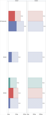
/*
Try this updated code
And better to post some real data,
So I can replicate your problem.
*/

%let path= c:\temp ;


data have;
input study $ group : $20. value1 value2 sub_group $;
cards;
study1 001/placebo 119 1 Allerg1
study1 001/placebo 115  8 Allerg2
study1 002/trt 112 4 Allerg1
study1 003/trt 112 2 Allerg1
study1 003/trt 112 6 Allerg2
study1 003/trt 110 2 Allerg3
study2 001/placebo 1129 . Allerg1
study2 001/placebo 1125 . Allerg2
study2 002/trt 1122 . Allerg1
study2 003/trt 1122 . Allerg1
study2 003/trt 1122 . Allerg2
study2 003/trt 1120 . Allerg3
;


proc format;
picture fmt
low-high='00009mg';
run;
options nodate nonumber orientation=portrait;
ods listing gpath="&path." style=htmlblue image_dpi=300;
ods graphics /width=3.5in height=6in reset=index noborder imagename='FAS' outputfmt=png ;
proc sgplot data=have(where=(study='study1')) noautolegend nocycleattrs pad=0px;
title "Study1";
format value1 value2 fmt.;
hbarparm category=group response=value1/group=sub_group fillpattern nofill groupdisplay=cluster datalabel=sub_group ;
hbarparm category=group response=value2/group=sub_group   groupdisplay=cluster ;
xaxis  display=(nolabel) values=(0 to 150 by 50) ;
yaxis display=(nolabel) colorbands=even;
run;

ods graphics /width=3.5in height=6in reset=index noborder imagename='PPS' outputfmt=png;
proc sgplot data=have(where=(study='study2')) noautolegend nocycleattrs pad=0px;
title "Study2";
format value1 value2 fmt.;
hbarparm category=group response=value1/group=sub_group fillpattern nofill groupdisplay=cluster datalabel=sub_group ;
hbarparm category=group response=value2/group=sub_group   groupdisplay=cluster ;
xaxis  display=(nolabel )   values=(0 to 1200 by 300) ;
yaxis display=(nolabel ) colorbands=even ;
run;


ods pdf file="&path.\want.pdf" style=minimal dpi=300 ;
data x;
x=' ';y=' ';output;
run;
title;
proc report data=x nowd noheader style={outputwidth=100% };
column x y;
define x/display style(column)={just=r};
define y/display style(column)={just=l};
compute y;
n+1;
if n=1 then do;
call define('x','style','style={ postimage="&path\FAS1.png"  bordertopcolor=white borderbottomcolor=white borderrightcolor=white borderleftcolor=white}');
call define('y','style','style={ preimage="&path\PPS1.png"  bordertopcolor=white borderbottomcolor=white borderrightcolor=white borderleftcolor=white}');
end;
endcomp;
run;
ods pdf close;
- Mark as New
- Bookmark
- Subscribe
- Mute
- RSS Feed
- Permalink
- Report Inappropriate Content
Catch up on SAS Innovate 2026
Nearly 200 sessions are now available on demand with the SAS Innovate Digital Pass.
Explore Now →Learn how use the CAT functions in SAS to join values from multiple variables into a single value.
Find more tutorials on the SAS Users YouTube channel.
SAS Training: Just a Click Away
Ready to level-up your skills? Choose your own adventure.

