- Home
- /
- Programming
- /
- Programming
- /
- Re: Making Charts
- RSS Feed
- Mark Topic as New
- Mark Topic as Read
- Float this Topic for Current User
- Bookmark
- Subscribe
- Mute
- Printer Friendly Page
- Mark as New
- Bookmark
- Subscribe
- Mute
- RSS Feed
- Permalink
- Report Inappropriate Content
Hello everyone,
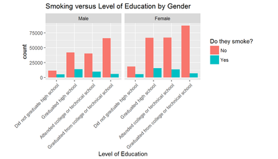
I am trying to analyze the BRFSS 2013 data and want to create a plot like
Can someone guide me on how to create a graph like this in SAS.? I tried using the code mentioned below -
ods graphics / reset width=6.4in height=4.8in imagemap;
proc sgplot data=WORK.BRFSS_13N;
vbar SEX_N / group=educatg group= _RFSMOKN groupdisplay=cluster datalabel;
yaxis grid;
run;
ods graphics / reset;
It created a graph with Education level at X-axis and grouped the data by SEX but I need to add another variable Smoking into the picture.
Kindly guide me. Thank you for your time and help
Accepted Solutions
- Mark as New
- Bookmark
- Subscribe
- Mute
- RSS Feed
- Permalink
- Report Inappropriate Content
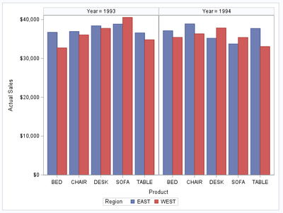
SGPANEL example:
proc sgpanel data=sashelp.prdsale;
  panelby year / columns=2;

  vbar product / response=actual
  GROUP=region GROUPDISPLAY=CLUSTER
  ;
run;
title;
Gives:
Bart
Polish SAS Users Group: www.polsug.com and communities.sas.com/polsug
"SAS Packages: the way to share" at SGF2020 Proceedings (the latest version), GitHub Repository, and YouTube Video.
Hands-on-Workshop: "Share your code with SAS Packages"
"My First SAS Package: A How-To" at SGF2021 Proceedings
SAS Ballot Ideas: one: SPF in SAS, two, and three
SAS Documentation
- Mark as New
- Bookmark
- Subscribe
- Mute
- RSS Feed
- Permalink
- Report Inappropriate Content
did you try with SGPANEL? (https://documentation.sas.com/doc/en/pgmsascdc/9.4_3.5/grstatproc/p17wwoehcyc6mxn1hpcgxy8ixw6w.htm)
Bart
Polish SAS Users Group: www.polsug.com and communities.sas.com/polsug
"SAS Packages: the way to share" at SGF2020 Proceedings (the latest version), GitHub Repository, and YouTube Video.
Hands-on-Workshop: "Share your code with SAS Packages"
"My First SAS Package: A How-To" at SGF2021 Proceedings
SAS Ballot Ideas: one: SPF in SAS, two, and three
SAS Documentation
- Mark as New
- Bookmark
- Subscribe
- Mute
- RSS Feed
- Permalink
- Report Inappropriate Content
SGPANEL example:
proc sgpanel data=sashelp.prdsale;
  panelby year / columns=2;

  vbar product / response=actual
  GROUP=region GROUPDISPLAY=CLUSTER
  ;
run;
title;
Gives:
Bart
Polish SAS Users Group: www.polsug.com and communities.sas.com/polsug
"SAS Packages: the way to share" at SGF2020 Proceedings (the latest version), GitHub Repository, and YouTube Video.
Hands-on-Workshop: "Share your code with SAS Packages"
"My First SAS Package: A How-To" at SGF2021 Proceedings
SAS Ballot Ideas: one: SPF in SAS, two, and three
SAS Documentation
- Mark as New
- Bookmark
- Subscribe
- Mute
- RSS Feed
- Permalink
- Report Inappropriate Content
- Mark as New
- Bookmark
- Subscribe
- Mute
- RSS Feed
- Permalink
- Report Inappropriate Content
Just to be persnickety, did you use one of the survey procs to use the sample design and weighting data in the BRSS data to get the weighted population counts, or possibly another tool like SUDAAN to deal with the complex sample design?
Catch up on SAS Innovate 2026
Dive into keynotes, announcements and breakthroughs on demand.
Explore Now →Learn how use the CAT functions in SAS to join values from multiple variables into a single value.
Find more tutorials on the SAS Users YouTube channel.
SAS Training: Just a Click Away
Ready to level-up your skills? Choose your own adventure.


