- Home
- /
- Programming
- /
- Programming
- /
- How to shrink space between values in Y axis?
- RSS Feed
- Mark Topic as New
- Mark Topic as Read
- Float this Topic for Current User
- Bookmark
- Subscribe
- Mute
- Printer Friendly Page
- Mark as New
- Bookmark
- Subscribe
- Mute
- RSS Feed
- Permalink
- Report Inappropriate Content
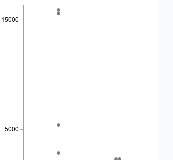
I am trying to generate boxplot using proc sgrender. Please see the below graph I generated. Since there are outliers in my data, I have to display in the graph as well. but there is too much space between 5000 and 15000. My question is how can i shrink the space between 5000 and 15000? I would like to display 5000 close to 15000.
here is the option I gave in Yaxis.
yaxisopts=( label="xxx" type=linear linearopts=(tickvaluelist=(0 5000 15000)));
- Mark as New
- Bookmark
- Subscribe
- Mute
- RSS Feed
- Permalink
- Report Inappropriate Content
First thing, you should provide the entire template. Options like Layout Overlay affect how, or if, yaxisopts and xaxisopts are applied.
Also you may need to decide that if the values that extreme whether the display should include them or not.
- Mark as New
- Bookmark
- Subscribe
- Mute
- RSS Feed
- Permalink
- Report Inappropriate Content
https://blogs.sas.com/content/graphicallyspeaking/2015/09/02/broken-axis-redux/
- Mark as New
- Bookmark
- Subscribe
- Mute
- RSS Feed
- Permalink
- Report Inappropriate Content
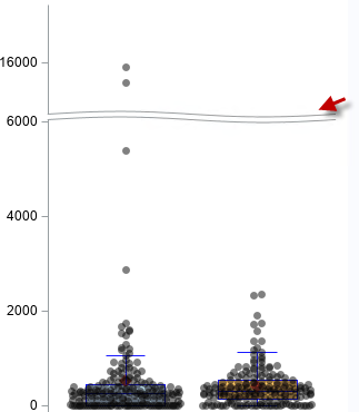
Thanks Reeza. I tried broken axis and it worked. Is there any way to hide the break?
- Mark as New
- Bookmark
- Subscribe
- Mute
- RSS Feed
- Permalink
- Report Inappropriate Content
- Mark as New
- Bookmark
- Subscribe
- Mute
- RSS Feed
- Permalink
- Report Inappropriate Content
- Mark as New
- Bookmark
- Subscribe
- Mute
- RSS Feed
- Permalink
- Report Inappropriate Content
Learn how use the CAT functions in SAS to join values from multiple variables into a single value.
Find more tutorials on the SAS Users YouTube channel.
SAS Training: Just a Click Away
Ready to level-up your skills? Choose your own adventure.


