- Home
- /
- Programming
- /
- SAS Procedures
- /
- Re: proc gchart, format inside=subpct
- RSS Feed
- Mark Topic as New
- Mark Topic as Read
- Float this Topic for Current User
- Bookmark
- Subscribe
- Mute
- Printer Friendly Page
- Mark as New
- Bookmark
- Subscribe
- Mute
- RSS Feed
- Permalink
- Report Inappropriate Content
Thanks,
Bruce
proc gchart data=new;
Vbar age /
TYPE=PCT
subgroup=disposition_new
Inside=subpct
G100
GROUP=age
NOZERO
Raxis=axis1
GAXIS=AXIS2
width=15
space=0
maxis=axis3
legend=legend3;
run;
- Mark as New
- Bookmark
- Subscribe
- Mute
- RSS Feed
- Permalink
- Report Inappropriate Content
- Mark as New
- Bookmark
- Subscribe
- Mute
- RSS Feed
- Permalink
- Report Inappropriate Content
- Mark as New
- Bookmark
- Subscribe
- Mute
- RSS Feed
- Permalink
- Report Inappropriate Content
- Mark as New
- Bookmark
- Subscribe
- Mute
- RSS Feed
- Permalink
- Report Inappropriate Content
Scott Barry
SBBWorks, Inc.
Sample 24887: Annotate values for each subgroup bar
http://support.sas.com/kb/24/887.html
- Mark as New
- Bookmark
- Subscribe
- Mute
- RSS Feed
- Permalink
- Report Inappropriate Content
A little pre-processing of the data to match the example given in the SAS note suggested by Barry and then it worked fine.
Thanks to all for your help.
- Mark as New
- Bookmark
- Subscribe
- Mute
- RSS Feed
- Permalink
- Report Inappropriate Content
I'm having this exact same problem. The annotate could is turning out to be a little difficult to decipher; I'm not sure what some of it is doing, exactly (e.g., "a", xsys, ysys, position, "E", etc.). Though an experienced Stata and R user, I'm getting up to speed in SAS.
BigD: could you please post the code that worked?
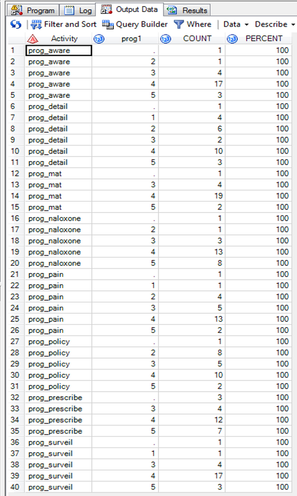
Here're my data and code:
And the code:
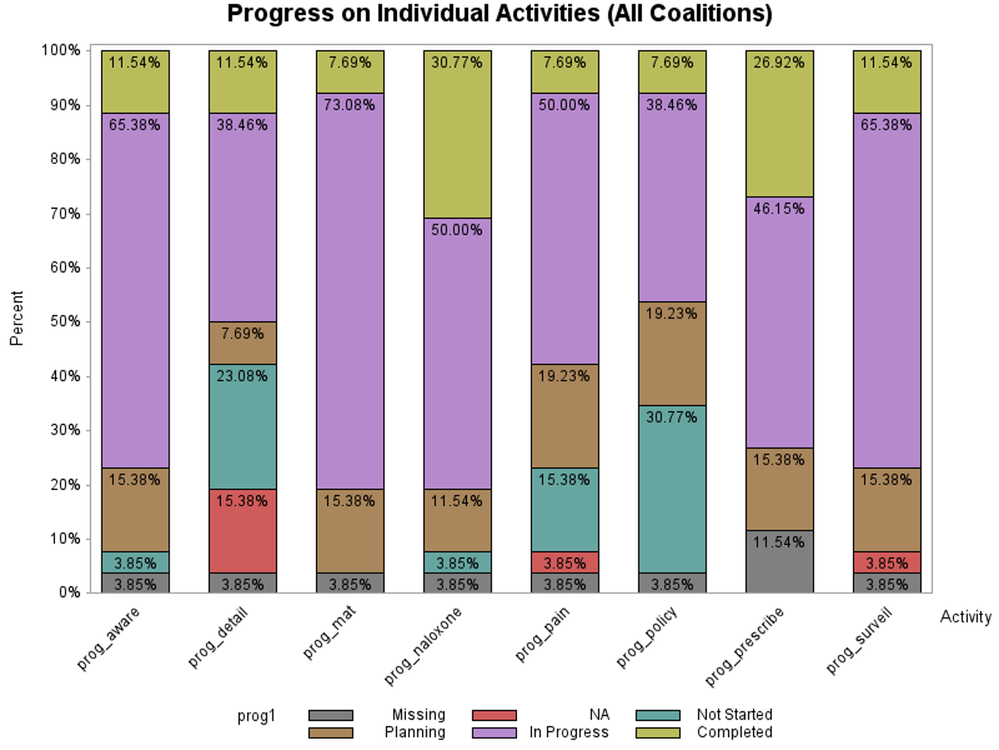
/*Figure 6:  Coalition Progress on Individual Activities (All Coalitions)*/
title1 "Progress on Individual Activities (All Coalitions)";
axis1 label=("Activity") value=(angle=45 rotate=0);
axis2 label=none value=none;
axis3 label=(angle=90 "Percent") value=("0%" "10%" "20%" "30%" "40%" "50%" "60%" "70%" "80%" "90%" "100%")
	minor=none;
PROC GCHART data=temp;
	format prog1 prog.;
	vbar count / type=percent subgroup=prog1 g100 group=Activity inside=pct
	gaxis=axis1 maxis=axis2 raxis=axis3 width=20;
RUN;
I get this graph, which is very nearly what I need, just that the two decimal points give an impression of a great precision that just isn't in the data!
I'd greatly appreciate any help!
Thanks,
David
Learn the difference between classical and Bayesian statistical approaches and see a few PROC examples to perform Bayesian analysis in this video.
Find more tutorials on the SAS Users YouTube channel.
SAS Training: Just a Click Away
Ready to level-up your skills? Choose your own adventure.


