- Home
- /
- Programming
- /
- SAS Procedures
- /
- proc gchart, format inside=subpct
- RSS Feed
- Mark Topic as New
- Mark Topic as Read
- Float this Topic for Current User
- Bookmark
- Subscribe
- Mute
- Printer Friendly Page
- Mark as New
- Bookmark
- Subscribe
- Mute
- RSS Feed
- Permalink
- Report Inappropriate Content
Thanks,
Bruce
proc gchart data=new;
Vbar age /
TYPE=PCT
subgroup=disposition_new
Inside=subpct
G100
GROUP=age
NOZERO
Raxis=axis1
GAXIS=AXIS2
width=15
space=0
maxis=axis3
legend=legend3;
run;
- Mark as New
- Bookmark
- Subscribe
- Mute
- RSS Feed
- Permalink
- Report Inappropriate Content
- Mark as New
- Bookmark
- Subscribe
- Mute
- RSS Feed
- Permalink
- Report Inappropriate Content
- Mark as New
- Bookmark
- Subscribe
- Mute
- RSS Feed
- Permalink
- Report Inappropriate Content
- Mark as New
- Bookmark
- Subscribe
- Mute
- RSS Feed
- Permalink
- Report Inappropriate Content
Scott Barry
SBBWorks, Inc.
Sample 24887: Annotate values for each subgroup bar
http://support.sas.com/kb/24/887.html
- Mark as New
- Bookmark
- Subscribe
- Mute
- RSS Feed
- Permalink
- Report Inappropriate Content
A little pre-processing of the data to match the example given in the SAS note suggested by Barry and then it worked fine.
Thanks to all for your help.
- Mark as New
- Bookmark
- Subscribe
- Mute
- RSS Feed
- Permalink
- Report Inappropriate Content
I'm having this exact same problem. The annotate could is turning out to be a little difficult to decipher; I'm not sure what some of it is doing, exactly (e.g., "a", xsys, ysys, position, "E", etc.). Though an experienced Stata and R user, I'm getting up to speed in SAS.
BigD: could you please post the code that worked?
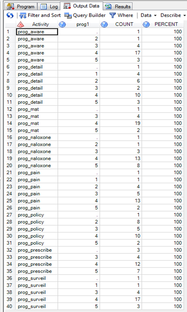
Here're my data and code:
And the code:
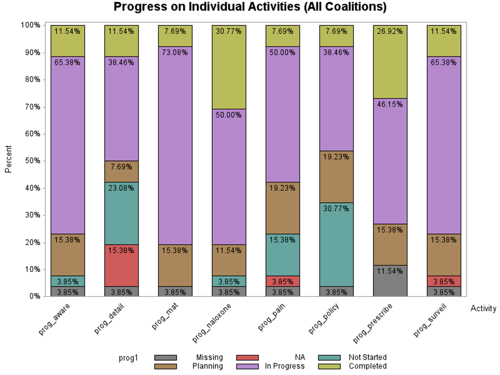
/*Figure 6:  Coalition Progress on Individual Activities (All Coalitions)*/
title1 "Progress on Individual Activities (All Coalitions)";
axis1 label=("Activity") value=(angle=45 rotate=0);
axis2 label=none value=none;
axis3 label=(angle=90 "Percent") value=("0%" "10%" "20%" "30%" "40%" "50%" "60%" "70%" "80%" "90%" "100%")
	minor=none;
PROC GCHART data=temp;
	format prog1 prog.;
	vbar count / type=percent subgroup=prog1 g100 group=Activity inside=pct
	gaxis=axis1 maxis=axis2 raxis=axis3 width=20;
RUN;
I get this graph, which is very nearly what I need, just that the two decimal points give an impression of a great precision that just isn't in the data!
I'd greatly appreciate any help!
Thanks,
David
Catch up on SAS Innovate 2026
Dive into keynotes, announcements and breakthroughs on demand.
Explore Now →Learn the difference between classical and Bayesian statistical approaches and see a few PROC examples to perform Bayesian analysis in this video.
Find more tutorials on the SAS Users YouTube channel.
SAS Training: Just a Click Away
Ready to level-up your skills? Choose your own adventure.


