- Home
- /
- Programming
- /
- SAS Procedures
- /
- Problem Graph
- RSS Feed
- Mark Topic as New
- Mark Topic as Read
- Float this Topic for Current User
- Bookmark
- Subscribe
- Mute
- Printer Friendly Page

- Mark as New
- Bookmark
- Subscribe
- Mute
- RSS Feed
- Permalink
- Report Inappropriate Content
Hello everyone,
I'm trying to make a graph using the price of 4 stocks (Goldman sachs, coca cola, yahoo and apple) on the same graph. I have taken their daily value from 2007 till 2014 (8 years) and I want to make a graph to see the evolution of the 4 stocks on the same graph. When I tried with the command below, I get something too concentrated (for example, the apple stock varies from 20 to more than 600 during these 8 years). Can you tell me what I can do to have a good graph ? Here is the command I used :
/* représentation graphique des cours boursiers */
proc gplot Skalli.base_union ;
symbol1 interpol=join value=none color=blue ;
symbol2 interpol=join value=none color=red ;
symbol3 interpol=join value=none color=green ;
symbol4 interpol=join value=none color=purple ;
plot (Goldman_Sachs coca_cola Yahoo Apple_)*Date / legend overlay ;
Title "Représentation des cours des quatre actions qui composent notre portefeuile" ;
run ;
ods rtf close;
Quit ;
I also tried this command :
/* Définir le titre */
title1 "Représentation des cours des quatre actions qui composent notre portefeuile";
/* Définir les symboles */
symbol1 interpol=join value=none color=blue height=2;
symbol2 interpol=join value=none color=red height=2;
symbol3 interpol=join value=none color=green height=2;
symbol4 interpol=join value=none color=purple height=2;
/* Define axis characteristics */
axis1 label=("Date") minor=none offset=(1,1);
axis2 label=(angle=90 "Cours")
order=(0 to 800 by 50) minor=(n=1);
proc gplot Skalli.base_union ;
plot (Goldman_Sachs coca_cola Yahoo Apple_)*Date / overlay legend=legend1
haxis=axis1 vaxis=axis2;
run;
quit;
Can you tell me what I can do to have a good graph ?What command can I add to have a better result ?
Thank you very much.

- Mark as New
- Bookmark
- Subscribe
- Mute
- RSS Feed
- Permalink
- Report Inappropriate Content
Hi:
Have you considered the SG Procedures? Sometimes they are much easier than GPLOT. See this paper:
from: http://www2.sas.com/proceedings/forum2008/255-2008.pdf
cynthia

- Mark as New
- Bookmark
- Subscribe
- Mute
- RSS Feed
- Permalink
- Report Inappropriate Content
Since each stock's price can be in a different price range (sometimes *very* different), it is often not fair to plot/compare them to the same scale. One thing I've found it useful to do is to plot each stock separately, and let each one auto-scale.
I show, in detail, how to do this in Example 14 of my book SAS/Graph: Beyond the Basics. Here is the code from that example:
http://robslink.com/SAS/book/example14.sas
And here is an example of what it looks like when you plot several different stocks:
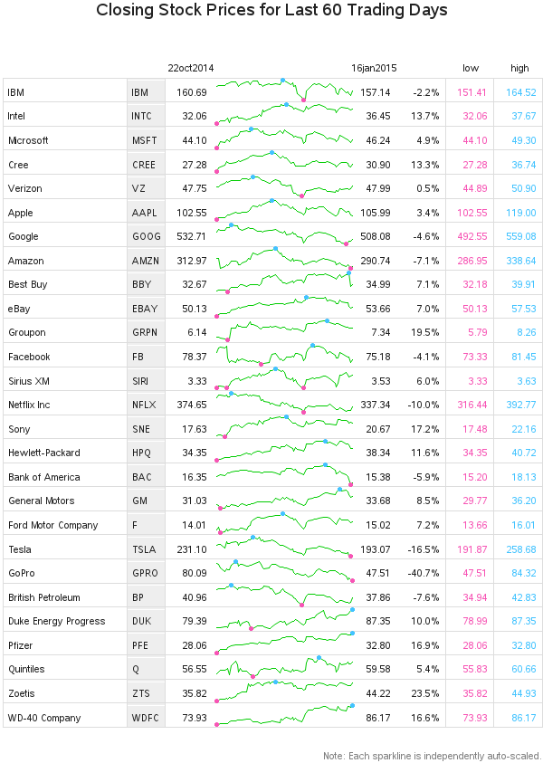
.jpg")
Catch up on SAS Innovate 2026
Nearly 200 sessions are now available on demand in the Innovate Hub.
Watch Now →Learn the difference between classical and Bayesian statistical approaches and see a few PROC examples to perform Bayesian analysis in this video.

Find more tutorials on the SAS Users YouTube channel.
SAS Training: Just a Click Away
Ready to level-up your skills? Choose your own adventure.
-
2 replies
-
12-28-2014 10:17 AM
-
2379 views
-
0 likes
-
3 in conversation
-
