- Home
- /
- Programming
- /
- SAS Procedures
- /
- PROC FMM
- RSS Feed
- Mark Topic as New
- Mark Topic as Read
- Float this Topic for Current User
- Bookmark
- Subscribe
- Mute
- Printer Friendly Page
- Mark as New
- Bookmark
- Subscribe
- Mute
- RSS Feed
- Permalink
- Report Inappropriate Content
Hello there,
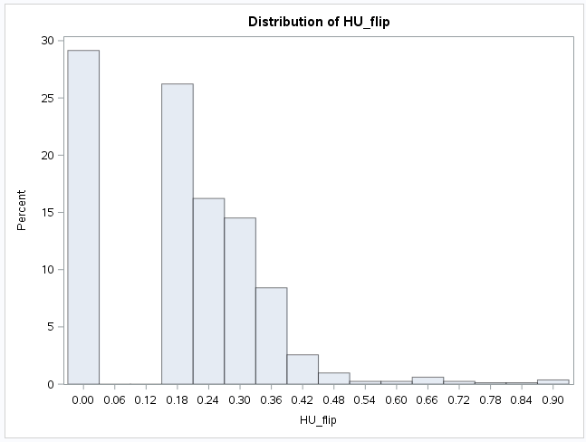
I would like to model a distribution that has a lot of zeros and numbers between 0 and 1. There is a gap between 0 and 0.12 with no cases at all. See picture attached.
I discovered the PROC FMM, but for some reasons the predicted values are quite off despite the Pearson Statistics was close to the sample size.
Here are my codes:
proc fmm data=dataset;
model HU_flip=x1 x2 x3 x4 x5 x6 x7 x8 x9/dist=truncnormal (0,.) link=log;
model HU_flip= /dist=constant (0);
probmodel x1 x2 x3 x4 x5 x6 x7 x8 x9;
output out=outfile predicted=poutcome;
run;
Are my codes seems ok? Please advise?
Thank you so much!
Yvonne
- Mark as New
- Bookmark
- Subscribe
- Mute
- RSS Feed
- Permalink
- Report Inappropriate Content
You may want to look at other distributions besides a truncated normal. I see a zero inflated gamma with a threshold at about 0.1. Does this seem to fit the process you are modeling?
Steve Denham
- Mark as New
- Bookmark
- Subscribe
- Mute
- RSS Feed
- Permalink
- Report Inappropriate Content
Dear Steven
Thanks so much!
How should I specifiy the gamma distribution in the FMM? Should I still run the model as two parts?
Yvonne
- Mark as New
- Bookmark
- Subscribe
- Mute
- RSS Feed
- Permalink
- Report Inappropriate Content
Can you say more about the response distribution? The truncated normal distribution is used for a continuous response that has been manually truncated to some minimum value. The graph you show makes me wonder if the response is a proportion of times that some event haened. For example, the proportion of answers that were wrong on a test, or the proportion of animals in an area that have some disease. For a proportion, you might want to use different response distribution.
- Mark as New
- Bookmark
- Subscribe
- Mute
- RSS Feed
- Permalink
- Report Inappropriate Content
Hi Rick
The respsonse is a health utilities score called EQ5D. There are five health domains and each asks the subject's level of functioning in that domain rating from 1 to 3. In total 243 health stated were defined. Then a score (0-1.0) is matched to each health state, and that is generated by a population-based time trade-off preference method.
Actually 1.0 meaning full health and 0 meaning death. I flipped the number to 0 and 1.0 instead.
Let me know if this makes sense to you?
Thank you so much for your help!
Yvonne
- Mark as New
- Bookmark
- Subscribe
- Mute
- RSS Feed
- Permalink
- Report Inappropriate Content
Let's see if I understand. Each person filled out five questions in which they could record a score 1-3.
That means that each person gets a health_score between 3 (poor health) and 15 (good heath).
But if the person dies, you give them a score of 0.
These scores are then normalized between 0 and 1 by the formula score=(health_score/15).
If this is correct, then that explains your gap: dead people get HU_flip=0 whereas the living people in the worst health have the a score of 3/15 = 0.2.
Is this correct? Not sure where the flip comes in. In your graph, are the people with HU_flip=0 dead, or are they in perfect health? Are the people with HU_flip near 0.18 in poor health or mostly good health?
- Mark as New
- Bookmark
- Subscribe
- Mute
- RSS Feed
- Permalink
- Report Inappropriate Content
Hi Rick
No the responses for 5 questions form a pattern or health state. E.g., 11111 (good health)or 33333 (worse health). There 245 health states and each pattern has been assigned a score between 1.0 and 0. Each country has their own utilities scores generated by the population based time trade off valuation method.
Does it make sense to you?
Thank you so much!
Yvonne
- Mark as New
- Bookmark
- Subscribe
- Mute
- RSS Feed
- Permalink
- Report Inappropriate Content
I am not familiar with this health score, but I looked up how people are modeling these scores. Here is one paper with some references to Tobit models:
http://onlinelibrary.wiley.com/doi/10.1111/j.1524-4733.2010.00695.x/pdf
Catch up on SAS Innovate 2026
Nearly 200 sessions are now available on demand with the SAS Innovate Digital Pass.
Explore Now →Learn the difference between classical and Bayesian statistical approaches and see a few PROC examples to perform Bayesian analysis in this video.
Find more tutorials on the SAS Users YouTube channel.
SAS Training: Just a Click Away
Ready to level-up your skills? Choose your own adventure.


