- Home
- /
- Programming
- /
- SAS Procedures
- /
- Re: Creating a plot with a "normal range" bar on the side
- RSS Feed
- Mark Topic as New
- Mark Topic as Read
- Float this Topic for Current User
- Bookmark
- Subscribe
- Mute
- Printer Friendly Page
- Mark as New
- Bookmark
- Subscribe
- Mute
- RSS Feed
- Permalink
- Report Inappropriate Content
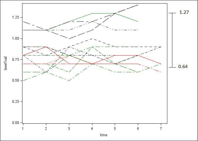
I have plot of the trajectory of a value over time and I would like to place just outside the graph, on the right, a bar indicating the normal range of the value (including numbers). How can accomplish this in proc template?
I've attached a rough picture of what I mean.

Thanks,
John
- Mark as New
- Bookmark
- Subscribe
- Mute
- RSS Feed
- Permalink
- Report Inappropriate Content
Without having data and your existing template it is pretty hard to provide details.
My first thought on this would be to add a high-low bar associated with a minimum or maximum value of you the x variable. Or look up the examples related to the GTL Draw statements and POLYLINE.
- Mark as New
- Bookmark
- Subscribe
- Mute
- RSS Feed
- Permalink
- Report Inappropriate Content
Here is some sample data. In the original graph you saw, there are 3 groups of patients, with each patient measured up to 7 time points. Here is data from one group, which includes 3 patients.
| PT | Time | Value |
| 102 | 1 | 1.1 |
| 102 | 2 | 1.1 |
| 102 | 3 | 1.2 |
| 102 | 4 | 1.3 |
| 102 | 5 | 1.3 |
| 102 | 6 | 1.2 |
| 103 | 1 | 0.7 |
| 103 | 2 | 0.7 |
| 103 | 3 | 0.6 |
| 103 | 4 | 0.9 |
| 103 | 5 | 0.7 |
| 103 | 6 | 0.8 |
| 104 | 1 | 0.9 |
| 104 | 2 | 0.9 |
| 104 | 3 | 0.8 |
| 104 | 4 | 0.9 |
| 104 | 5 | 0.9 |
| 104 | 6 | 0.9 |
April 27 – 30 | Gaylord Texan | Grapevine, Texas
Registration is open
Walk in ready to learn. Walk out ready to deliver. This is the data and AI conference you can't afford to miss.
Register now and lock in 2025 pricing—just $495!
Learn the difference between classical and Bayesian statistical approaches and see a few PROC examples to perform Bayesian analysis in this video.
Find more tutorials on the SAS Users YouTube channel.
SAS Training: Just a Click Away
Ready to level-up your skills? Choose your own adventure.


